|
|
|
Showing 261 - 270 of ~910 |
| Image |
Comment |
| 03/15/2006 06:12:50 AM | |  Photographer found comment helpful. Photographer found comment helpful. |
| 03/10/2006 08:19:38 AM | Forbiddenby smykComment: Greetings from the Critique Club ...
Very well done. You photo meets the challenge, is technically well done, and is a great idea.
The only constructive criticism I have is the belt caught a little too much light as is drawing away some attention from the rest of the photo. Also, (and this is very minor) the light source seems just a little bit low which is casting a shadow on his neck, but again - no big deal really.
I like the idea a lot, and it seems others did, too. Nice photo, nice finish. Well done.
milo | | Photographer found comment helpful. |
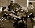
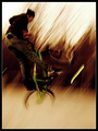
| 03/07/2006 11:19:25 AM | It's a rough gameby KHoltComment: Greetings from the Critique Club ...
I'm gonna be honest with you, there's nothing to critique. This is superb shot. You froze the action. The expressions are perfect. The background is thrown out of focus. The intensity is clearly shown. It meets the challenge.
The glare off the goal post is a slight distraction, but it's not like you can direct them to "scuffle" about 5 feet to the left :)
In my opinion, you got an excellent score, but it should have been higher. Fickly voters, I guess.
Awesome Job. | | Photographer found comment helpful. |
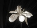
| 03/07/2006 11:07:00 AM | Wild Irisby thilomComment: Greetings from the Critique Club ...
Very pretty flower, and good shot. There are a few things which could give it some more "pop".
First, I can still see the background a little. In a shot like this, it should be totally black (which is what you were going for, I imagine). Boosting the contrast up just a little bit would have completely removed the background. The image is sharp in focus and the depth of focus (depth of field) is also very good. The leaf on the bottom right is a little bit distracting, perhaps you caould have ripped it right off. As stated in a previous comment, using the rule of thirds here would have helped the composition. And lastly, in my opinion, either getting closer to - or farther away from - the flower would have helped. As is, it lacks just a little bit of interest.
Still, I fine shot. Good job.
milo | | Photographer found comment helpful. |
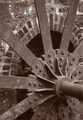
| 03/07/2006 09:34:57 AM | Rock Run Millby LN13Comment: Greetings from the Critique Club ...
Well, much of what I'm thinking about this shot has already been addressed in some of the comments below, but I'll echo my thoughts anyway.
It's technically a very well done shot. The leading lines work very well, the composition is perfect. I don't think the sharpness is off too bad, but F5.6 of f8 would have improved the crispness of it. A little more contrast would have been nice, but I wouldn't say it's bad as is.
At the end of the day, I'd say it's a great shot - there's just nothing to really "pull it out of the pack" during voting. Tough to figure out what the voters are going to like :)
Well done
milo | | Photographer found comment helpful. |
| 03/06/2006 02:48:11 PM | Natures Beautyby trainComment: Greetings from the Critique Club ...
This is excellent! Everything's in sharp focus (except for just a tiny bit on top), the colors are great, the rose is perfect. It's fit's the challenge nicely. There's not a lot of contrast, but it's not needed - the softness is very nice.
The Composition is good, but I think it would be a bit better if the center of the flower was right dead on an intersection of thirds. In my opinion, here at dpc, it's hard to predict how a flower shot is going to do. Sometimes people just like 'em, other times - not so much.
Still, this is excellent. Well done.
milo | | Photographer found comment helpful. |
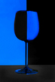
| 03/06/2006 01:39:27 PM | Clichéby liebeComment: Greetings from the Critique Club!
I've always liked this type of shot. And having tried it myself, I know how difficult it is to achieve. This is a very respectable take on it. I like the colors, although the blue seems to glow just a bit too much for my liking. The image is sharp and the centered composition works here because of the subject.
On the down side, I see three colors - blue, black, and dark grey. I suppose it could be argued that dark grey is just a tone of black, but in a specific duotone challenge, this may have hurt your score a bit. Also, the grey of the base makes the image seem just a little ... "off". The best photoshop is photoshop that can't be detected, and this particular part is a little too obvious, in my opinion.
Still, it's a very pleasing image. Well done.
milo | | Photographer found comment helpful. |
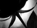
| 03/06/2006 10:42:18 AM | Hide Romanceby LaMerryComment: Greetings from the critique club...
Let me start by saying I like this shot a lot. I like the fact that it's an abstract, but not so much that you can't figure out what it is. There's just enough detail showing on the smaller leaves to hold my attention. It's crisp ... sharp ... well done.
I don't particularly like the leaf on the right. It's partially in focus and partial out of focus which makes it a bit distracting, and I don't think it needs to be there anyway. Just leaving that area blank would have been OK I think.
Normally I would say that the eye is drawn to the brightest part of an image, which in this case is the background and not the subject, but it works here because of the silhouette you've created.
Great Job!
milo | | Photographer found comment helpful. |
| 02/20/2006 01:26:30 PM | | | Photographer found comment helpful. |
| 02/15/2006 07:56:09 AM | | | Photographer found comment helpful. |
|
Showing 261 - 270 of ~910 |
Home -
Challenges -
Community -
League -
Photos -
Cameras -
Lenses -
Learn -
Help -
Terms of Use -
Privacy -
Top ^
DPChallenge, and website content and design, Copyright © 2001-2025 Challenging Technologies, LLC.
All digital photo copyrights belong to the photographers and may not be used without permission.
Current Server Time: 08/06/2025 09:51:34 AM EDT.
|