| Image |
Comment |
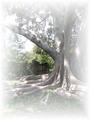
| 08/24/2004 03:22:38 PM |
Retreatby KylieComment: The tree is beautiful, but there is way too much white cloud around it i think. Too get this same feel without so much cloud on the outside, just take it into photoshop and lower the opacity to about 65 or 70% then flatten the image. It may give you teh same feel. You could also put a poem over it and sell it on DPCprints! Nice composition! |
 Photographer found comment helpful. Photographer found comment helpful. |
| 08/24/2004 03:21:06 PM |
Water Mosaicby KylieComment: This is a beautiful shot, worthy of framing if you have this type of decor in your home. I like the colors a lot, and the contrast is really nice. I think the diagonal line is a tiny bit distracting, but it also adds some brownish orange into the photo... so i am mixed on that. the white is a bit bright at the upper right, but it's not damaging to the photo overall. Nice job! |
| Photographer found comment helpful. |
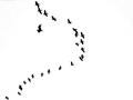
| 08/24/2004 03:19:28 PM |
Bell Curveby KylieComment: Great capture. The photo is a bit stark (black/white) but that does add a nice feel. It's an interesting photo, that would work best in a set of photos for a particular subject (either the city you were in, or birds, or black/white). I picture it in a series at a museum, but not alone on a wall of a house. Very clean photo. Good job! |
| Photographer found comment helpful. |
| 08/18/2004 12:56:32 PM |
Long Way To Goby KylieComment: Excellent image. Great DOF, color, focus, feel... all around great photo! I didn't get to vote in this challenge, but I am impressed. You are really coming a long way! |
| Photographer found comment helpful. |
| 07/21/2004 05:35:14 PM |
Hot Coco Times Threeby bruskiComment: Soooooooo yummy! this is the most enticing photo yet! Yum! I wish the lighting was brighter from the left, but it's almost perfect. great crop and idea! |
| Photographer found comment helpful. |
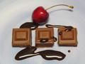
| 07/21/2004 05:34:19 PM |
The Chocolate Platterby NodeComment: I like everything except the lighting. Crop is good, composition is good, idea is good... but i think it needs to be more vibrant. |
| Photographer found comment helpful. |
| 07/21/2004 05:32:42 PM |
Want some?by dahvedComment: Cute idea, yummy chocolate. The cherry is a bit dark though and the background is not very consistent in color or feel. It seems a littel blurry. |
| Photographer found comment helpful. |
| 07/21/2004 05:31:54 PM |
|
| Photographer found comment helpful. |
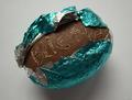
| 07/21/2004 05:31:02 PM |
Chips Ahoy!by ElemmennopeComment: Haha, cute! I like the idea, the overall feel. I wish it were less blurry though. I'd like to see the lighting source a little less blue/white toned. |
| Photographer found comment helpful. |
| 07/21/2004 05:28:51 PM |
Egg Messageby mtbriderComment: The idea is fun, the composition is good, but the lighting is really off. I'd use a warm tone and also light the photo from a few angles |
| Photographer found comment helpful. |
Home -
Challenges -
Community -
League -
Photos -
Cameras -
Lenses -
Learn -
Help -
Terms of Use -
Privacy -
Top ^
DPChallenge, and website content and design, Copyright © 2001-2025 Challenging Technologies, LLC.
All digital photo copyrights belong to the photographers and may not be used without permission.
Current Server Time: 08/01/2025 12:56:28 PM EDT.