| Image |
Comment |
| 09/15/2008 09:18:10 PM |
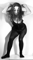
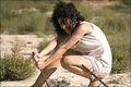
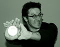
Muse Verses Celingby Love6Comment: This photo doesn't seem to work for me. It meets the challenge, but the lighting fopr me does not help. It casts shaddows which I find distracting. The hair over much of the face also is a bit distracting for me. |
 Photographer found comment helpful. Photographer found comment helpful. |
| 09/15/2008 09:13:22 PM |
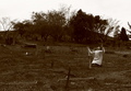
Moving God to bring her backby CarlvanHeerdenComment: Interesting take on the challenge. I like the brown colouring. However, the person seems to blend into the background a bit too much. OWuld have liked them to be a little more prominent, maybe by being slightly brighter, and a little more contrast in the overall scene. Many of the crosses and details in the dirt blend in a little too much, and that reduces the effect |
| Photographer found comment helpful. |
| 09/15/2008 07:51:39 PM |
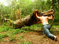
Urch !!by ManelinComment: Nice idea, though the man looks blurred, like he is moviong, instead of being still, empahsising no movement. Would have preferred a slight levels adjustment as his back and left foot look overexposed and washed out. This would then have emphasised the muscle tone showing his is straining. Would have been tempted to have him in shots also so that the leg muscle definition could have been shown. |
| Photographer found comment helpful. |
| 09/15/2008 07:49:37 PM |
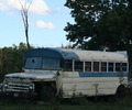
Broken Downby AnnaXTComment: Yes, the item looks immovable, but the description for the chaallenge did say someone trying to move something immovable. It would have been great if the challenge was left further open (ie just Immovable) as this them would have scored better. Even a person sitting in the drivers seat, or leaning out the window would then have meant it met the challange completely.
Some light on the bus would have been better, as I find it too dull. The use of flash or lighting in some way to highlight the bus slightly would have added to this shot.
I am not sure about the crop. You have cut off the front and rear door slightly. Some more space both left and right would have added to the balance of the shot and even a little more foreground(with weeds included) could have helped, especially with the extra light. |
| Photographer found comment helpful. |
| 09/15/2008 03:30:11 AM |
Stuckby LouisaComment: Good idea, shame that you cropped so close to her head, cutting off the top of hert hair. More space above her would have balanced the photo, more space below also would have added to the shot. Seeing her feet and how the pole is stuck in the ground I think would have added to the overall effect |
| Photographer found comment helpful. |
| 09/15/2008 03:28:56 AM |
|
| Photographer found comment helpful. |
| 09/15/2008 03:27:15 AM |
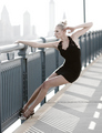
Bridge of Steelby escapetoozComment: Not sure about the composiution, which is hanging onto the bridge. Very pale with the overexposed sky. It all makes it look a little stark, and highlights her white skin. Some additional colour would have been great |
| Photographer found comment helpful. |
| 09/15/2008 03:25:35 AM |
|
| Photographer found comment helpful. |
| 09/15/2008 03:16:30 AM |
|
| Photographer found comment helpful. |
| 09/15/2008 03:15:16 AM |
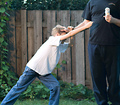
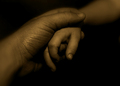
Fathers Loveby nikon90sComment: A different take, and one that works. I like the idea, the lighting effect and what you have come up with. The childs arm fades off nicely. I would have been tempted to do the same with the fathers, leaving slightly more of the photo in on the bottom left where the arm is going out of focus for the same effect |
| Photographer found comment helpful. |
Home -
Challenges -
Community -
League -
Photos -
Cameras -
Lenses -
Learn -
Help -
Terms of Use -
Privacy -
Top ^
DPChallenge, and website content and design, Copyright © 2001-2025 Challenging Technologies, LLC.
All digital photo copyrights belong to the photographers and may not be used without permission.
Current Server Time: 08/01/2025 06:42:35 PM EDT.