| Image |
Comment |
| 07/20/2009 10:57:37 PM |
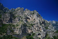
Amalfi coastlineby Rino63Comment: I like the deep, rich colour of the sky. However, the rocks seem to fade into each other, while you have some great colours there that could have eben worked with. Some adjustments to individual colour layers could have brought out the reds and greets from the grey rock, and made a more appealing image |
 Photographer found comment helpful. Photographer found comment helpful. |
| 07/20/2009 07:24:12 PM |
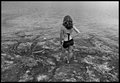
When Rock meets Waterby LydiaComment: I find that the person is the subject of this image, and not anything Geology related. By the composition and processing, the rocks are hard to see any detail, and are really just a convienient background for the person in the shot. |
| Photographer found comment helpful. |
| 07/20/2009 07:23:00 PM |
|
| Photographer found comment helpful. |
| 07/20/2009 07:22:22 PM |
terraqueousby Ecce_SignumComment: I find the rocks here a little too bright and the detail washed out, which means they do not stand out strongly as the true subject. The view does lack a subject to draw attention, as nothing clearly stands out from the rest of the image. |
| Photographer found comment helpful. |
| 07/20/2009 07:18:25 PM |
|
| Photographer found comment helpful. |
| 07/20/2009 07:17:30 PM |
Boiling soup of the earthby IreneMComment: An interesting image you have composed here. The colours are very subtle which work really well. I do feel though that the right side of the photo needed more light, as this is where the main subjects are, and yet much of them is dark and the details hard to see. Some light coming from that side to brighten them up would have helped. |
| Photographer found comment helpful. |
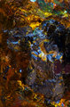
| 07/20/2009 03:04:17 AM |
Silver on blueby MbargeComment: A greater depth of field would have helped here. At the moment, half of the image is dark and out of focus, whereas with a great depth of field, the details along the rocks to the water could then have made for an interesting shot. |
| Photographer found comment helpful. |
| 07/20/2009 03:03:03 AM |
stone faceby JMoreiraComment: Shooting from directly above, with the light behind, for me does not show off the rocks in the most interesting way. Shooting so that we can see the different shapes, and the light resulting in different shades would have worked better. The placement of the rocks also does not seem to really appeal |
| Photographer found comment helpful. |
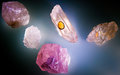
| 07/20/2009 02:58:47 AM |
Peacock Oreby jbrowningComment: Unfortunately, due to the presentation, focus and composition of the photo, what appears to be a realy interesting rock with plenty of great colours comes across as a random mix of colour, with no real focal point to draw attention |
| Photographer found comment helpful. |
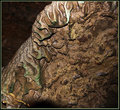
| 07/20/2009 02:57:32 AM |
slide 52by drydocComment: The harsh lighting relecting off the top of the image, and casting harsh shaddows detracts. I also am struggling to really see what you want me to see, some rock waves but not a real lot to jump out and capture the eye. The title does not give any ideas either. Also, the shades of the browns really are not inspiring. |
| Photographer found comment helpful. |
Home -
Challenges -
Community -
League -
Photos -
Cameras -
Lenses -
Learn -
Help -
Terms of Use -
Privacy -
Top ^
DPChallenge, and website content and design, Copyright © 2001-2025 Challenging Technologies, LLC.
All digital photo copyrights belong to the photographers and may not be used without permission.
Current Server Time: 08/06/2025 03:23:18 PM EDT.