| Image |
Comment |
| 10/01/2009 03:57:49 PM |
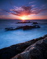
The sun's afroby prperoldComment: Great Title, Good image. I like the effect of the long exposures on the water, the almost mystic feel that it goves the overall photo as a result. Composition is very centered, and the front rocks seem to lead somewhere. Could an off center sun, and more room to the right have worked? Just a thought. A great image and great colours through it as well.......... |
 Photographer found comment helpful. Photographer found comment helpful. |
| 10/01/2009 03:55:31 PM |
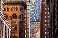
densityby oldbimmercoupeComment: A very interesting image, a contrast between the old and new, the styles that make up a city. It does though have a disjointed feel, the different building on different anglles, and the lines dont lead to any focal point at all. |
| Photographer found comment helpful. |
| 10/01/2009 03:50:26 PM |
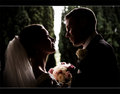
the lookby SimmsComment: The light here is great, love the way it highlights the features. However, the break in teh background, where the brioght light is coming in, gives it a seperated, almost broken line through the photo and makes it almost like two halves. It unfortunately keeps putting this 'broken marriage' through my head, as it seems like a massive barrier in the image. Unfortunately, it completely ruins the effect of what otherwise is a great capture............... |
| Photographer found comment helpful. |
| 10/01/2009 03:47:38 PM |
One Last Sip Before I Goby MaryOComment: Great depth of field here, really making the subject jump out from the background. The colours ghere are really good, and the composition I feel works really well. |
| Photographer found comment helpful. |
| 10/01/2009 03:43:07 PM |
- REGAL - by andrewtComment: Very Regal. The lion photographed well always looks great. I have never managed to capture one well, but still trying........The crop is very close at the top, and seeing he is looking up and right, I feel a little more room above the image would have balanced this a little more. You have given that space right, but not above. |
| Photographer found comment helpful. |
| 10/01/2009 03:41:21 PM |
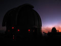
Wait Until Darkby GeneralEComment: It seems pretty dark to me already, probably a little too dark (at least on my screen) as I can see some of the detail in the large Telescope, but not a real lot, and I feel with it being a little lighter this could have been really good. The red lights stand out a little too much at the moment as well. The left compostion does work well, especially with the red of the su n just disappearing on the right.A little longer on the exposure and this could have been very very good. |
| Photographer found comment helpful. |
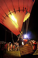
| 10/01/2009 03:41:17 PM |
taking offby bobccComment: An interesting place to photograph. The bright white light thogh draws a lot of attention, an also highlights that most of the light is on the other side of the balloon. Hence it gives a bit of a feel that I am missing something here, that the balloon is covering up the actions from me. I do like the positioning of the basket on the right, and the crop of the balloon, which does help balance the image. |
| Photographer found comment helpful. |
| 09/28/2009 02:35:19 PM |
Deconstructionby vladoComment: Hey Vlado....just got back to the site....Brilliant picture and congrats on the PB.......... |
| Photographer found comment helpful. |
| 08/16/2009 06:45:45 AM |
There and back again by RichterComment: The processing of this shot really suits it, and the title. Well thought through on the overall presentation.........Crop is good, placement of the elements (roadand chair) are great to make the image......... |
| Photographer found comment helpful. |
| 08/16/2009 06:42:11 AM |
"About a Boy" - Nick Hornbyby kolasiComment: This shot for whatever reason seems to work. Normally, I would say to have the space on the side he is looking, but for some reasoin having it this way creates interest. Normally the chords running through would annoy me, but their location and colour for some reason also seems to work...........A well shot and lit image that seems to bend the normal convention in a way that adds interest......... |
| Photographer found comment helpful. |
Home -
Challenges -
Community -
League -
Photos -
Cameras -
Lenses -
Learn -
Help -
Terms of Use -
Privacy -
Top ^
DPChallenge, and website content and design, Copyright © 2001-2025 Challenging Technologies, LLC.
All digital photo copyrights belong to the photographers and may not be used without permission.
Current Server Time: 08/05/2025 06:56:01 AM EDT.