| Image |
Comment |
| 06/12/2006 03:58:42 PM |
|
 Photographer found comment helpful. Photographer found comment helpful. |
| 06/12/2006 03:53:58 PM |
Crevasseby JutildaComment: Beauty! Love the lighting. Nice to see something as mundane as a rip in a leaf transformed to a beautiful piece or artwork. |
| Photographer found comment helpful. |
| 06/12/2006 03:53:02 PM |
|
| Photographer found comment helpful. |
| 06/12/2006 03:51:48 PM |
The Treeby cordeliawlComment: Fun candid moment. Looks like it could use a bit more contrast though. |
| Photographer found comment helpful. |
| 06/12/2006 03:51:15 PM |
A Stella Diveby hotpastaComment: Nice splash image. Water kinda has an unnatural green to it though. How many images did you take to get this one? |
| Photographer found comment helpful. |
| 06/12/2006 03:50:32 PM |
The Ripple...by IreneMComment: Crazy! To catch it just hovering over the surface. Looks like it has eyes too. only improvement I can see is sharpness. |
| Photographer found comment helpful. |
| 06/12/2006 03:49:00 PM |
|
| Photographer found comment helpful. |
| 06/12/2006 03:48:20 PM |
|
| Photographer found comment helpful. |
| 06/12/2006 03:44:38 PM |
|
| Photographer found comment helpful. |
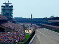
| 06/12/2006 02:27:22 PM |
"Why Don't We Do It In The Road?"by BosborneComment: Greetings from the Critique Club!
Composition: I think the composition of this photo is pretty good. There are only a few improvements that I can see. The biggest thing that I notice (which is actually pretty small) is that I would like to have the enter image shifted up slightly. Then the flags at the top wouldn't be cropped off, and the edge of the crowd at the bottom would be cropped off (so the eye isn't distracted by that small edge). I like how the cars are almost directly on the lower right rule of third intersection point. Did you consider entering a shot from sometime during the race so one could see the race in action? But maybe the lack of them racing fits your title better, I don't know.
Technical: My main complaint on the technical side is that the crowd does look slightly blue. A bit of color balancing would have helped this out. I like the clarity of the image though; almost everything in this image is very visible. The sharpness of the image helps with this as well.
Overall: I don't think the scene is too busy. The starting line is an obvious focal point and the rest of the scene helps move the eye around it. It's true that there are a lot of elements in this photo, but there is also enough dead space to even it out. This image does an excellent job of showing the overall scene. Having the cars in motion may be another interesting element to consider, but still looks good as it is. Message edited by author 2006-06-12 14:30:23. |
| Photographer found comment helpful. |
Home -
Challenges -
Community -
League -
Photos -
Cameras -
Lenses -
Learn -
Help -
Terms of Use -
Privacy -
Top ^
DPChallenge, and website content and design, Copyright © 2001-2025 Challenging Technologies, LLC.
All digital photo copyrights belong to the photographers and may not be used without permission.
Current Server Time: 06/22/2025 05:57:02 PM EDT.