| Image |
Comment |
| 11/18/2003 11:39:24 PM |
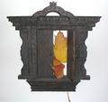
Doorway To No Whereby RoosterComment: Greatings from the Critique CLub
This was one of the more original images submitted for this challenge.
It is a very good concept. Some things I would change are to not have the leaf stick out the bottom.
Create more contrast by using different lighting techniques.
I do like the idea of having this with a high key (all white) background but the main object lacks depth and definition.
It is also not straight in the frame and the background is not even.
I like how the one leaf wraps around the closed door. Your use of limited colour is one of the strong points here.
I hope this helps.
JC
|
 Photographer found comment helpful. Photographer found comment helpful. |
| 11/18/2003 03:47:39 PM |
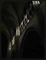
Cemeteryby StevePaxComment: Greetings from the Critique Club,
I was just reviewing what I mentioned during the challenge in my commnet to you.
Looking at this image again, I would say possibley a little lower angle to capture the light rays, but keep it out of the viewers eyes, which is how it feels now.
Can you set the iso on the cd400? If so try going down to 50 to remove some of the grain.
Backlit shots can be very tricky and if you have a camera that does not allow manual adjustments it's going to be a challenge for sure.
You may want to try using a polarizing filter of some sort also. Even if you can't actually attach it to the camera you can hold it in front of the lense, polarized sunglasses work too.
As I said in my previouse comments, this could be a really good image.
I hope this helps.
JC
I would also try different Brightness and Contrast settings if you have the software to do this with. |
| Photographer found comment helpful. |
| 11/17/2003 10:59:56 AM |
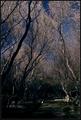
Sacred Groundsby heidaComment: I didn't have time to comment during the challenge. I gave this shot a 7. I love the way you framed the cemetery with the trees forming a vee.
The darkness at ground level really adds a feeling of mystery or being forelorn.
With the bright light on the tree tops, and crisp blue sky to contrast the dark and indistinct base you've created an image that makes one get close to see what else there is.
cheers,
JC |
| Photographer found comment helpful. |
| 11/16/2003 06:39:33 PM |
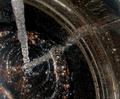
enoughby claudiadfComment: This is a very complex image. I very much like the colours esp.
A different crop to eliminate the right hand 3rd of the picture would remove some non-essential busy-ness.
Also, using a polarizing filter or some how diffusing the light would help not have the glare in the lower left hand corner.
I like this DOF, but would also love to see it shot with others, shallower and broader.
Unfortunately I can't see it as a still life, sorry.
As an artistic attempt very definitely!
I hope this helps.
JC |
| Photographer found comment helpful. |
| 11/16/2003 06:03:08 PM |
Infinite Upward Spiralby ScantyNebulaComment: I struggled to find words for a critique while this challenge was running and failed, now I find myself with your image as my first assignment with the critique club.
so here goes;
I like this image. It has a feeling of movement, the colours work and I like the perspective. I also like your choice of border.
A different crop may help. Cropping some of the nebulous swirls at the bottom and cleaning up the top to make it more distinct would create more drama.
I would crop it just below the pink item and use a clone tool or paintbrush to darken & remove the "noise" at the top right and crisp up the edge.
This is a good abstract effort and I think if you experimented a bit more with increasing the angle to lengthen the object it may produce a more provocative image.
I hope this helps.
JC
|
| Photographer found comment helpful. |
| 11/15/2003 10:58:46 AM |
|
| Photographer found comment helpful. |
| 11/15/2003 10:56:49 AM |
Cemeteryby StevePaxComment: This is one of those images that the viewer must sit with and try and decide if the intent was to have a very soft focus or it was inadvertent. I can't decide even having viewed it a number of times. The light is a good element this could be a really good image with a little more work, I feel. 5 |
| Photographer found comment helpful. |
| 11/15/2003 10:54:23 AM |
Small cemetery in Austrian villageby carinaComment: This is a nicely composed image. I think the use of a polarizing filter would have helped eliminate the glare which distracts from the overall quality. 5 |
| Photographer found comment helpful. |
| 11/15/2003 12:13:37 AM |
|
| Photographer found comment helpful. |
| 11/15/2003 12:12:50 AM |
|
| Photographer found comment helpful. |
Home -
Challenges -
Community -
League -
Photos -
Cameras -
Lenses -
Learn -
Help -
Terms of Use -
Privacy -
Top ^
DPChallenge, and website content and design, Copyright © 2001-2025 Challenging Technologies, LLC.
All digital photo copyrights belong to the photographers and may not be used without permission.
Current Server Time: 09/01/2025 10:23:44 AM EDT.