| Image |
Comment |
| 11/25/2003 05:00:15 PM |
Black & White(thinking) & Red (causes suffering) all overby vrphotosComment: Very good, and so timely. I think this would have been a bit better with out the handle with care,, while I think I understand your reason for including it, it does add one too many elements.
I also might have had all the signs in black and white except for th fragile and background. That would have given a more conitinuous theme. 9 |
 Photographer found comment helpful. Photographer found comment helpful. |
| 11/25/2003 03:08:42 PM |
|
| Photographer found comment helpful. |
| 11/25/2003 12:36:18 PM |
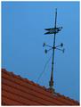
Gone With the Windby GPComment: Greetings from the Critique Club
I think this location has a lot of potential for very good and interesting shots. The textures and perspectives available in this image are very pleasing.
This photo has a few problems. The focus appears soft, and in a shot like this I feel it should be sharper. It appears to be oversharpend, possibley in an attempt to make it more focused?
The wind vane would be better vertical.
It has a bit too much noise. I see it's been suggested you use a program like NeatImage to fix this. You may also try shooting with other ISO's say 50 or 100 if your camera supports that. This would help not have it in the first place. Also did you use a digital zoom feature of this camera? That can cause these problems also.
I do like your comment on your thoughts behind this shot. It fits the subject well.
I hope this is helpful.
JC |
| Photographer found comment helpful. |
| 11/24/2003 08:26:50 PM |
The Color of Moneyby PDavisComment: Greatings from the Critique Club
This is very hard to critique.
Conceptually, it's good. Being american money it doesn't have a lot of colour to work with. Shame you couldn't get ahold of some Euro's!
As far as composition, it just isn't, well, exciting. The lighting is a bit flat. I'm rather at a loss as to what to say to improve it.
I don't know how you would introduce more contrast, which might help, you picked up about as much detail as is possible.
It is an interesting perspective.
I'm sorry I don't have more constructive things to say.
JC |
| Photographer found comment helpful. |
| 11/24/2003 06:18:11 PM |
King Inkby NazgulComment: Greetings from the Critique Club
Great shot. Well, I don't know who this is, and I do have a life but that doesn't really enter into it, does it.
Very nice composition, though I would suggest a bit more space between the feather and bottle. The way they run together is a bit distracting. A little more definition would create more distinct elements.
I particularly like the reflection in the bottle, lower left.
Not quite as tight a crop on the left, a little more breathing room.
I do like the fact that it is not a stark white background. The subtle shades of grey work here. In many shots going for the pure white background it can actually hurt the eyes to look at for to long. Your treament tones it down a bit while still creating the tension a black and white photo produces.
The highlight on the bottle is the one real flaw I would point out. I can understand wanting some reflected light to show the shape, but this is bit too much.
As with all critiques, these are my opinions. I hope they are usefull.
JC |
| Photographer found comment helpful. |
| 11/23/2003 06:01:02 PM |
|
| Photographer found comment helpful. |
| 11/23/2003 05:59:16 PM |
"Put on Your Game Face!"by RiderGalComment: I don't know what that means,, but assume you've depicted it.... The pole coming out of his head is a minor flaw. A bit bright on his nose and forehead. 6 |
| Photographer found comment helpful. |
| 11/23/2003 05:56:54 PM |
|
| Photographer found comment helpful. |
| 11/22/2003 02:28:29 PM |
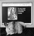
"I do"by AllyrelliaComment: Good idea, cute critter. Personally I don't like screen shot inclusions. Most are too soft on focus. Possibly printing the advert and creating a curved background to wrap around the chinchilla could have elevated this shot. I do like it being black and white. 6 |
| Photographer found comment helpful. |
| 11/22/2003 02:25:35 PM |
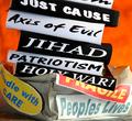
America, 2003by muckpondComment: Yes. I hope you had some vaseline under that duct tape. I like your use of an angled crop to give this more interest. 7 |
| Photographer found comment helpful. |
Home -
Challenges -
Community -
League -
Photos -
Cameras -
Lenses -
Learn -
Help -
Terms of Use -
Privacy -
Top ^
DPChallenge, and website content and design, Copyright © 2001-2025 Challenging Technologies, LLC.
All digital photo copyrights belong to the photographers and may not be used without permission.
Current Server Time: 09/01/2025 11:56:09 AM EDT.