|
|
|
Showing 1591 - 1600 of ~1875 |
| Image |
Comment |
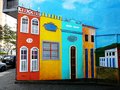
| 08/05/2009 07:20:24 AM | Midas (blue period)by Ecce_SignumComment: It has taken us a scant five years to get to your photo, but at long last the Critique Club has dredged it back up. Being a member has its perks, I guess :)
Your entry was quite fitting for the challenge, with strong leading lines and a menacing façade that stretches off seemingly forever. The centered composition is alright, though I think I would prefer either a symmetrical approach or an uncentered composition. One thing that might have made this quite interesting visually, and likely made it border on an abstraction, would be to have shot the photo in a landscape format and then positioned the tip of the structure at the edge, but uncentered. Not necessarily on the thirds, but just so that it wasn�t centered. This would almost give the impression of a long hallway if you used the white portion for it, and the dark side would have been equally obscure looking.
As others noted, the blue is a bit intense for my taste, as well, and as you noted, you�ve got some aliasing going on there. We�ll blame that on antiquated software compression algorithms ;)
I can�t make up my mind how I feel about the fragment of cloud on the left. It�s interesting in that it seems very much like an element from an impressionist painting due to the way that it is so saturated and distinct, having very little transition of tone. The shape helps this effect too. But then it also seems a bit distracting� but balances out that side, which is lower. Like I said, can�t make up my mind.
As an aside, it�s kinda neat to get such an old image for CC, especially for a still active member. Seeing the evolution is definitely encouraging. It�s also interesting because it really shows how comparatively short a time I�ve spent here.
-Derek
|  Photographer found comment helpful. Photographer found comment helpful. |
| 08/05/2009 04:13:23 AM | | | Photographer found comment helpful. |
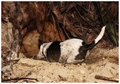
| 08/05/2009 01:23:58 AM | 4-august 09 snapshots. action kateeby rozComment: Sounds exactly like my dog... he will retrieve his tennis ball until he gets heat stroke in the summer if I'm not careful. Doesn't matter where it goes or how much enthusiasm I throw it with. It's fun to capture the glee dogs exhibit. | | Photographer found comment helpful. |
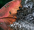
| 08/05/2009 12:17:56 AM | The Divideby aprudhommeComment: I'd have to say this was my favorite from the challenge. The textures and colors really separate this from the pack. Not only is the challenge embodied by the contrast of colors, but also the texture. Great job and congrats on the finish. | | Photographer found comment helpful. |
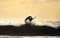
| 07/31/2009 04:51:40 AM | Surferby subject22Comment: Yeah, that's what I was talking about. Your sky is still blown out so you can up your shutter even more if possible. If you've reached the top of your shutter you could stop down a little so you aren't asking your camera for a higher shutter than it can supply to deal with that much light, or decrease ISO.
You could also do spot meter, meter for sky, recompose with AE lock on surfer, shoot. This way you can still pull some texture out of the sky, or capture more of the morning/evening colors. | | Photographer found comment helpful. |
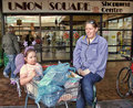
| 07/31/2009 02:20:50 AM | Waitingby in2truthComment: Hahaha. The fairy's expression is priceless. Mum's happy and child is less than pleased. The expressions really do a lot for this. | | Photographer found comment helpful. |
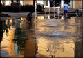
| 07/31/2009 12:52:22 AM | Waterworldby pixelpigComment: We have a fountain sorta like this here in town too, that the kids just love. I like the warm reflected colors in the water. | | Photographer found comment helpful. |
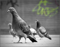
| 07/29/2009 09:32:44 AM | Don't Mess with da Boys!by bobonacusComment: The time has come for your Critique Club comment!
Your subject quite obviously meets the challenge, which is always a nice start. What is really interesting about your shot to me, however, is the selective saturation. Keeping the one bit of graffiti colored draws attention to it very well, but at the same time doesn�t steal the show from the front and center pigeon. Your title really helps to make the photo, which for some voters might be a negative. Having said that, I think your title is great and I really like it. The stance of the pigeons is perfect for this, and the graffiti in the background and street setting really make it look as though they�re trying to be tough. Great use of humor here. I like the offset subject, and the choice for aperture was perfect, keeping the background pigeons and graffiti in sufficient focus to be recognizable but not distracting.
My only issue for this shot is that the focus could have been a bit sharper on the lead bird, there seems to be a small bit of softness on the eyes. Maybe a high pass filter or maybe the noise ninja was a bit overdone?
All in all, good job.
-Derek
| | Photographer found comment helpful. |
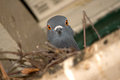
| 07/29/2009 08:57:50 AM | Do I Smell Popcorn?by mgsmith53Comment: Hello and greetings from the Critique Club;
Of course, the first thing that grabs my attention in your photo and what is the focal point, is the bright eyes of the pigeon. The orange and yellow of the eyes have an excellent contrast with the gigantic black pupil. I can only imagine how bright the flash was for the bird! I�m also surprised how serene it still looks despite said flash, but I guess it is a pigeon, after all. You use of flash is pretty good here, and doesn�t seem terribly brutal. You have nice, sharp focus, and your colors are nicely saturated, especially in the case of the eyes, which are further accentuated by the fact that the entire frame is devoid of color, with them being the sole exception.
There are two minor nitpicks that this shot could benefit from, in my opinion though:
First, if you had used a faster lens, the distracting elements of the background�s lines and the sticks of the nest would have been blurred a bit more, bringing an additional focus to the bird (although as things are, they are blurred a decent amount). Secondly, it would have been nice if you had been able to get an angle other than straight up at the bird. This way, you might have been able to use the structure as some nice leading lines into the bird, regardless of whether you went with a centered composition or not. Your title was a good choice as well, adding some humor to the entry.
As your score showed, this was a pretty good entry and I had to pick out some minor things for room to improve.
-Derek
| | Photographer found comment helpful. |
| 07/29/2009 07:58:29 AM | Du Noonby whiteroomComment: This is a really nice entry. I might've liked to see a bit more contrast but that's it. You'll likely get nailed for chopping off the torso but I think that adds to the photo.
I'm guessing this might be a strong contender for a posthumous if this isn't from him. | | Photographer found comment helpful. |
|
Showing 1591 - 1600 of ~1875 |
Home -
Challenges -
Community -
League -
Photos -
Cameras -
Lenses -
Learn -
Help -
Terms of Use -
Privacy -
Top ^
DPChallenge, and website content and design, Copyright © 2001-2025 Challenging Technologies, LLC.
All digital photo copyrights belong to the photographers and may not be used without permission.
Current Server Time: 06/18/2025 07:41:48 PM EDT.
|