|
|
|
Showing 1251 - 1260 of ~1875 |
| Image |
Comment |
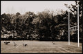
| 05/11/2010 06:58:23 AM | waiting on the benchby RunzamukkComment: Things appear a bit washed out as a whole. Feels like having the bench skewed relative to the viewer may make things feel more dynamic. Perhaps lowering the shooting angle too. |  Photographer found comment helpful. Photographer found comment helpful. |
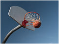
| 05/11/2010 06:54:42 AM | Nothing But Netby EstimatedEyesComment: The amount of blur on this is awkward to me; I'd prefer a higher commitment to blur or sharpness, one or the other. | | Photographer found comment helpful. |
| 05/11/2010 06:52:30 AM | blitzby skewsmeComment: Interesting take on things. I like the departure, and the processing is an interesting choice (mean that in a good way). | | Photographer found comment helpful. |
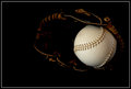
| 05/11/2010 06:51:12 AM | Softball by fotofanComment: I'd like to have a bit more detail to show the shape of the glove; at least maybe a rimlight. | | Photographer found comment helpful. |
| 05/11/2010 06:47:05 AM | Vintage Chanelby Covert_OddityComment: Hello from the Critique Club-
I canΟΔÄôt decide what I think of your take on the challenge. I see the relation between your take (advertising) and the world of fashion. Anybody flipping through a fashion mag knows that 95% of the paper is advertising space, so the two are obviously inextricably linked. But is there a delineation? IΟΔÄôm not really sure, I guess thatΟΔÄôs for the DNMC worriers to worry over.
You have very successfully created a nice advertising type image, regardless of which users find it to relate to the challenge. I enjoy your subdued approach, and your positioning is very nice and directed. It would have been nice to get the Paris to reflect fully as well, but raising the positioning a bit, but thatΟΔÄôs a minor thing. Same thing with maintaining symmetry in the front of the right shoe and the background on the right as well. IΟΔÄôm not really sure what it is, but something about the look of the ΟΔÄ€antique toneΟΔÄù for lack of a better term makes the pure black portions of the background seem to have a violet tint. I donΟΔÄôt actually think its that color, but the contrast of the two colors fools the eye.
Nice entry, all nitpicks aside.
| | Photographer found comment helpful. |
| 05/11/2010 06:30:08 AM | Asian Modelby amateurboiComment: Hello from the Critique Club-
I am a fan of your composition- I really like how the viewer focuses on her eye first, then directs their attention up the shaft of the umbrella to where she is looking. The only issue, however, is that it feels like I should be looking at the umbrella, but it isnΟΔÄôt really the focus of the shot. In fact, IΟΔÄôm left wondering what exactly is the focal point. Fashion typically wants you to focus on specific items that are being displayed, either that or the model themselves. While I think your composition here was pleasing, I donΟΔÄôt find that it fits with the subject matter of the challenge. There are some background elements that distract slightly, but I feel like the lack of a clear focus is more of an issue. YouΟΔÄôve got some orange leaking into the sky in the top left, and IΟΔÄôm not too sure what that is, as it should presumably be pure white. This photo works quite well as a candid portrait. I just feel like this was the wrong challenge for it. The gray portion of the border is a little too similar to the hues of the photo as well. IΟΔÄôd prefer something a bit more sharply contrasting.
| | Photographer found comment helpful. |
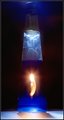
| 05/11/2010 06:07:09 AM | Fire Waterby ManicComment: Hey there, looks like I got another one of yours :)
As noted, I like the idea of your subject. With some more careful execution, and some alterations to your props, I think you could make this pretty interesting. Couple comments on the props first- the label is definitely distracting, as is the blemish on the glass. IΟΔÄôd consider using a bottle that the viewer will most definitely associate with booze and readily recognize. I would keep the brand label on it, and position the bottle such that you can read the label but that you can also see inside the bottle. A silver tequila would work well for this, but a colored alcohol would work fine too. Next, IΟΔÄôd choose a bit of fire that is more fitting of the subject matter. A birthday candle just doesnΟΔÄôt quite mesh with firewater to me, so IΟΔÄôd recommend making one of these . IΟΔÄôd then make two separate setups and swivel the camera on my tripod from one to the other- the first one be the flame, which I would use a slotted piece of black tagboard to simulate a fast shutter speed for to capture, then hold the tagboard in front of the lens, rotate the camera, then expose for the bottle and fire flashes. The reason I would do a dual setup is to avoid light contamination from the candle on the table and make setups more consistent. I quite like your lighting from the top though, itΟΔÄôs a very nice touch. ItΟΔÄôs a pain trying to keep glare down on curved surfaces, especially in basic, so IΟΔÄôm not really sure what to suggest other than moving your lighting source further away to decrease the relative size of your specular highlights. Message edited by author 2010-05-11 06:15:44. | | Photographer found comment helpful. |
| 05/11/2010 05:44:33 AM | autumn collectionby slingramComment: Hello and greetings from the Critique Club-
Upon first glance at your photo, IΟΔÄôm struck by the nice combination of the red hues with the dead leaves. They actually go quite nice together I think, and the metal grate provides some nice detail and additional interest. Your exposure is great, with nice saturation and tonality. Detail is great as well, and I think your choice for depth of field works well given the subject matter. I think that your composition is a bit awkward though- another user noted the leaf being in the way, and I agree with this statement. The manner that youΟΔÄôve chosen to portray things lends me to believe youΟΔÄôre really trying to showcase the shoes themselves, so you donΟΔÄôt want things to detract from that. The composition, as well, does this to an extent too. I donΟΔÄôt think both shoes necessarily need to be in frame, but certainly think that one of them should be completely showcased. The photo itself is very still-lifeΟΔÄôish, which isnΟΔÄôt generally a genre of photography IΟΔÄôd associate with fashion. Definitely reminiscent of a ordering catalog shot, but not quite "fashion," if you get my drift. Not quite an advertisement and not fashion-showy either. You may have gotten some vote lowering due to that, but itΟΔÄôs obviously a subjective issue. One last thing- I donΟΔÄôt see any issue caused by it, but getting in the habit of lowering ISO as much as possible is a good practice to get into, and you had some leeway on this one. Overall, a good entry and a good start. Message edited by author 2010-05-11 06:34:41. | | Photographer found comment helpful. |
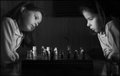
| 05/11/2010 05:32:37 AM | Boring - I know your every moveby AbraComment: Hello, and greetings from the Critique Club.
I think youΟΔÄôve come up with a good idea for this challenge. It is a good idea for the challenge, especially with such a quick capture. Some things that I think could help things- IΟΔÄôll agree with what the comments say. I think a large reason your score suffered was the fact that both sides have some ghosting going on, so your subjects donΟΔÄôt appear to be legitimately there, which is a definite part of a great shot in this genre. It is also noted that a darker background benefits these shots, which I also agree with because it helps to separate your subjects and decrease and ghost effect you may get- itΟΔÄôs the texture on the wall behind that really makes this look ghosty. The scene itself is lacking a bit contrast and is a bit dark. Your white pieces are not quite white enough and a large portion of your tones drop down into the lower zones with very little detail. Some technical notes- somebody commented on the sharpness of the photo, which does seem a bit soft. You might consider not shooting at quite a small aperture. After a certain point (generally somewhere in the f/16 range) you begin to experience diffraction and your sharpness will actually start to decrease across the entire depth of field. I would also recommend you drop your iso down to base, since noise quickly becomes an issue in longer exposures (not necessarily an issue here, but a general note). To compensate for this, you will obviously have to decrease your shutter speed a bit to keep the ambient knocked down. By doing this, you will also strengthen the double exposure effect and prevent ghosting some. To further the effect, increase the power of your flashes as well. Though this will increase the amount of time for the flash duration (assuming youΟΔÄôre using a speedlight, itΟΔÄôs reversed if youΟΔÄôre using monoblocs), it should not be to the point that it has an effect since youΟΔÄôre dealing with slow moving subject matter. I like your composition, but would maybe back things out a bit more, as it feels a little bit cramped to me. The posing seems very natural, as well.
| | Photographer found comment helpful. |
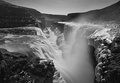
| 05/09/2010 07:15:05 PM | Powerby BrinComment: Hello from the Critique Club;
Upon seeing your photo, IΟΔÄôm amazed at how up and in your face the action is. The water careening off the edge, and the mist flowing around- it really brings the viewer into the scene. This effect is increased by your placement of the river itself, and how it trails off into the distance. I like the lack of clouds, as well as the interesting ice formations all along the rocks. The texture is really what makes this photo interesting to look at.
I think perhaps there is a bit much mist, and that itΟΔÄôs somewhat decreasing the clarity and contrast of the scene. One thing, and IΟΔÄôm not sure it would have been possible, would have been to make the point of view slightly lower and to the right so that rock isnΟΔÄôt in the foreground, and the water takes precedence. Otherwise, I very much like the scene and the composition. The way the canyon curves down into the distance from the top corners is very nice.
| | Photographer found comment helpful. |
|
Showing 1251 - 1260 of ~1875 |
Home -
Challenges -
Community -
League -
Photos -
Cameras -
Lenses -
Learn -
Help -
Terms of Use -
Privacy -
Top ^
DPChallenge, and website content and design, Copyright © 2001-2025 Challenging Technologies, LLC.
All digital photo copyrights belong to the photographers and may not be used without permission.
Current Server Time: 06/21/2025 05:51:05 PM EDT.
|