| Image |
Comment |
| 06/19/2003 08:38:11 AM |
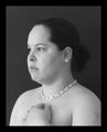
Self Portrait #4by jillzComment: A lovely, classic black and white. This is what a portrait should be. IMHO, of course. |
 Photographer found comment helpful. Photographer found comment helpful. |
| 06/19/2003 08:28:05 AM |
Meby nathaliedooComment: I would like this more if it your face was just a tad bit brighter. You get lost in the shadows. But I like the close-up framing and your hand on your forehead is a nice touch. |
| Photographer found comment helpful. |
| 06/19/2003 08:27:03 AM |
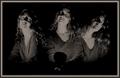
Me Myself and Iby grigrigirlComment: This is one of my favorites. I think it's because of the concept, but also the lighting you used. It reminds me of a silent-movie startlette. Could have been centered just a little bit more. There seems to be a bit more space on the left than the right and in a composition shot like this, it's symmetry is important. |
| Photographer found comment helpful. |
| 06/19/2003 08:20:46 AM |
Kiss me!by sylkComment: I know you were going for humor, but had you chosen to make this just a classic portrait, it would have been even better. I love your framing and the lighting. It highlights your hair and the way your bangs fall across your face exposing only one eye is very attractive. Speaking of your eye, you beautifully captured the color. |
| Photographer found comment helpful. |
| 06/19/2003 08:04:56 AM |
|
| Photographer found comment helpful. |
| 06/19/2003 08:03:23 AM |
|
| Photographer found comment helpful. |
| 06/19/2003 07:59:38 AM |
Juneisyby ChiquiComment: A classic look. When I saw this, I immediately thought of the commissioned paintings of royalty you might see over the fireplace in some elite home. I'm torn on whether I find the softness of the focus a distraction or whether it evokes a romantic feel. Remember the old-time movies when the close-ups of the starlette were slightly out of focus? That's what this looks like and it's not altogether a bad technique. |
| Photographer found comment helpful. |
| 06/19/2003 07:52:48 AM |
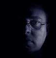
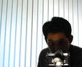
Through the Looking Glassby FiverComment: Though it is apparent that you intended to keep yourself in shadow, this seems to be more of a portrait of your camera than of you. |
| Photographer found comment helpful. |
| 06/19/2003 07:51:05 AM |
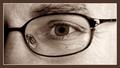
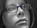
Aprilby AprilTheatreGeekComment: Looking through the thumbnail gallery, this shot captured my attention. I like the lighting and the close-up and the thoughtful look of your expression. I wish you had been able to reduce a little more of the glare on your glasses so we could see your eyes better. |
| Photographer found comment helpful. |
| 06/19/2003 07:48:20 AM |
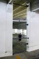
Splitby lionelmComment: This may be a photo of you, but to me, it doesn't really fit the definition of a portrait. Even if I weren't considering that in my rating, the picture as a whole doesn't do much for me. It seems out of focus and since the focal point (you) is so small, dark and undefined, there's not much to look at. |
| Photographer found comment helpful. |
Home -
Challenges -
Community -
League -
Photos -
Cameras -
Lenses -
Learn -
Help -
Terms of Use -
Privacy -
Top ^
DPChallenge, and website content and design, Copyright © 2001-2025 Challenging Technologies, LLC.
All digital photo copyrights belong to the photographers and may not be used without permission.
Current Server Time: 08/04/2025 04:44:19 PM EDT.