| Author | Thread |
|
|
07/07/2003 10:27:43 AM |
On behalf of the critique club....
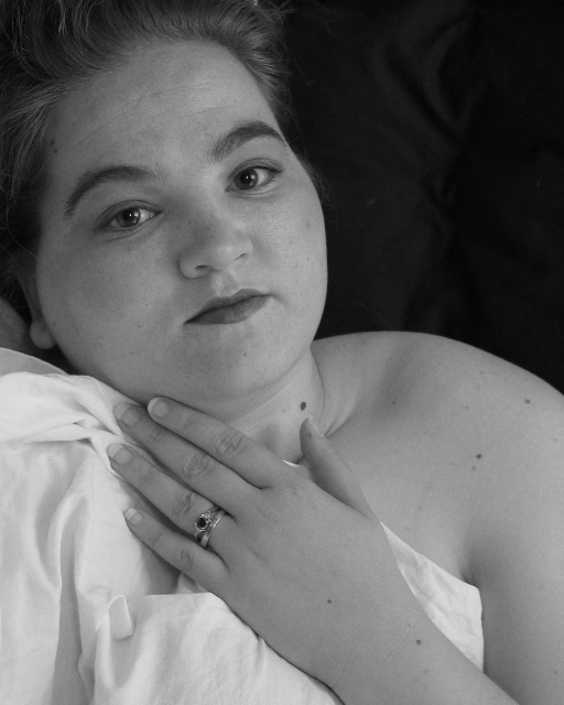
It is a very nice composition, your pose and use of black and white compliment this photo nicely.
There is a bit of softness in this photo, and it can be easily corrected with the use of an unsharpening mask, as it is mainly only around the eyes.
Your lighting works well with this photo as does the overall dof. This definately fits the self portrait challenge. Nicely done and hope to see more in future challenges.
Anna |
|
 Photographer found comment helpful. Photographer found comment helpful. |
|
|
06/25/2003 03:03:34 PM |
Just wanted to say thanks for all of the comments regarding my self-portrait. I'm proud of it, it's the first one I've ever done and one of the only pictures of myself that I like :)
I was surprised that there were so many black and white self portraits and such serious faces. I will definitely try some more but with more emotion on my face. The emotionally charged ones were my highest rated shots. |
|
Comments Made During the Challenge  |
|
|
06/24/2003 04:55:40 AM |
|
Interesting use of dark background and light foreground :) I like it! |
|
| Photographer found comment helpful. |
|
|
06/20/2003 08:48:19 PM |
|
I like the contrast of the white in the lower-right and the black in the upper-left. Feels like it might be a tiny bit too muted -- more contrast? |
|
| Photographer found comment helpful. |
|
|
06/20/2003 08:54:30 AM |
a bit soft for my taste (I like white to be white and black to be black) but with a bit of level tweeking it woudl be a 8-10
|
|
| Photographer found comment helpful. |
|
|
06/20/2003 08:28:05 AM |
|
Very nice photo. I like how clear and clean it looks. Great pose! Good luck! |
|
| Photographer found comment helpful. |
|
|
06/20/2003 06:01:41 AM |
|
I really like the sensuous feel of this image and the fact that it includes the wedding bands. The sheet is an integral part of the content though I think the lighting on it isn't quite right - it makes your skin tones look slightly too grey in comparison, I think it would possibly work better in colour with beautiful skin tones against the clean white sheet. I like the area of black at top right. I think expression looks like you're a little uncomfortable, though I appreciate it's not hard to look relaxed in such a situation! |
|
| Photographer found comment helpful. |
|
|
06/20/2003 12:33:45 AM |
|
Pretty good shot but it needs a little more contrast I think. Try using Levels to increase the intensity of the "midtones". |
|
| Photographer found comment helpful. |
|
|
06/19/2003 03:24:21 PM |
|
Super use of light and compositon to capture your lovely self! Nice work all around. |
|
| Photographer found comment helpful. |
|
|
06/19/2003 12:44:50 PM |
|
I like this photograph very much. The focus, and the lighting are beautiful. I am not sure I like the crumpled up sheet in front of you. A very honest portrait. |
|
| Photographer found comment helpful. |
|
|
06/19/2003 10:31:54 AM |
|
this is very sweet, i like it... 7. |
|
| Photographer found comment helpful. |
|
|
06/19/2003 08:38:11 AM |
|
A lovely, classic black and white. This is what a portrait should be. IMHO, of course. |
|
| Photographer found comment helpful. |
|
|
06/18/2003 07:31:09 PM |
I think a portrait should reveal some character, or emotion of the model, by showing expression in eyes or other facial features. Did your picture accomplish that? Yes!!
artistic/creativity? Fairly
Technical? Fine focus and exposure
Overall? Nice shot Good luck! |
|
| Photographer found comment helpful. |
|
|
06/18/2003 03:05:28 PM |
Unassuming, reasonable straigthforward approach, b & w the appropiate choice for this 'true' capture. The composition (emphasizing face and hand) is both simple and sensitive.
My compliments. > 6 |
|
| Photographer found comment helpful. |
|
|
06/18/2003 02:49:33 PM |
Hello,
Nice B/W shot. It looks like you are laying down and the photo is turned 90 deg. I like the reflections in you eyes. I think more contrast (more shadows) might have drawn out more detail and therefore more interest in this photo, because it seems a little flat (I'm not sure that the right term). |
|
| Photographer found comment helpful. |
|
|
06/18/2003 02:39:28 PM |
|
Nice composition but it needs more contrast. |
|
| Photographer found comment helpful. |
|
|
06/18/2003 02:22:59 PM |
|
Its nice shot but a little too gray needs more contrast |
|
| Photographer found comment helpful. |
|
|
06/18/2003 01:30:48 AM |
|
A beautiful self portrait shot. I can see that the B&W works really well here. I also like the way your hand is crossing over like that. Lovely job and GL in this weeks challenge. |
|
| Photographer found comment helpful. |
|
|
06/18/2003 12:08:55 AM |
#4? I missed 1-3 I guess.....lol
Nice job with the lighting and focus. |
|
| Photographer found comment helpful. |
Home -
Challenges -
Community -
League -
Photos -
Cameras -
Lenses -
Learn -
Help -
Terms of Use -
Privacy -
Top ^
DPChallenge, and website content and design, Copyright © 2001-2026 Challenging Technologies, LLC.
All digital photo copyrights belong to the photographers and may not be used without permission.
Current Server Time: 06/27/2026 08:36:09 PM EDT.