| Image |
Comment |
| 09/05/2003 09:46:45 AM |
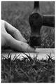
Honey! I can explain!!! by kosmikkreeperComment: This is my favorite of the challenge. I love everything about it from the humor of the theme to those excellent expressions on your models' faces. The lighting is nice as it comes in from the left like the light from a bedside table and I like that you used black and white. Just great. Good luck! |
 Photographer found comment helpful. Photographer found comment helpful. |
| 09/05/2003 09:29:48 AM |
Oops.....I Did it AGAIN!by NazgulComment: This is good...I wonder what it would look like in black and white. Could be a little more eye-catching even. |
| Photographer found comment helpful. |
| 09/04/2003 12:12:07 PM |
|
| Photographer found comment helpful. |
| 08/27/2003 02:07:30 PM |
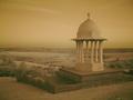
The Chattriby robsmithComment: This is a beautifully captured image of this monument. I like brown and gold tones and the softness of the contrasts. I can easily picture this enlarged and framed, hanging on the wall of an executive office or dining room. I hope I remember to come back and and this to my favorites after the challenge because it certainly is. |
| Photographer found comment helpful. |
| 08/27/2003 01:58:24 PM |
A Nightlight for the Seaby byetkoComment: I like this very much. The contrast of the lighthouse against the sky is quite striking and I think placing it off to one side was perfect. I looks a little tilted to the left but I think that may be an illusion caused by the shape of the building, since the steps seem to be level with the bottom of the photo. Weird effect. Anyway, this is one of my favorites of the challenge. |
| Photographer found comment helpful. |
| 08/19/2003 10:52:00 AM |
Surrounded by Blueby alanfreedComment: This is great! I love the blueness of the water and the expression on his face is perfectly captured. Just a terrific shot! |
| Photographer found comment helpful. |
| 08/18/2003 03:18:08 PM |
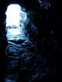
Light At The End Of The Tunnelby JaxsonComment: Great title for this shot. I like that you can see just the slightest reflection of the water within the blackness leading to the cave opening. I think a sharper focus would enhance the image a little since there seems to be so much wonderful detail in the stone. The brightness of the sun also seems to wash out some of those details. Otherwise, I think this is a nice contribution to the challenge. |
| Photographer found comment helpful. |
| 08/18/2003 03:10:57 PM |
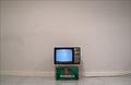
The Essentialsby jgal76Comment: This is one of the most clever shots of the challenge. Perfect use of negative space to emphasize your idea. I keep looking at that cable running across the floor and I can't decide whether I like it or if it would be better if it weren't there, but since it obviously had to be there to get the TV turned on, I reckon I like it just fine. I'm glad you left the "snow" on the screen rather than taking a picture of a football game or something. The blue screen adds the right amount of color to the otherwise dullness of the tones, again emphasizing your theme. |
| Photographer found comment helpful. |
| 08/18/2003 08:43:55 AM |
illuminant shroudby grigrigirlComment: Beautifully artistic. The lighting is perfect and the shroud adds a wonderful softness to her form. This is a terrific example of not only negative space but of nude photography. |
| Photographer found comment helpful. |
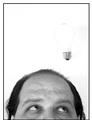
| 08/18/2003 08:38:30 AM |
Not a Bright Ideaby moodvilleComment: I like this shot a lot but the lightbulb, unfortunately, gets lost in the white background. Wouldn't it be fun if it was yellow? Also, the focus on your subject seems just a little soft. For this photo, I think the crisper the better. Very humorous and original though. |
| Photographer found comment helpful. |
Home -
Challenges -
Community -
League -
Photos -
Cameras -
Lenses -
Learn -
Help -
Terms of Use -
Privacy -
Top ^
DPChallenge, and website content and design, Copyright © 2001-2025 Challenging Technologies, LLC.
All digital photo copyrights belong to the photographers and may not be used without permission.
Current Server Time: 08/04/2025 07:33:37 PM EDT.