| Image |
Comment |
| 04/25/2005 01:50:46 PM |
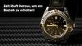
Zeit läuft ausby Art RoflmaoComment: Composition: Excelletn
Lighting: Very nice!
Color: excellent
Clarity: excellent
Lettering: would like to see the Boctok lettering used if possible, but this is good
|
 Photographer found comment helpful. Photographer found comment helpful. |
| 04/25/2005 01:47:42 PM |
Writing a Love Poemby admart01Comment: Composition: Excelletn!!
Lighting: would like to see this lit a little better, the diamond looks white instead of sparkly and clear
Color: good
Clarity: extremely clear!!
Lettering: fits advert extremely well |
| Photographer found comment helpful. |
| 04/25/2005 01:42:43 PM |
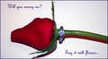
Diamonds are Foreverby slingshotComment: Composition: ok... the rose needs tobe turned to a nicer side
Lighting: too stark
Color: nice
Clarity: stone in itself looks out of focus, this may be because of the lighting tho?
Lettering: verynice font used |
| Photographer found comment helpful. |
| 04/25/2005 01:40:41 PM |
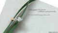
Natural Jewelryby RissaComment: Composition: excellent
Lighting: too harsh
Color: color is nice on rocks and leaf washed out on metal and stones
Clarity: excellent
Lettering: you left room for any advertising that needs to be added to picture |
| Photographer found comment helpful. |
| 04/25/2005 01:38:45 PM |
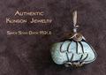
Gorcon's Fine Jewelryby Dr.ConfuserComment: Composition: Excellent
Lighting: a little glare on metal but not overly so
Color: excellent
Clarity:excellent
Lettering: Fits add perfectly |
| Photographer found comment helpful. |
| 04/25/2005 12:16:08 PM |
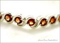
Garnet Tennis Braceletby shutterflyComment: Composition: Very nice
Lighting: Too harsh
Color: Color is off. Garnets unless noted are a deep red not an orangy red color
Clarity: fair, The silver is blending into the background, this is an advertisemetn for this and should be showing off the pattern of the metal along with the stone. The two stones that are in focus show off their faciting very well
Lettering: a bit small, but extremely tasteful and in harmony with the bracelet |
| Photographer found comment helpful. |
| 04/25/2005 12:12:52 PM |
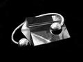
New Age Braceletsby WildpurpleComment: Composition: Good
Lighting: Good
Color: Good
Clarity: this is an advertisement for the jewelry and in my opinion the bracelet should be all in focus.
Lettering: Nice and ample room for advertisement wording |
| Photographer found comment helpful. |
| 04/25/2005 12:11:27 PM |
Diamonds Are A Girl's Best Friendby DeniseBernadetteComment: Composition: for advertising purposes I find the composition poor (sorry)
Lighting: lighting on the jewelry is poor, the diamonds look white and the setting looks dirty
Color: too red in areas that are not the jewelry, verywhite on jewelry
Clarity: good
Lettering: has no space for advertising other than the little girls face or hand |
| Photographer found comment helpful. |
| 04/25/2005 12:08:49 PM |
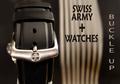
Swiss Army Watchesby TommyMoe21Comment: Composition: Good
Lighting: looks very nice
Color: very nice
Clarity: extremely
Lettering: the two different fonts are distracting. I like the use of the swiss army + in the wording. |
| Photographer found comment helpful. |
| 04/25/2005 12:06:15 PM |
Silver Heart Earringsby postoakinversionComment: Composition: I see the focus on the models eyes not on the jewelry
Lighting: lightign is ok, its too harsh on the earring IMHO
Color: verynice
Clarity: not clear enough on the jewelry
Lettering: I cannot see where any lettering could be placed on this for advertising purposes. |
| Photographer found comment helpful. |
Home -
Challenges -
Community -
League -
Photos -
Cameras -
Lenses -
Learn -
Help -
Terms of Use -
Privacy -
Top ^
DPChallenge, and website content and design, Copyright © 2001-2025 Challenging Technologies, LLC.
All digital photo copyrights belong to the photographers and may not be used without permission.
Current Server Time: 07/31/2025 12:07:08 PM EDT.