Fantasiaby
shabbychicComment: ***Greetings from the critique club***
(this section is written prior to reading the existing comments...)
This is a tough one. I'm not immediately drawn to this photo, so my task it to explain why.
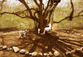
The photo is technically very well done. You have achieved a wonderful softness in the back that matches the mood of your title perfectly. I must confess that I'm not very familiar with the Disney Fantasia, although I've come across a great many renaissance ones in my time. For this analysis, therefore, I'll have to look at the elements in your frame to get the meaning. What I see immediately is a woman on a swing which is flower-garland decorated. Some garland leaves have fallen, or are sprinkled, around the swing. The swing and the attached tree are surrounded by a circle of stones. There is a dalmation inside the ring. A winged angel is placed against the tree. It is small.
The title of fantasia resonates in the woman's head. Inside this stone ring, she is no longer grown up. She is transported back to her childhood. Maybe the dog is now dead, a childhood pet forever loved. The tree deserves some mention. Its majesty and strength may symbolise the saftey found within the circle, or it might relate to a particular place the swing was in, or both. The expression on the face is hard to make out, but it doesn't appear troubled (unlike the dog's). The pure white dress helps emphasise the purity of the girl, or it could represent some religious meaning. The angel also may be read in two ways: the obvious relgious overtone, or in the sense of 'daddy's little angel'. Being a fantasia for one's youth, the latter interpretation feels more secure.
(You can tell that I'm trying to make sense of the elements of this photo.)
There are other elements which bear more on photographic and artistic choice than on intellectual placing of ideas within a frame.
The first of these is the colour scheme. Browns dominate the lower section and greens the upper. Neither colour class are presented aggressively. At the very top of the frame, a blue white section appears. This white motive reappears in the dalmation, in the stones and in the dress. The colour scheme is developed convincingly in the composition. The split between the green and the brown area is roughly at the mid-point, with the brown being extended into the green linking the two areas. The long branches just into the green tie the lower brown into both the top and to the frame border. The white permeates both main colour areas and provides its own strong graphic content.
The second element is the actual composition of the elements. The mid-point split has already been mentioned. The tree springs from the centre upwards and outwards. The woman is more or less in the centre. Between her and the dog is the angel. I can't make sense of the placing of these latter two elements. The stone circle dominates the foreground.
So far, I've only tried to describe what I actually see in the photo, not what I feel about it. The over-riding feeling I get when I look at it again and again is that I *should* be impressed by the intelligence and complexity of the shot. There are two reasons why I don't. The first is technical, and the second personal.
Technically, I find the shot messy. I could be wrong, but the blurring on the shrubs on the left is stronger than that on the right. At the same focal distance, the detail in both sides should be the same. It's not. The same blurring problem (as I label it) affects the overhanging branch in the top right section. The dog's tail joins with the stone ring, blurring the distinction between the two. The swinging girl isn't clearly distinguished from the tree which muddies the sensation of what is really the subject. (If this is deliberate, please forgive me: there is the exact same loss of distinction between the left foot of the woman and the angel.) The garland-decorated swing is partially lost.
However, the most messy aspect of the shot is the feeling that the concept is messy. Fair enough, it's valid to just put together a collection of elements of the perfect childhood, you might say. But that collection itself comes across as messy. To be frank, I'd like either a) much more, far more items for a pot-pourri, or b) a focussed shot on a particular aspect of the fantasia. This shot gives me neither. Too much might ruin a photo, but not enough weakens it. Choose your argument.
A minor point on paper, but large in practice, is the messiness of the colour scheme. It has been orchestrated very well, but the actual choice of hues, I feel, is weak. This leads to my second, more personal, point.
I'm not a woman. (You'll see that in my profile page.) I don't relate well to female images of femininity. I can understand them, I believe. But the colour choices of, say, my wife, leave me cold. I'm not religious at all. When I see religious iconography, I'm unsure as to what to think about the owner. There are so many reasons for religion that I'm unwilling to arbitarily assign one to an image I may encounter. For these two reasons, I suppose, this photo does not attract me. But hey, we're all different. Now, I'm going to read the comments left on this photo and see if I can add anything...
Just one point: I thought that the swing should be moving at first, but after consideration, realised that contemplation usually occurs quietly. Then I understood that this scene is reflective, looking back, not a reconstruction of what actually had happened. Unmoving swing, as you have it, is better.
My final comments are just random thoughts that occurred to me during this cc process.
1. I really like your thought process as it shows itself in this photo.
2. Have all the actors in unison unless you have a reason not to. The woman looks up, the dog and the statue don't.
3. The elements are challenging. Why isn't the composition?
4. The sky looks unintentional.
5. I'd have preferred the garland to be very different from the backing tree.
6. I wish that there had been a visual clue to how the elements relate within the frame. I suppose that this is my biggest quandary. On this note, I'll stop.
If you have any comments on my comments, please feel to chew the cud.
Best wishes,
Jim
Message edited by author 2006-02-04 02:47:42.