| Image |
Comment |
| 05/17/2005 09:36:49 AM |
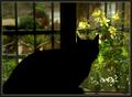
Going Downby Toniann220Comment: I wonder if the intention here wouldn't have been better supported by a tigher crop and a portrait format? 5 |
 Photographer found comment helpful. Photographer found comment helpful. |
| 05/17/2005 09:35:47 AM |
Calienteby KevinRiggsComment: This is one image I would far rather see unsilhouetted! Still, you've forced me to use my imagination. (Which I'm doing now.................) 8 |
| Photographer found comment helpful. |
| 05/17/2005 09:28:41 AM |
Fisherman at Dawn — Red River Beachby Bear_MusicComment: My only question is: 1/ how would this have worked if the fisherman had been used to connect the sea with the sky? I'm not fond of this border. Otherwise, a lovely image. 8 |
| Photographer found comment helpful. |
| 05/17/2005 09:26:09 AM |
Americas Templesby chaddybonesComment: If you'd have placed the sun directly behind the buildings, would their outline have been sharper? That certainly would have avoided the unhelpful white blob. The black silhouette on the left doesn't help that much, either. But, beyond these quibbles, this is a potentially very good image. I like the attempt at combining motifs rather than just shoot a straightforward subject. 7 |
| Photographer found comment helpful. |
| 05/17/2005 09:22:50 AM |
Engagedby cabaComment: This image is so nearly perfect. The warmth and romanticism are shown so well in the background. My feeling is that the faces needed to be a little more distinct (by being closer to the centre of the frame?) and the glasses far more so. 7 |
| Photographer found comment helpful. |
| 05/17/2005 09:20:47 AM |
|
| Photographer found comment helpful. |
| 05/17/2005 09:18:30 AM |
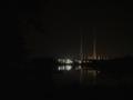
Silhouetted by Powerby lilnukeeComment: It seems to be that you've inverted the challenge theme - the main subject is far brighter than all but the lighted section. 3 |
| Photographer found comment helpful. |
| 05/17/2005 09:17:06 AM |
|
| Photographer found comment helpful. |
| 05/17/2005 09:15:57 AM |
Photographers at dawnby allankentComment: Oh - nice. I can just see this gracing a book cover perfectly. I really like the tonal range here, as well as the composition and combined ideas. Lovely stuff. 10 |
| Photographer found comment helpful. |
| 05/17/2005 09:14:46 AM |
Father and Sonby twm122Comment: This lovely idea suffers from too much extraneous background spoilers. Also, there seems to be too much bottom. 4 |
| Photographer found comment helpful. |
Home -
Challenges -
Community -
League -
Photos -
Cameras -
Lenses -
Learn -
Help -
Terms of Use -
Privacy -
Top ^
DPChallenge, and website content and design, Copyright © 2001-2025 Challenging Technologies, LLC.
All digital photo copyrights belong to the photographers and may not be used without permission.
Current Server Time: 08/02/2025 12:08:56 AM EDT.