| Image |
Comment |
| 04/29/2008 01:49:49 AM |
|
 Photographer found comment helpful. Photographer found comment helpful. |
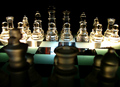
| 04/29/2008 01:48:09 AM |
Light vs. Dark - An Epic Battle by fldaveComment: I really like the DOF with the blurred foreground and sharp background. The lighting is overall good, however it would be better if the top of the background king was better lit. The reflections on the chess board are distracting, looks like they could have been avoided by making your light source bigger, either by a large diffusion sheet or by moving the light closer. |
| Photographer found comment helpful. |
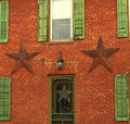
| 04/29/2008 01:24:16 AM |
Only the Best People Live at Even Numbers!by friartuckComment: What are the black/white/brown columns on the sides of the photo? Is that part of the architecture? They are very distracting.
I know you don't have any control over it but the off-center light above the door looks strange to me. |
| Photographer found comment helpful. |
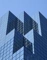
| 04/29/2008 01:13:57 AM |
Reflections on Blue Glass Symmetries by rhadshawComment: My initial reaction to the photo was that it is technically very nice but not very interesting. Coming back to it later it grabbed me a little more and the more I look at it the more I like it. |
| Photographer found comment helpful. |
| 04/29/2008 01:12:13 AM |
10 points of focusby cireComment: The image looks a little soft to me. Especially the window and upper shutters. |
| Photographer found comment helpful. |
| 04/29/2008 01:07:56 AM |
Two lumps of sugar please!by love32907Comment: The whole photo is OOF and the lighting is a little harsh. Because of the bright lighting it's difficult to see much definition in the sugar cubes. |
| Photographer found comment helpful. |
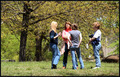
| 04/29/2008 01:06:28 AM |
Four ladies chattingby TammerComment: This looks snapshot-ish. It might look a little better with a tighter crop but even then since you are really only seeing one face full on and a little side view on 2 others I'm not sure it would make it more interesting. |
| Photographer found comment helpful. |
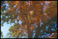
| 04/27/2008 03:25:42 AM |
Reflectionsby EstimatedEyesComment: This is a good example of the photo changing once you know what you are looking at. When I first looked at it I just saw a bunch of random colors and patterns. I could identify the tree but couldn't figure out what all the brown part was. I didn't like it at all.
I then read the description and suddenly I could see what it was and now I really like it. |
| Photographer found comment helpful. |
| 04/25/2008 03:28:48 PM |
|
| Photographer found comment helpful. |
| 04/23/2008 09:56:27 PM |
one sunby whiterookComment: Nice color, would have been better if the horizon was not tilted. |
| Photographer found comment helpful. |
Home -
Challenges -
Community -
League -
Photos -
Cameras -
Lenses -
Learn -
Help -
Terms of Use -
Privacy -
Top ^
DPChallenge, and website content and design, Copyright © 2001-2025 Challenging Technologies, LLC.
All digital photo copyrights belong to the photographers and may not be used without permission.
Current Server Time: 08/20/2025 06:16:23 AM EDT.