| Author | Thread |
Comments Made During the Challenge  |
|
|
04/29/2008 08:22:53 PM |
|
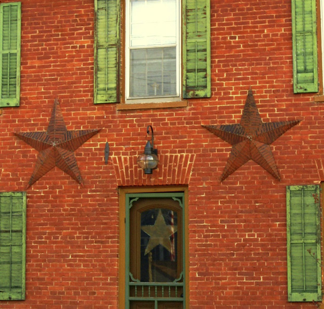
good composition, but the colors all seem to bleed into another. |
|
 Photographer found comment helpful. Photographer found comment helpful. |
|
|
04/29/2008 02:54:28 AM |
|
like subject and framing of shot, maybe sharper? |
|
| Photographer found comment helpful. |
|
|
04/29/2008 01:12:13 AM |
|
The image looks a little soft to me. Especially the window and upper shutters. |
|
| Photographer found comment helpful. |
|
|
04/28/2008 03:08:45 PM |
|
I think this would be better if the picture was taken square to the building - it look like its at an angle. |
|
| Photographer found comment helpful. |
|
|
04/26/2008 08:17:46 AM |
|
Great symmetry to this building, and I like the contrasting colors. It seems like this was taken from slightly off center, and that makes the center door/window frames just slightly off. I would have tried to shoot this as straight on as possible, while watching the reflection in the door. Also, a bit of a crop to the right to even up the shutters with the left would have made this even MORE even! Nice shot! |
|
| Photographer found comment helpful. |
|
|
04/24/2008 11:14:14 PM |
|
the opposite colors are great together |
|
| Photographer found comment helpful. |
|
|
04/23/2008 11:03:38 PM |
|
There may be ten points of focus but they are all very soft. 5 |
|
| Photographer found comment helpful. |
|
|
04/23/2008 10:27:04 PM |
|
idk the pic seems alittle off balance, doesnt really seem even to me |
|
| Photographer found comment helpful. |
|
|
04/23/2008 11:53:16 AM |
|
Beautiful building and a good eye! The only thing that would improve it is better lighting so it would show the relief quality of the star structures; three dimensions would be more apparent in that situation. |
|
| Photographer found comment helpful. |
|
|
04/23/2008 11:09:25 AM |
|
I wish this were shot a bit more directly from the front. Or at least the upper right light window frame cropped out. I like the patterns very much. |
|
| Photographer found comment helpful. |
|
|
04/23/2008 10:01:16 AM |
|
i like the thought of this, and the colors are really nice. |
|
| Photographer found comment helpful. |
Home -
Challenges -
Community -
League -
Photos -
Cameras -
Lenses -
Learn -
Help -
Terms of Use -
Privacy -
Top ^
DPChallenge, and website content and design, Copyright © 2001-2026 Challenging Technologies, LLC.
All digital photo copyrights belong to the photographers and may not be used without permission.
Current Server Time: 06/28/2026 07:27:54 PM EDT.