| Author | Thread |
|
|
05/11/2008 01:19:15 PM |
*Critique Club*
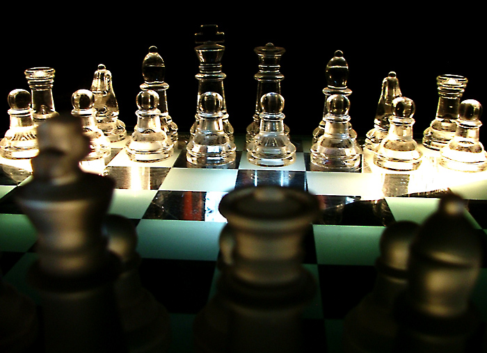
I really like the concept of this shot and the set-up is good. Unfortunately the execution is lacking somewhat.
While I like your shooting position(seems to be just the right distance from your foreground pieces), it might have been better centered between the dark king and queen and a bit more level, that way it keeps the viewer from feeling like they are "falling off" the right side.
The lighting on both sides of the board has resulted in blown highlights (on the right side it really hurts four chessmen). Perhaps raising the board by using clear glass jars or glasses - something to move the light farther away from the board. Might also use something to diffuse or soften the light (I use a couple sheets of wax paper)
The lighting on the right side also makes the board appear to have a large crack due to the glare.
The lighting on the clear pawns(from King to Queens Bishop) is great and I would think that raising the board and moving the lights would give that same effect on all of the clear pieces.
Good idea, just a little more work on the details
Russ |
|
 Photographer found comment helpful. Photographer found comment helpful. |
Comments Made During the Challenge  |
|
|
05/04/2008 11:04:25 PM |
|
One of the better ones this challenge. Well done! |
|
| Photographer found comment helpful. |
|
|
05/01/2008 02:10:13 PM |
|
I like the concept, but the image itself doesn't do it for me. I feel like I'm sliding off the right side, the light is harsh, and the darks are quite noisy (which I like sometimes, but it doesn't help this shot). |
|
| Photographer found comment helpful. |
|
|
04/29/2008 02:38:45 PM |
|
Nice depth of field, with interesting lighting. |
|
| Photographer found comment helpful. |
|
|
04/29/2008 01:48:09 AM |
|
I really like the DOF with the blurred foreground and sharp background. The lighting is overall good, however it would be better if the top of the background king was better lit. The reflections on the chess board are distracting, looks like they could have been avoided by making your light source bigger, either by a large diffusion sheet or by moving the light closer. |
|
| Photographer found comment helpful. |
|
|
04/28/2008 12:59:54 PM |
|
dramatic lighting. image is crooked. sloppy mistake that might cost you. |
|
| Photographer found comment helpful. |
|
|
04/28/2008 04:45:35 AM |
|
It does have a sort of ominous feel to it. |
|
| Photographer found comment helpful. |
|
|
04/28/2008 01:35:57 AM |
|
This board again? Do you all trade it for your shots? I like the view over the king/queen/bishop. |
|
| Photographer found comment helpful. |
Home -
Challenges -
Community -
League -
Photos -
Cameras -
Lenses -
Learn -
Help -
Terms of Use -
Privacy -
Top ^
DPChallenge, and website content and design, Copyright © 2001-2026 Challenging Technologies, LLC.
All digital photo copyrights belong to the photographers and may not be used without permission.
Current Server Time: 07/03/2026 09:16:21 AM EDT.