| Image |
Comment |
| 11/08/2003 12:49:14 AM |
Not So Scary Monster by smellyfish1002Comment: Wonderful job! I still find it hard how people can find enough wrong to give a photo like this a one!?!?!...no more rant...Congrats! |
 Photographer found comment helpful. Photographer found comment helpful. |
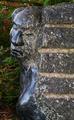
| 11/05/2003 07:49:38 PM |
Romancing the stone?by visitorComment: Hey Vistor:)
I did not vote this challenge but would have given this a 6. that you took a picture of a sculpture may not have helped. I read a thread where some folks questioned if ok to take pictures of some one elses work...just a thought. The composition of the image is on the dark side over all, not lending itself to standing out. The next issue I see is the face is taking my eyes to the left side and then out of the frame, I would have tried to have had more space in front of and to the right of the sculpture..this being done by fliping the image (DPC legal I believe) or taking the shot from another angle. On the monitor I'am Using here at work the Sculpture fades into the background at the bottom where it becomes difficult to determine where the two meet. I do think it does say grace just not with the impact one would hope for. I entered the tool challenge awhile back and had only three comments. I think I just did not have the most interesting shot and the folks that judged it felt the same...techincal was good but just no POW! anyway my thoughts. Hope I helped
Good luck in the future.
Richard |
| Photographer found comment helpful. |
| 11/05/2003 12:50:32 AM |
Self Portrait in Lightby darcyComment: I did not vote this challenge. but for the record this would have been a three from me. the color,and light seem way to harsh. the framing with the extra space to the right of the model is also very distracting. because the image is so over exposed it is hard to tell where the Models eyes are focused...they almost seem to be "Wall eyed" detail is lacking.
Sorry:( I hope this helped a little. |
| Photographer found comment helpful. |
| 11/05/2003 12:40:02 AM |
Glass Studyby lumbardhComment: Dude! Man you shoulda stayed with the black sheet to the top of the frame..it ahhh?... it ahhh? oh yea! now I remember! it messes up your display..you know? And your light source is just a bit to strong. clever though 7:) |
| Photographer found comment helpful. |
| 11/03/2003 01:33:46 AM |
Three Little Jugsby agwrightComment: Your efforts paid off! Top prize! Good job! For the record...I came back through during voting and had given this a ten.
keep up the good work
Richard Message edited by author 2003-11-03 01:34:21. |
| Photographer found comment helpful. |
| 11/03/2003 12:55:58 AM |
|
| Photographer found comment helpful. |
| 11/02/2003 11:34:34 AM |
|
| Photographer found comment helpful. |
| 11/02/2003 11:29:39 AM |
|
| Photographer found comment helpful. |
| 11/02/2003 11:27:58 AM |
|
| Photographer found comment helpful. |
| 11/01/2003 03:24:51 PM |
Come back!by kiwinessComment: stunning portrait. crisp clean lines and super focus. just a hair to much light on the shoulder for me...still wonderful image 9. |
| Photographer found comment helpful. |
Home -
Challenges -
Community -
League -
Photos -
Cameras -
Lenses -
Learn -
Help -
Terms of Use -
Privacy -
Top ^
DPChallenge, and website content and design, Copyright © 2001-2025 Challenging Technologies, LLC.
All digital photo copyrights belong to the photographers and may not be used without permission.
Current Server Time: 08/26/2025 10:19:36 AM EDT.