| Image |
Comment |
| 01/03/2006 05:47:40 PM |
|
 Photographer found comment helpful. Photographer found comment helpful. |
| 01/03/2006 12:47:59 PM |
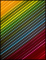
Blinding Contrastsby jeroweComment: I see the blind part, but not the contrasts? To much gray white. The pattern and composition are good but it needed some interesting lighting to maybe get some more contrast in tone. |
| Photographer found comment helpful. |
| 01/03/2006 12:46:07 PM |
Shadow Flightby GrayGhostComment: I like your origami work. The bird is very nicely done in the varigated paper. The green in the background is a bit bothersome. Over all, however, it is well thought out, put together and shot. |
| Photographer found comment helpful. |
| 01/03/2006 12:43:47 PM |
|
| Photographer found comment helpful. |
| 01/03/2006 12:43:17 PM |
Light & Shadowby KarenNfldComment: THe candle holder really radiated out some great light in this. Like golden tones. Nicely done...not sure why it had to be validated, looks fine to me. |
| Photographer found comment helpful. |
| 01/03/2006 12:38:48 PM |
|
| Photographer found comment helpful. |
| 01/03/2006 12:37:43 PM |
Random Radiationby dahkotaComment: The gerbera has layers of pattrning. I like the detail of the outer most layer but wish the lighting could have been adjusted to see the next layer in and the center. |
| Photographer found comment helpful. |
| 01/03/2006 11:01:40 AM |
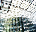
A Plethora of Squaresby TheLittleIslandComment: Looks like you had enough light that you could have gone done a few stops and avoided the blow out that is predominant in this. It distracts from the great lines and patterns. |
| Photographer found comment helpful. |
| 01/03/2006 10:59:59 AM |
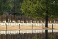
The Chairsby RistyzComment: Very cool find. Your chair pattern gets a bit lost from all the trees. I think you might have gone in closer on the chairs and if possible included more of the reflection...not sure of you how you might have done that, but the pattern would be stronger. |
| Photographer found comment helpful. |
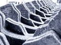
| 01/03/2006 10:57:59 AM |
Concrete bicycle holdersby HCvEComment: Nice tones...I like the steel blue gray. I think you mith have crop down from the top a bit and avoided the blow out in the background and made your pattern stronger at the same time. Very finely composed. |
| Photographer found comment helpful. |
Home -
Challenges -
Community -
League -
Photos -
Cameras -
Lenses -
Learn -
Help -
Terms of Use -
Privacy -
Top ^
DPChallenge, and website content and design, Copyright © 2001-2025 Challenging Technologies, LLC.
All digital photo copyrights belong to the photographers and may not be used without permission.
Current Server Time: 08/15/2025 09:28:52 AM EDT.