| Image |
Comment |
| 11/08/2003 06:55:46 PM |
Feeling Blueby bruskiComment: well it just about as perfect as I have seen full size and it also looks great in the thumbnail. Love the deep rich blue colors, the lighting, the arrangement and compostion....and the excellent reflections. aaaaaaaaaaaahhhhits a 100 ok only a 10 |
 Photographer found comment helpful. Photographer found comment helpful. |
| 11/08/2003 06:53:56 PM |
Wine is A Gracious Creatureby vrphotosComment: the cork screw could go and be replaced by the cork. I like the abstract in the wine glass VERY MUCH it looks like wine being poured. Very nice effect. |
| Photographer found comment helpful. |
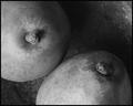
| 11/08/2003 06:52:01 PM |
Still on the shelfby ChezComment: some white balance problems too me, anyways. The shot is fine other wise as is the composition |
| Photographer found comment helpful. |
| 11/08/2003 06:45:02 PM |
escape from clicheby rhipsterComment: rather clever, wish the BG was the same color as in the picture but then there would be no escape, would there.....well there isn't any escape and it is something you are just going to have to deal with (insert devilish laugh with reverb). |
| Photographer found comment helpful. |
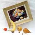
| 11/08/2003 06:35:57 PM |
Pairby dsidwellComment: A bit too macro for a still life, but the shot is so well done I'll overlook that. The composition is excellent and i really like the textures. 9 |
| Photographer found comment helpful. |
| 11/08/2003 06:34:05 PM |
keysby DieHappyComment: i like the keys, the background DOF is not great enought to cover up the busy back ground which is distracting and takes awa from the lines of the keys. |
| Photographer found comment helpful. |
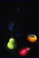
| 11/08/2003 06:31:54 PM |
In the classic styleby JC_HomolaComment: too dark in the upper half and i cannot see what the blue object is although its hint of blue color make me want to see it more. the red pear is too low in the composition, and it apperars to be falling out of the frame. |
| Photographer found comment helpful. |
| 11/08/2003 06:23:27 PM |
brokenby JasperComment: frame line, lose it....like the idea and the hi keyness of this. I wish what ever the round thing causing the break were smaller....it seems a bit much and the comp suffers because of it. the overall shot is very fine, but I really like the glass in this. |
| Photographer found comment helpful. |
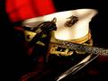
| 11/08/2003 06:20:00 PM |
Sword and Coverby scrum8Comment: Hmmmm....well you did not eed the item under the hat, whatever it is, and forgive my ignorance for not knowing what it is. the hilt of the sword is too level with the hat. I almost like the lighting but it appears exposed and it kills what appears to have been some nice shadows.. |
| Photographer found comment helpful. |
| 11/08/2003 06:16:08 PM |
|
| Photographer found comment helpful. |
Home -
Challenges -
Community -
League -
Photos -
Cameras -
Lenses -
Learn -
Help -
Terms of Use -
Privacy -
Top ^
DPChallenge, and website content and design, Copyright © 2001-2025 Challenging Technologies, LLC.
All digital photo copyrights belong to the photographers and may not be used without permission.
Current Server Time: 08/05/2025 02:58:50 PM EDT.