| Image |
Comment |
| 05/09/2004 08:25:08 PM |
|
 Photographer found comment helpful. Photographer found comment helpful. |
| 05/09/2004 08:24:45 PM |
Tumblersby spydrComment: OK I like this a lot, the colors are great, the compostion very fine......What is up with the ragged edged frame? tsk. |
| Photographer found comment helpful. |
| 05/09/2004 08:22:45 PM |
|
| Photographer found comment helpful. |
| 05/09/2004 08:20:29 PM |
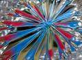
Into the Looking Glassby peeteComment: Although I am not usually a fan of centering I think it works well ins this. Like it very much, especially the contrasts of the patterns on the perimeter against that of the center. Like the duotone look it has as sell and the fine detail. Excellent. |
| Photographer found comment helpful. |
| 05/09/2004 08:18:18 PM |
Nature's Little 'Twists'by f-32Comment: A fine macro...I think you could have got the great trio together and closer and recomposed with no distraction of the right background it would have been better, but this is a great a idea and fine entry for this challenge. |
| Photographer found comment helpful. |
| 05/09/2004 08:16:00 PM |
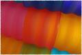
Curvy Colorsby DCThiessenComment: Great, like the colors and the shadows (wish there were more) and the compositon, the excellent lighting. Very very well done. |
| Photographer found comment helpful. |
| 05/09/2004 08:34:19 AM |
Colour Danceby mocabelaComment: LOSE THE FRAME....you have enough clash without it....WOW WHAT A BAD COLOR OF THE FRAME(and that don't necessarily mean just the green!)....everything else is GREAT! |
| Photographer found comment helpful. |
| 05/09/2004 08:31:49 AM |
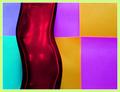
Playful lightby sfaliceComment: A little dark, but the great compostion, shapes and colors override that for me. Excellent. |
| Photographer found comment helpful. |
| 05/09/2004 08:30:41 AM |
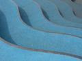
Wavesby ghotiComment: This is great except for the distractions from the lines in the form of small white blotches on the blue portions of the image which could have easily been cloned away. |
| Photographer found comment helpful. |
| 05/08/2004 09:27:38 PM |
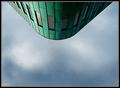
The New Waysby arnitComment: the shot is very good. the orientation is confusing on purpose which helps the abstraction BUT I think the portrait orientation might have made for a stronger image. |
| Photographer found comment helpful. |
Home -
Challenges -
Community -
League -
Photos -
Cameras -
Lenses -
Learn -
Help -
Terms of Use -
Privacy -
Top ^
DPChallenge, and website content and design, Copyright © 2001-2025 Challenging Technologies, LLC.
All digital photo copyrights belong to the photographers and may not be used without permission.
Current Server Time: 08/17/2025 06:42:15 AM EDT.