|
|
| Image |
Comment |
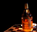
| 01/05/2008 01:06:49 AM | Devil's Brewby SherwinJamesComment: This is a fantastic commercial photograph. I think whiskey would have made the better match, but that really has nothing to do with the quality of the image - so it didn't effect the score.
This image would work well in an advertisement, and quite frankly, this style of photography in general would (if it hasn't already) earn the photographer more money than most of the artsy-fartsy fire-themed images in the challenge.
Bottom line - Excellent photo. |  Photographer found comment helpful. Photographer found comment helpful. |
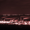
| 01/05/2008 12:58:09 AM | Oil Flareby rob_smithComment: The color doesn't work for me, I would prefer either black and white, or a bold, brilliant full color. Besides the color, the photo is excellent. It's crisp, it's cropped and composed thoughtfully.
Good work, I'd love to see something different with the color. | | Photographer found comment helpful. |
| 01/05/2008 12:45:57 AM | Passionby h2Comment: Excellent photo. Putting a gradient on the frame was gutsy, but it works. I'm sorry, but I have no criticisms here because none are necessary - good job and thank you for sharing. | | Photographer found comment helpful. |
| 01/05/2008 12:41:05 AM | The Eye of New Yearsby carbon451Comment: We all know what we're looking at, but it's abstract and interesting enough to be able to say, "Hey, it looks like a jelly fish," or "I bet that's what an exploding star looks like!"... I wish the title made no mention of New Years, in fact.
This may not sound like much if all you wanted to do was put a long exposure on a firework, but in my opinion the abstract, yet identifiable value adds a longer lasting charm to the photo. The longer a photograph can hold charm, the longer someone will enjoy displaying it on their wall. At least that's how I see it.
A few minor nitpicks - I'm seeing some glare in the upper right, and the bottom left seems to have too much of a red tone to it. No worries, though, I haven't deducted points for either of these issues because those sorts of screen-to-screen discrepancies would be resolved in the final printing.
Bottom line... It's that time of the year again, and I am frankly bored with the same ol' fireworks images, but your capture here is above all of that because everytime I look at it I can see something else.
Thank you for the entry. | | Photographer found comment helpful. |
| 01/05/2008 12:20:58 AM | | | Photographer found comment helpful. |
| 01/05/2008 12:17:41 AM | | | Photographer found comment helpful. |
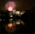
| 01/05/2008 12:12:23 AM | Belvedere Under Fire by muur88Comment: Beautiful photo, excellent entry. It works for the "Fire" theme, as well, without being too forced. It would be ridiculous for me to offer a criticism, so all I can say is thank you for sharing your work. | | Photographer found comment helpful. |
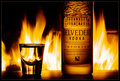
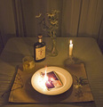
| 01/04/2008 03:27:09 PM | fire waterby whiterookComment: I love product placement in photography... it may not glow in an artistic light the way other entries due, but these sorts of shots absolutely have a place in photography. As a matter of fact, a more profitable place in photography in the eyes of a commercial artist.
There are a few things that bug me... focus isn't quite as sharp as it should be, and the lighting isn't quite right, either. The tabletop pattern works well, so good choice there, but the candle isn't working for me - I think removing it from the dish so that nothing takes away from the bottle would work much, much better.
Thank you for the submission! | | Photographer found comment helpful. |
| 01/04/2008 03:01:10 PM | She Loves Me Notby wardmacComment: This is in the Top 3, for me.
The photograph is sound fundamentally... nothing in the image distracts me by being either too soft or too harsh, and that is always difficult with this sort of lighting (at least it is for me). The props are placed nicely, as well...
The subject is relevant to the contest, but is totally unique from all of the other submissions. That, to me, is what makes a photo a winner - does it fit the criteria without trying too hard? Absolutely.
Your image works the most for me because it offers a story, it is art.
Thank you for sharing. | | Photographer found comment helpful. |
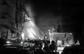
| 01/03/2008 10:05:40 PM | Accessibility Sucksby mchalmersComment: This is one of the better photos for the contest, in my opinion. It fit the criteria, everything in the shot is relevant, it is original and tells a very real story, and most importantly, you didn't totally neglect the fundamentals of good photography in the process.
I'm usually turned off by frames, but here is a good example a simple frame used in good taste to compliment the image.
My criticism would be that I don't like the crop touching the edge of the ribbon. I'd prefer it be closer in, or further away. This is such a minor nitpick that I feel silly even offering it.
Great entry. | | Photographer found comment helpful. |
Home -
Challenges -
Community -
League -
Photos -
Cameras -
Lenses -
Learn -
Help -
Terms of Use -
Privacy -
Top ^
DPChallenge, and website content and design, Copyright © 2001-2025 Challenging Technologies, LLC.
All digital photo copyrights belong to the photographers and may not be used without permission.
Current Server Time: 08/14/2025 08:15:01 PM EDT.
|