| Image |
Comment |
| 10/03/2004 06:47:42 AM |
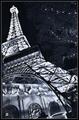
Paris, Las Vegasby Pep VentosaComment: Good composition, but not enough sharpness in the shot to keep my interest. This duotone doesn't quite work for me. 5 |
 Photographer found comment helpful. Photographer found comment helpful. |
| 10/03/2004 06:47:36 AM |
Mercyby hopperComment: Nice, sensitive portrait. The green eyes have been overdone here though. Shame the backlighting on the hair is overexposed. I find the background a bit too distracting. Great model... but there's something about her expression and her mouth that seems a bit awkward. Good composition, but perhaps a tighter crop could have worked better... do you really need space at the top of her head? 6 |
| Photographer found comment helpful. |
| 10/03/2004 06:47:31 AM |
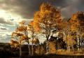
Fallby ursulaComment: Some beautiful light, and I like the neatimaged clouds but the composition here is a bit chaotic to me. I'm not really sure what the pof is here. The trees and hills look way oversharpened... to the point of actually losing detail. 6 |
| Photographer found comment helpful. |
| 10/03/2004 06:47:26 AM |
The Walkby L1Comment: Nice shot... conjures up an emotive sense of ennui. I wish the man didn't blend so much into the background though. Not quite sure about the composition... too much room on the left of the frame and the boy on the right is too centered for my taste. It feels like it was an arbitrary decision to frame it like this because you didn't want to be unimaginative and place everything dead centre. The pylons on the right are a bit distracting. 6 |
| Photographer found comment helpful. |
| 10/03/2004 06:47:17 AM |
Wish I Knew What You Were Thinkingby flip89Comment: Great capture, the eyes are extremely expressive here. The composition/crop seems a bit of an afterthought though, the eyes look oversharpened and the dof is too shallow. The white background element on the left of the frame should have been cloned out, it's quite distracting. The overall gamma seems very high, the photo looks a bit washed out. I'd lower the gamma and increase the contrast. 6 |
| Photographer found comment helpful. |
| 10/03/2004 06:47:04 AM |
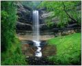
Munising Fallsby pitsamanComment: Nice waterfall shot, but rather oversharpened. There's a plant to the left of the frame in front of the waterfall which is a bit distracting. Shame the waterfall itself is a little overexposed. 6 |
| Photographer found comment helpful. |
| 10/03/2004 06:46:59 AM |
Naughty .... but niceby agwrightComment: This shot doesn't really do a lot for me, but is well taken, evenly lit, effective background, good use of dof. There's a bit too much glare on the strawberry which you could have removed with a polariser. 6 |
| Photographer found comment helpful. |
| 10/03/2004 06:46:54 AM |
In the Fangs of Shadowby librodoComment: Great portrait, good choice of subject. The face is much too high contrast for my taste though, and I don't think the out-of-focus hand works in the foreground. Great expression captured. 6 |
| Photographer found comment helpful. |
| 10/03/2004 06:46:49 AM |
Lancing Collegeby marboComment: Nice colours here, and an interesting building, but the overall composition and use of silhouettes is not quite 'clean' enough for my taste. Perhaps a panoramic crop might have suited this better. It's a shame the treeline in front of the college isn't more simple. 6 |
| Photographer found comment helpful. |
| 10/03/2004 06:46:45 AM |
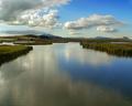
Bear River Marshesby dsidwellComment: Great view, and nice sky, but there's not enough detail to keep my eye in the frame for long. The shot needs something else to keep the interest. 6 |
| Photographer found comment helpful. |
Home -
Challenges -
Community -
League -
Photos -
Cameras -
Lenses -
Learn -
Help -
Terms of Use -
Privacy -
Top ^
DPChallenge, and website content and design, Copyright © 2001-2025 Challenging Technologies, LLC.
All digital photo copyrights belong to the photographers and may not be used without permission.
Current Server Time: 06/24/2025 05:41:36 PM EDT.