| Image |
Comment |
| 11/15/2007 08:48:04 AM |
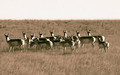
Home on The Rangeby vtruanComment: Its a shame they are not spread out vertically a bit more. The composition suffers a bit from horizontal banding, i.e, sky, grass, animals, grass. If they were more randomly positioned it would really break up the image and make it more interesting |
 Photographer found comment helpful. Photographer found comment helpful. |
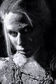
| 11/15/2007 08:46:00 AM |
Je penseby LonzComment: Looks like this has suffered from a bit of camera shake in low light. Even though the eye is relatively sharp compared to the rest of the image, it could still do with being sharper still. Its also a bit burnt out and so has lost some detail, again, if this was in any other part of the image it would be ok but the eye is the main point of focus for the viewer and should be perfect |
| Photographer found comment helpful. |
| 11/14/2007 03:24:43 PM |
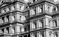
Cliff Dwellingby Les_FeckComment: Great patterns. The vertical lines seem to lean ever so slightly to the left. A very small cw rotation during the cropping stage would have been a consideration. Good contrast and sharpness across the whole image |
| Photographer found comment helpful. |
| 11/14/2007 03:22:43 PM |
Securityby LeeDComment: I hope the baby didn't end up at the bottom of the canal!! Seriously though, good focus and composition. Could have pushed the deeper tones to give more constrast. |
| Photographer found comment helpful. |
| 11/14/2007 03:21:05 PM |
Best Friendsby L1Comment: Great capture of the moment. To be able to clearly see both faces would have allowed me to score higher. Good tonal range and sharpness of the girls against the blurred background |
| Photographer found comment helpful. |
| 11/14/2007 03:19:39 PM |
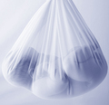
I've had too much.by noth1021Comment: Interesting aspect ratio. Not a fan of the specular highlight on the cylinder. Would have been good to eliminate the bright white "spot" to the far left as it distracts the eye |
| Photographer found comment helpful. |
| 11/14/2007 03:18:02 PM |
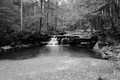
Swallow Falls State Park by BarryRNComment: The tree areas look a bit flat in tonal range. Perhaps a different mix of hues during the B&W converstion could have pushed the woodland contrast more to make it more dramatic |
| Photographer found comment helpful. |
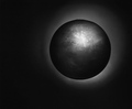
| 11/14/2007 03:13:33 PM |
Untitledby FromacComment: Interesting title.... if only the surface was sharper, it looks a bit like a game texture mapped rendered object, especially with the "polygonal" outline at the top, if this has been masked, greater care to make sure it was perfectly circular would have made a difference but I might be wrong |
| Photographer found comment helpful. |
| 11/14/2007 03:10:42 PM |
|
| Photographer found comment helpful. |
| 11/14/2007 09:04:23 AM |
Logby raishComment: Noisy, blown out, seems quite pixelated. I see red and blue hues to not sure if this strictly counts as duotone, certainly I have not seen any other tritone entries yet during my voting. Quite nicely composed though, your main subject, the log, is positioned roughly a third to the left |
| Photographer found comment helpful. |
Home -
Challenges -
Community -
League -
Photos -
Cameras -
Lenses -
Learn -
Help -
Terms of Use -
Privacy -
Top ^
DPChallenge, and website content and design, Copyright © 2001-2025 Challenging Technologies, LLC.
All digital photo copyrights belong to the photographers and may not be used without permission.
Current Server Time: 08/24/2025 03:28:04 AM EDT.