| Image |
Comment |
| 11/28/2007 08:49:40 AM |
|
 Photographer found comment helpful. Photographer found comment helpful. |
| 11/28/2007 08:48:27 AM |
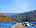
At The Mall?by scarbrdComment: Just off being completely symmetrical unfortunately. Would have been great to have it either spot on or more deliberately from an angle. This is somewhere inbetween and isn't working for me. |
| Photographer found comment helpful. |
| 11/28/2007 08:46:14 AM |
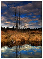
Lurkingby DrAchooComment: Lovely colours, good idea, the sky looks a little "overdone" somehow and doesn't seem consistent with the reflection in terms of colour |
| Photographer found comment helpful. |
| 11/28/2007 08:29:31 AM |
|
| Photographer found comment helpful. |
| 11/28/2007 08:28:47 AM |
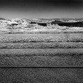
Beach Dwellerby CamComment: The blue tones are perhaps a bit washed out and there is not enough variety. Could have done with there being more strongly defined clouds to break up the sky |
| Photographer found comment helpful. |
| 11/28/2007 08:26:36 AM |
|
| Photographer found comment helpful. |
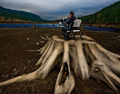
| 11/28/2007 08:25:41 AM |
Telecommuting by robaComment: Lovely tones on the wood, it really stands out from the rest of the image but you've pushed it too far IMO in the dodge and burn department. The tonal range of the rest of the image is very flat in comparison. A more subtle approach would have given a more natural approach |
| Photographer found comment helpful. |
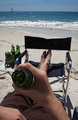
| 11/27/2007 08:30:13 AM |
Wish you were hereby Delta_6Comment: Nice idea, its just lacking something extra for me but I can't qute point out what. Your using the full tonal range, well composed (rule of thirds on the bottle and horizon), its a decent enough entry, I just can't see it reaching the top ten |
| Photographer found comment helpful. |
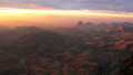
| 11/27/2007 08:26:58 AM |
exploring the further reaches of the planetby GordonComment: Excellent view, lovely lighting and rich shadows. Could almost have done with a bit of dodging and burning just to really beef up the rocky landscape to provide a bit more variety in places and a real punch |
| Photographer found comment helpful. |
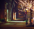
| 11/27/2007 08:25:14 AM |
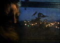
Shopping in the twilight zoneby KelliComment: The noise and rather washed out colours make this appear rather flat. Some nice DOF effects with more defined focus on the fairy lights and then tailing off to a blurry background would have provided the depth required to give this more impact |
| Photographer found comment helpful. |
Home -
Challenges -
Community -
League -
Photos -
Cameras -
Lenses -
Learn -
Help -
Terms of Use -
Privacy -
Top ^
DPChallenge, and website content and design, Copyright © 2001-2025 Challenging Technologies, LLC.
All digital photo copyrights belong to the photographers and may not be used without permission.
Current Server Time: 08/24/2025 10:14:39 PM EDT.