| Image |
Comment |
| 12/05/2007 08:45:36 AM |
|
 Photographer found comment helpful. Photographer found comment helpful. |
| 12/05/2007 08:44:09 AM |
|
| Photographer found comment helpful. |
| 12/04/2007 08:58:19 AM |
|
| Photographer found comment helpful. |
| 12/04/2007 08:56:19 AM |
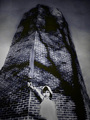
Childe Rowland at the Dark Towerby KelliComment: Something about the lighting on the figure doesn't look right and appears superimposed into the tower image and seems very disconnected. Holding the sword in the air comes across to me as being comical which is quite the opposite feeling I get from the tower and the sky and this further adds seperates the tower and figure. Lovely tones and patterns on the tower, would have had more impact on its own |
| Photographer found comment helpful. |
| 12/04/2007 08:52:22 AM |
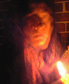
The Little Match Girlby snafflesComment: Too blurred I'm afraid, simply not enough light to capture a moving subject. I can see you used a tripod as the brickwall is sharp but as this is essentially a portrait, the girl needs to be sharp too. |
| Photographer found comment helpful. |
| 12/03/2007 08:44:05 AM |
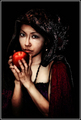
Once Upon a Timeby heavyjComment: Looks incredibly overprocessed and have become a cross between a painting and CGI. Some might think its great and fits the challange well but its not for me. |
| Photographer found comment helpful. |
| 12/01/2007 07:58:49 AM |
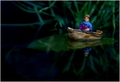
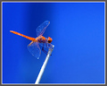
Dragonflyby CraftyComment: Excellent sharpness and detail which is enhanced by having a neutral background. The blue takes up a lot more area than the orange but you achieve balance well by ensuring that the orange is more heavily saturated so thats very well done. The only thing that is a bit questionable is the relatively elaborate border which distracts from some of the detail on the dragon fly. |
| Photographer found comment helpful. |
| 12/01/2007 07:55:57 AM |
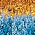
Colder & Colderby korpenComment: Not sure how you've done this, not overly keen on it to be honest. The top half of the image looks more yellow on my display than orange and so is struggling a bit to complement the blue |
| Photographer found comment helpful. |
| 12/01/2007 07:54:25 AM |
fish outa waterby jaimeDpComment: Difficult to quite make out what the main subject is and the title is not giving much away. Lovely green hues take up more area of the image than the red, but you still achieve colour balance by saturating the red a lot more so thats very good. |
| Photographer found comment helpful. |
| 12/01/2007 07:51:58 AM |
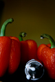
Sun on the wireby docjonnyComment: The blue is simply not strong enough to be complementary to the orange hues. Interesting aspect ratio |
| Photographer found comment helpful. |
Home -
Challenges -
Community -
League -
Photos -
Cameras -
Lenses -
Learn -
Help -
Terms of Use -
Privacy -
Top ^
DPChallenge, and website content and design, Copyright © 2001-2025 Challenging Technologies, LLC.
All digital photo copyrights belong to the photographers and may not be used without permission.
Current Server Time: 08/24/2025 02:14:50 PM EDT.