| Image |
Comment |
| 05/25/2013 04:25:05 PM |
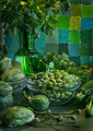
study in greenby mariucaComment: Subdued mood, but strong echoes of classic still life paintings. Lots to look at. |
 Photographer found comment helpful. Photographer found comment helpful. |
| 05/25/2013 04:23:54 PM |
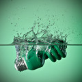
Clean & Greenby dswannComment: Well executed. Glad to see a bit of the object still above the surface line. Let us know how many shots it took to get this. |
| Photographer found comment helpful. |
| 05/25/2013 04:22:26 PM |
On The Greenby WarbyComment: Nice play of geometry and variations of color. Should score well. |
| Photographer found comment helpful. |
| 03/17/2013 08:56:14 PM |
|
| Photographer found comment helpful. |
| 03/17/2013 08:35:17 PM |
Peer Pressureby smardazComment: Good use of expert editing. I suspect some will vote lower based on the instruction in challenge detail: "The title of your image MUST be "Falling Apart"." |
| Photographer found comment helpful. |
| 03/05/2013 05:01:17 AM |
|
| Photographer found comment helpful. |
| 03/05/2013 04:59:58 AM |
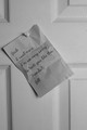
dear johnby klkitchensComment: Having the door slightly off from straight upright fits the jolting impact of an emotional situation. Sharpness is good. Exposure could have been much brighter for this challenge topic (this much grey suggests that an automtic exposure mode might have been used without enough exposure compensation). |
| Photographer found comment helpful. |
| 03/05/2013 04:52:19 AM |
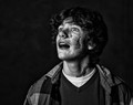
Biscuitsby CoryComment: Layers of brown spots and distortion, degree of blur, odd shirt message, and stark setting all are elements that could be an artistic statement. But it doesn't draw me in even after looking quite a while. Lots of dark elements likely to push score low. Will be interested to hear how this was accomplished in minimal editing (shot thorugh dirty pane of glass?). |
| Photographer found comment helpful. |
| 03/05/2013 04:40:19 AM |
|
| Photographer found comment helpful. |
| 03/05/2013 04:39:39 AM |
White Rice by IAmEliKatzComment: Elegant simplicity. Exposure could have been slightly brighter, but I still expect to see this in the top 10. |
| Photographer found comment helpful. |
Home -
Challenges -
Community -
League -
Photos -
Cameras -
Lenses -
Learn -
Help -
Terms of Use -
Privacy -
Top ^
DPChallenge, and website content and design, Copyright © 2001-2025 Challenging Technologies, LLC.
All digital photo copyrights belong to the photographers and may not be used without permission.
Current Server Time: 08/06/2025 03:42:28 PM EDT.