|
|
|
Showing 121 - 130 of ~867 |
| Image |
Comment |
| 11/02/2010 05:42:24 PM | 10by sidpixelComment: This is lovely - the light, the structure, the detail. Fantastic. I was thinking that it is a shame you couldn't get it into a challenge, but then I don't think it would be appreciated anyway. |  Photographer found comment helpful. Photographer found comment helpful. |
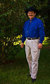
| 10/22/2010 04:32:26 AM | Self-Portrait...by 777STANComment: Hi Stan, welcome to the Critique Zone!
I'm afraid I have to be honest here, my first take on this shot is that it looks like a snap of a friend at a BBQ, so what went wrong?
Technically: The shot is just not that sharp. I can see some sharpening has been done to rescue it, but (having tried similar myself) it never really works. I would suggest closing the aperture down - the kit lenses are never that great wide open. Boost your ISO to 200 or 400 and close your aperture to f6.3 or f7.1, make sure that the focus is bang on where you want it (the face, not the trousers!) and good to go. The lighting is more 'flash' than 'fill flash' too - the darkness behind your subject makes true 'fill flash' unnecessary.
Artistically: You have carefully used the rule of thirds, but the slightly dull background doesn't add any interest - it's dark and fairly homogenous. I would either go in much tighter, or shoot against a more interesting background. The point of view is also a problem here - this is the same point of view that we would see in normal life, and as such we don't tend to be grabbed by it - try getting low and shooting up, or shooting from above for a more unusual perspective.
PP: You don't mention saturating, but these colours (particularly the blue) are way over-saturated. I find de-sat can be useful on these occasions. Also be very wary of the over-sharpening. Some things just can't be recovered.
It is clear from your portfolio that you are way better than this shot, which is perhaps really just an exercise in lighting, so I don't want to get you down! Just head out and get back shooting! Happy hunting,
Frank. | | Photographer found comment helpful. |
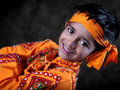
| 10/22/2010 04:21:22 AM | Smile by DigiFotoBuddyComment: Hi Shailesh, welcome to the critique zone! It's always hard to critique a ribbon winner so this might be quite short!
My initial take is that this is a very bright, cheerful image of an excellent model. As another commenter said, it does look like a professional portrait shot - but with soul.
Technically, there is nothing I can really say about this. The focus and DOF control are bang on, as one would expect from your work. There is the raging question about 'fill flash' but I am sure you are sick of that one and since the voters have spoken, who am I to disagree!
Artistically, the composition is simple and appealing. Kudos to your son for pulling off such a great expression - excitement and fun, with just a touch of uncertainty/shyness lingering in the eyes. I'm not sure about the use of such an extreme angle of tilt, but definitely some tilt does give it interest.
All in all, a cracking shot and recognised as such by the voters. | | Photographer found comment helpful. |
| 10/22/2010 04:14:11 AM | Brittanyby yakatmeComment: Hi Robert, welcome to the critique zone!
My initial take on this shot is that it has a really warm, rich feel - like a proper chesterfield sofa. The soft reds and browns work really well with the rumpled fur to give an impression of comfort and tactile pleasures.
Technically: Your focus, and control of the DOF is unsurprisingly superb - the OOF cushion on the right hand side works nicely to isolate Brittany's expression. The only area where I would take some issue is lighting, partly because I would have liked just a little more detail in the left eye, and partly because I am not convinced that this is 'fill flash' rather than just 'flash'. That seems pretty contentious at the moment!
Artistically: This is completely subjective, but I find the fairly central position of the face a little odd. I can't see what the space to the right is adding - a little is good for the isolation effect, but there is a lot there. That's all though, as I said before the 'feel' of the photo, the colours and textures, are just great.
All in all, a really classic study of Brittany - I'm sure she would be pleased!
Happy hunting.
Frank. | | Photographer found comment helpful. |
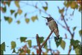
| 10/21/2010 11:55:27 AM | Phil, the Flash, Takes a Breakby zencowComment: Hi Chris - here we are again!
This will probably be a much shorter critique, since there really isn't much to say that hasn't already been said. It is a pleasant shot - but unremarkable. You said that it came from trialling a technique, and that is pretty much what it looks like. That said, from where I'm sitting you have nailed the fill flash thing.
Technically: It's all good - the focus, the DOF and especially the light. You have managed to get a nicely exposed background while capturing all of the hummingbird detail courtesy of the flash.
Artistically: I think the biggest issue is that tiny subject in that fairly open frame. A busier and more interesting background could bolster a composition like this - setting the subject in its environment, but there just isn't enough there to do this. Another minor point (which I got from a pro wildlife photographer's book) is about the angle of shot. Here you are looking up at the bird, which is the angle most people also have so it doesn't really grab them as being different. It may not be possible, but a horizontal or downward angle might add interest. Equally, apparently we should try and shoot land animals horizontal or upwards... got to be worth a try!
In summary, it is technically spot on and you definitely achieved what you were going for, so I guess now the mission is to park that little bit closer!! Happy hunting.
Frank. | | Photographer found comment helpful. |
| 10/21/2010 08:15:52 AM | Good Fences Make Good Neighborsby Luci11eComment: Hi Lorie, welcome to the other side of the Critique Fence! i have a tendency to speak my mind, so I just hope there is something useful in here for you.
My initial take on this is that it is small, slightly red in hue, and a little blown out. Given that the average voter spends about five seconds looking at each shot, it needs to have a more positive initial impact.
Technically: It's nice and sharp, and you have a fine depth of field without going overboard with a really small aperture, so that's all fine. The problem you have (incidentally the same problem I had in 'bridges') is light, and basic editing. There are some very bright, almost blown areas, and some very dark areas. The eye is drawn to the light and your (theme) subjects are in the dark. The result is the kind of comment you have below.
Artistically: This is completely subjective, so take what you will! I am not a fan of the crop - it squeezes my vision vertically and feels slightly uncomfortable. In addition to that, your subjects are both right at the edges, so you can't get a feel for them at the same time. There is also no real 'story' here - the horses don't look close as if they are meeting or some such, it's all very geometric. The slight red hue to everything also makes your subjects blend in to the reddish fence. When there isn't a lot of colour contrast, I am often tempted to try converting to BW, and making it about contrast rather than colour.
PP: This could be sharper - I always do a little sharpening after the re-size (radius 0.5px, 70-80% max) to bring back the edge. You definitely need to fix the colours, either in RAW conversion or hue/sat (have you played with the hue bit in individual colour spaces? It is an eye-opener) - or go B&W. As for sorting the bright/dark problem, I haven't tried it yet but I suspect that Topaz Adjust will help - they do a free 30 day trial...
Happy hunting!
| | Photographer found comment helpful. |
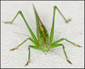
| 10/15/2010 07:53:58 AM | This is my last pose for you buddy.. so hop off ok?by docjonnyComment: Hi Doc, welcome to the Critique Zone!
My initial take on this shot is that it is pleasant (sharp, clear etc) but lacks the 'wow factor' that tends to grab the voters' attention. Still, I am surprised that you had no comments.
Technically: Your point of focus is spot on - he has a lovely sharp head and eyes. The Depth of Field is interesting - given the nature of the subject, I suspect that you were hand holding this one - hence the smallish aperture. If the opportunity was there I would have take an insurance shot at these settings, then tried pushing the aperture to get a better DOF - perhaps to try and get the whole of the front four legs in focus? The lighting is good directionally, but a little overpowering on a white wall.
Artistically: This is very subjective, but maybe of interest. The centred crop can be a real passion killer when it comes to giving a shot 'wow factor' - especially on a plain white background. For a non-macro challenge, I would have suggested off-setting him to the right and showing perhaps an expanse of empty wall to his left to give a sense of space. Since this is a macro challenge, I think this needs to be tighter. A lot tighter. Perhaps just the bottom right hand corner, as far left as the end of the left foreleg and as far back as just above the thorax joint.
PP: You don't mention sharpening, but this does look a trifle over-sharpened. It could probably also take a little more contrast. I mentioned the power of the light, a tweak on the shadow/highlight tool would take the edge off that, and let more detail show.
In summary, this is a nice shot of a grasshopper, but just doesn't stand out from the crowd enough to get the voters' attention. With a little more playing around though, I think it could. Happy hunting! | | Photographer found comment helpful. |
| 10/15/2010 07:21:38 AM | A Spot of Milkby michelaudetteComment: Hi Michel, since you didn't find my last critique useful enough to tick the box, I'll keep this one brief.
This is a rather nice shot - technically nice and crisp with good DOF and I think that you did a very good job with the lighting.
Artistically, I am not sure why you decided to cut the cup handle off half way down? Perhaps it was practical based on the amount of milk on your work surface... Either way I find the crop a little awkward - either tighter on the surface with the handle out of the way, or further back showing the whole curve of the handle would have worked better for me.
There are plenty of droplet shots on DPC, but this is sufficiently different, and well executed, to stand out. | | Photographer found comment helpful. |
| 10/13/2010 10:23:53 AM | Fallby Photomom1981Comment: Hi Monica, welcome to the Critique Zone! Naturally everything I might say is subjective, so take anything you might find useful...
My initial impression of this is that it is very bright, and very yellow. There is a hugh contrast between most of the photo and the eyes, which is (to me) a little unsettling and some areas of interest (around the hands and apple) are lost off the bottom. I have to be honest, I struggle to find it appealing. Why?
Technically: You have a really sharp camera / lens combo there, I know, I have it too. With such a small aperture you should have a seriously sharp picture throughout, but it's not quite there. The ISO setting is also introducing some unnecessary noise. I would drop that to 100 and use maybe f6.3 at most on this. The shutter should still be plenty fast enough - I would still set it at 1/160 which should make it a little darker than you have it, bringing some of that lovely detail back. The lighting is also rather harsh on such delicate skin.
Artistically: This really needs to be razor sharp - and there is no reason it couldn't be, even if you have to manually focus (focus on the eyes!). In composition terms, as I said I feel it is 'cut off' a little high - maybe more apple could be in there for contrast? Also, it is worth trying to compose so that the eyes are on a 'thirds' intersection.
Post: You say that you adjusted everything, normally I stick to sharpness (before and after resizing), curves for contrast and a very light touch on the hue/sat. For advanced editing I will normally play with dodge and burn but that's about it. Remember, the more you process, the more you lose what was there in the first place!
In summary, this is a fairly pretty shot of your child (?) - but I reckon you can produce something better with the gear and eye for a cute moment that you clearly have. | | Photographer found comment helpful. |
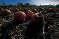
| 10/13/2010 07:02:08 AM | Night Pumpkinsby ccarterComment: Hi Chuck, welcome to the critique zone!
My inital take on this image is that while this was taken at night, it doesn't really show apart from being a little dark. You don't have a real 'night' feel to the shot, so what to do?
Technically: This is a pretty noisy image - not only have you got ISO 640 in play, but also 'long exposure' noise. Your use of f8 has also given you a pretty big depth of field which I'm not sure you need. I would drop the ISO and the aperture (maybe f6.3 and 200?) and take the hit on the shutter time - it should be cleaner. You can then run it through noise reduction in PP. I also suspect that there is a long exposure noise reduction setting in your D90, don't know if it was on? The natural lighting is interesting on the foreground, less so in the background although nice in the sky on the right.
Artistically: This is of course completely subjective, but... I would have taken this shot from slightly to the left, focusing on the big pumpkin left of centre, moved a lot closer and put that probably slightly right of centre and a little low. That would give the photo a real sense of focusing on the pumpkins. It would also block out a little of the background. If you want the field look in for Charlie Brown, you could start a little above and have two thirds ground in the shot. If possible, I would have definitely done a 'recon' during the day, composed the shot, and then come back to take it at night.
PP: You don't say what you did do, but I suspect that a little Noise Reduction, sharpening and popping the contrast with curves or even levels would have boosted the look of this a little.
Random thought, this could be a great location for 'painting with light'? ie. Sticking the camera on 'Bulb' and then using a big flashlight to 'paint' in the bits you want? Worth a play if you have the time. Hope some of this was useful! | | Photographer found comment helpful. |
|
Showing 121 - 130 of ~867 |
Home -
Challenges -
Community -
League -
Photos -
Cameras -
Lenses -
Learn -
Help -
Terms of Use -
Privacy -
Top ^
DPChallenge, and website content and design, Copyright © 2001-2025 Challenging Technologies, LLC.
All digital photo copyrights belong to the photographers and may not be used without permission.
Current Server Time: 08/20/2025 04:32:04 AM EDT.
|