DPChallenge: A Digital Photography Contest You are not logged in. (log in or register
 
Challenge Entries
Portfolio Images
This image is not part of a public portfolio.
Good Fences Make Good Neighbors
Luci11e


Photograph Information Photographer's Comments
Challenge: From The Knees Down (Basic Editing)
Camera: Nikon D40
Lens: Nikon AF-S DX Zoom-Nikkor 55-200mm f/4-5.6G IF-ED VR
Location: Warren Co. TN - Eastside
Date: Oct 9, 2010
Aperture: f/5
ISO: 200
Shutter: 1/160
Galleries: Animals, Rural
Date Uploaded: Oct 9, 2010

Went out to my sons place, wanted to shoot him and his horse. 8am and the kid was still in the bed....farm boy my ass! So I got a few shots of the horses including this one....
crop
adjusted saturation and temp
adjusted exposure and contrast
re-size (wanted to save this bigger but with the program I use this was biggest I could figure out without going over the max) and save

Statistics
Place: 67 out of 83
Avg (all users): 4.7306
Avg (commenters): 3.0000
Avg (participants): 4.0556
Avg (non-participants): 4.8854
Views since voting: 737
Views during voting: 357
Votes: 193
Comments: 2
Favorites: 0


Please log in or register to add your comments!

AuthorThread
10/21/2010 08:15:52 AM
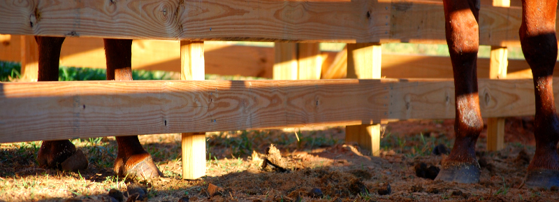
Hi Lorie, welcome to the other side of the Critique Fence! i have a tendency to speak my mind, so I just hope there is something useful in here for you.

My initial take on this is that it is small, slightly red in hue, and a little blown out. Given that the average voter spends about five seconds looking at each shot, it needs to have a more positive initial impact.

Technically: It's nice and sharp, and you have a fine depth of field without going overboard with a really small aperture, so that's all fine. The problem you have (incidentally the same problem I had in 'bridges') is light, and basic editing. There are some very bright, almost blown areas, and some very dark areas. The eye is drawn to the light and your (theme) subjects are in the dark. The result is the kind of comment you have below.

Artistically: This is completely subjective, so take what you will! I am not a fan of the crop - it squeezes my vision vertically and feels slightly uncomfortable. In addition to that, your subjects are both right at the edges, so you can't get a feel for them at the same time. There is also no real 'story' here - the horses don't look close as if they are meeting or some such, it's all very geometric. The slight red hue to everything also makes your subjects blend in to the reddish fence. When there isn't a lot of colour contrast, I am often tempted to try converting to BW, and making it about contrast rather than colour.

PP: This could be sharper - I always do a little sharpening after the re-size (radius 0.5px, 70-80% max) to bring back the edge. You definitely need to fix the colours, either in RAW conversion or hue/sat (have you played with the hue bit in individual colour spaces? It is an eye-opener) - or go B&W. As for sorting the bright/dark problem, I haven't tried it yet but I suspect that Topaz Adjust will help - they do a free 30 day trial...

Happy hunting!

  Photographer found comment helpful.
 Comments Made During the Challenge
10/14/2010 09:35:41 PM
This photo is to much about the fence and I've seen this crop a lot in this challenge I'm not a huge fan it looks like you took a normal shot and cut it in half.
  Photographer found comment helpful.


Home - Challenges - Community - League - Photos - Cameras - Lenses - Learn - Prints! - Help - Terms of Use - Privacy - Top ^
DPChallenge, and website content and design, Copyright © 2001-2024 Challenging Technologies, LLC.
All digital photo copyrights belong to the photographers and may not be used without permission.
Current Server Time: 04/24/2024 10:20:51 PM EDT.