|
|
|
Showing 111 - 120 of ~867 |
| Image |
Comment |
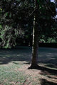
| 06/17/2011 07:36:45 AM | Solitaryby lavi83Comment: Hi Lavinia - welcome to the Critique Zone!
I confess that I am a bit mystified by this shot. When I first saw it, I thought of a few things to say but then I looked at your portfolio. The gap between this shot and the quality in your portfolio is so large that I am forced to wonder if you were shooting for the brown here? I will critique assuming that you were not.
Technically: That is a very capable camera/lens combo - but definitely not at its best at f3.5. The tree either needs more or less light - either definitely a silhouette or lit enough to see the detail - perhaps using 'spot' metering would help get the levels right? I would then boost the ISO to about 400 and close the aperture a little (maybe f5.6?)
PP: This needs a little work, I suggest. There isn't much interesting or important colour so I would be tempted to convert to black and white like this. To really bring out the textures and contrasts, some work on levels or curves and some sharpening is also really a requirement.
Artistic: It definitely looks like you have gone for the rule of thirds here. It's not enough and this is where I am surprised because your portfolio shows some really excellent use of structure and composition, while this is a little lacking. Perhaps a different perspective on the tree would have helped? From the ground up maybe? In any event the very bright area bottom left is a distraction.
I hope that some of this is useful - it is all just my opinion of course but I am very confident that you are capable of far better photographs than this!
Happy hunting,
Frank. |  Photographer found comment helpful. Photographer found comment helpful. |
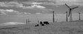
| 06/16/2011 06:04:52 AM | wind powered cowsby disassociationComment: Hi Leigh, welcome to the Critique Zone!
This is an interesting shot but I have to be honest and say straight up that it doesn't grab me as it is. The subject has potential but that is not enough on its own. What don't I go for?
Technical: It's ok - not as sharp as I would have liked but not dramatically out. The settings seem a little odd though. By the time you get to f18 on that lens, I would expect to have some diffraction creeping in (affecting sharpness) - you only need about f7.1 to achieve the DoF you need here. ISO 800 also seems high for such a nice day - which will also hit the sharpness.
PP: Two things that I would pick up on are the b/w conversion and sharpening. For the latter, I always sharpen post down-sizing. The re-size often detracts from the image that way. For the conversion, this looks like a straight de-sat, which leaves the image rather flat. Have you tried using other methods? Channel mixer is my favourite, really allows you to get some contrast in there. There are some more ideas here
Artistically: This is completely subjective of course but... the perspective here is exactly the same as average joe would see walking past. I find myself more grabbed by shots showing an unusual perspective, perhaps from the ground, past a massive cow to a wind turbine or some such. Secondly, the subject cows are completely central, with the secondary windmills to the right. My eye almost feels dragged from right to left, which is not natural in the western world - we like to view from left to right. I don't know how you fix this.
As I sai, it's an interesting idea, but having scouted through your portfolio, it is definitely less than you are capable of (loved your minimalist landscape outtake!)
Happy hunting,
Frank. | | Photographer found comment helpful. |
| 06/10/2011 08:40:03 AM | letter boxby tigerluongComment: Hi Frank, Welcome to the Critique Zone!
This is an interesting and appealing little shot - I like the quirky letter box and it scores well on having both geometry and textures which are critical to a successful monochrome shot. There are a couple of things, though, which stop this from reaching its full potential.
Technically: This is a really sharp shot - not surprising with that cracking lens. However, one of the things that brings this photo down a little is the background. I would have been tempted to open the aperture right up to f2.8 and blur out the house behind entirely - it doesn't add anything.
PP: As I said, fantastically sharp, but some of the detail is lost in the highlights. A little shadow/highlight, or for more control a little 'burn' in photoshop would have brought those back.
Artistically: The strengths of this shot are the shape of the letter box and the texture of the hedge - everything else is a distraction. Could you have composed this to avoid the background a bit more? A very narrow DoF and some more selective burning (including the wall, back left) would have helped I think.
This is a great subject for a black and white shot and it is so nearly a really great shot. I look forward to seeing more of the world from your point of view!
Happy hunting,
Frank. | | Photographer found comment helpful. |
| 06/10/2011 08:25:07 AM | Youv'e Got Mail...by thrumyiisComment: Hi Janine - Welcome to the Critique Zone!
What a cracking shot - really polished and aesthetically pleasing. Why did it only score 5.7 rather than the 6+ that it was definitely capable of? Partly because DPC voters tend to demand a more 'typical' shot, but there are a couple of things that with 20/20 hindsight hold it back a little.
Technically: Nothing really to say here - it pretty much hits the mark. The DoF for this needs to cover the whole shot and you have, although f5.6 seems a little wide, chancing that it might not have.
PP: Your dodge and burn experiment worked well, I'd say. It's added some really nice contrast to the shot which is obviously critical for a black and white. Normally I'm not a fan of selective desat, but you have used it carefully and it definitely adds in this shot, giving you a real focal point. It could have stood to be a little sharper - in cases like this I will always sharpen after re-sizing down as you will lost the edge in the process.
Artistically: This is all completely subjective, but I think this is where you lost a couple of tenths. Firstly, the angles here draw the eye from right to left (near to far), which is against the natural grain of scanning left to right - immediately the brain is seeing something 'uncomfortable' at the subconscious level. Secondly, the shot is not quite lined up - there was the opportunity to use the bricks to break the shot into thirds and put the lines horizontally across the shot - the slight tilt, I think, hurts the shot a bit.
All of this is just my opinion of course, but hopefully there is something useful here for you? It's a well taken shot and I look forward to seeing more of your stuff.
Happy hunting,
Frank. | | Photographer found comment helpful. |
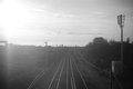
| 06/08/2011 08:57:54 AM | Train to Brieby JopsyDaisyComment: Hi and welcome to the Critique Zone!
I think that this, like so many in the challenge, is a shot that you have to look at more than once to really let it sink in. There is a lot to see here and it is presented very nicely - the haze (dirty train window?) definitely adds atmosphere.
Technically: It does seem a little tiny bit soft - possibly due to the dirt, possibly the fairly large aperture. In this case I can't see that as a real negative since it adds to the 'antique' feel.
Artistically: As I mentioned, this does have a great atmospheric feel to it - not least because those lines by Walthamstow probably haven't changed in fifty years! But... there are two things I would (with the benefit of time and hindsight) pick up on: There isn't a lot of contrast here - the desat route to achieve black and white is not a great one so minimal editing is very limiting, suggesting changing the in-camera settings; Secondly HCB's 'Brie' is notable for it's use of thirds (tree, horizon etc), while this capture is very centred - a little more railway would have made this a little more appealing I suspect.
All in all, a nice, atmospheric shot for the challenge - well done!
Happy hunting,
Frank. | | Photographer found comment helpful. |
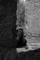
| 06/08/2011 08:46:54 AM | ruinby posthumousComment: We meet again, Meester Bond... er... Posthumous! Welcome back to the Critique Zone.
Interesting shot - not a classic of your style I would say, but you are one of the few I have seen who has managed to inject some real contrast and richness into the b/w - Kudos for that.
Technically: Not a lot to say, its obviously very sound, so only opinion remains. I did think initially that you could have gone for a narrower DoF, but then it occurs to me that you wanted to show the 'ruins', so that wouldn't help.
Artistically: Classic bit of framing and rule of thirds, nice light and dark etc. If I had one criticism, it would be that I would like to see a little more of the runined model - maybe just far enough across the windowsill to see both elbows and enjoy the triangular geometry you would achieve, but that it just personal taste.
Nice shot, good story but (for me) not really up there with your best work. Get back out there dammit!
Happy hunting,
Frank. | | Photographer found comment helpful. |
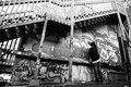
| 06/08/2011 03:39:55 AM | Ganglandby nGallahanComment: Hi Nathan, Welcome to the Critique Zone!
Congratulations on the image - there are not many in this challenge who have managed to get such a rich b/w and really pump the contrasts like this - it is really gripping.
Technically: There is really nothing to say here, even with 20/20 hindsight I cannot find something that I would change.
Artistically: More of a grey area (no pun intended!). The balance is great, the positioning of your (unintentional?) model looks spot on to me, but the slightly tilted looking perspective just seems a little forced. Can't quite put my finger on it. The top of the image is also a little cramped - I like the stairs there to frame it, but perhaps pulling back a little so that more of them appears? Or shooting from the bottom so that they go right to the bottom left? This wall could be a rich seam of shots to mine!
Happy hunting,
Frank. | | Photographer found comment helpful. |
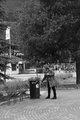
| 06/08/2011 03:09:53 AM | She follows instructionsby mundilitliComment: Hi Arnmundur, welcome to the Critique Zone!
Firstly, I have to say that unlike the other commenters, I like this shot. It is something of a social commentary and I like the sense of solitude there. I definitely think that it was a shot worth taking but with 20/20 hindsight, I might have done it differently.
Technically: I think that the settings are fine, although an ISO of 500 seems a little high? I have also read that most DSLRs perform better at the 'standard' ISOs (100, 200, 400 etc) than the in between settings. The long DoF works really well here - this shot doesn't want a blurred background. It does need to be sharper though, there's no way around that.
PP: It's a minimal editing challenge, so tricky but this definitely needs some sharpening. For a minimal editing challenge, shooting in JPEG has to be the way forward to gain your camera's built in sharpening too. The black and white conversion is also a bit flat - again difficult to do anything about in this challenge, but to avoid editing, a filter (possibly blue for this shot?) might have added some depth to the contrasts.
Artistically: I can see the use of the rule of thirds, but only vertically. I would be tempted to place her less centrally on the horizontal as well. Also, the geometric pattern of the brickwork is quite interesting in a black and white shot - more so than the tree I think, so perhaps include more of that?
Overall, I think that the lack of sharpness and the DPC tendency to race through voting leave this shot a little under-rated. It is interesting and I encourage you to continue to develop this style.
Happy hunting!
Frank. | | Photographer found comment helpful. |
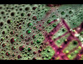
| 03/03/2011 09:21:06 AM | Latticeby leonedavisComment: Hi Lee, welcome to the Critique Zone!
What can I say? Hmmm. It's a fun shot - definitely fits with the challenge in being a macro, lots of colour and interest.
Technically, there isn't a lot to say - you have complete control of the DOF here, and putting it across the shot at the perfect diagonal is really pleasing. It's nice and sharp where it should be, and very blurred where it should be.
Artistically, this is a puzzle macro - how can it be measured artistically?! It's a lot of fun, but lacks a little 'wow'. The border is nicely done and frames it well, but push come to shove I suspect that the voters just decided that it is only a shot of some bubbles - bright, colourful and very well executed but it didn't grab them.
I suspect that if this were an abstract macro challenge, you could have added a full point to the score. This is the kind of shot you could sell to a smart restaurant or coffee bar more successfully than the DPC voter! Ultimately, as long you like it, it's a success.
Happy hunting,
Frank. | | Photographer found comment helpful. |
| 02/14/2011 07:55:42 AM | A Little Birdie Told Me......by battymaddieComment: Hi Madelyn - welcome to the Critique Zone!
I'm afraid that I'm not sure that the bird made that much difference to the voters. With the bird, you have an interesting focal point (and title), without the bird, you have a pretty sunset. I think that your concept was excellent, but I'm not sure it really worked in practice.
Technically: This has a really high shutter speed - metering off the sun, I'm guessing. So you know that everything else is going to be a silhouette. Given that the silhouettes are then your subject they need to be really sharp and they're not - the water is bang on in the middle but that doesn't help.
PP: You have boosted the hell out of the saturation and contrast, which makes the final output very red, and a little 'blocky'. I suspect that a slightly more delicate touch (perhaps trying to preserve some blue in the sky for balance?) would have been more pleasing, but not seeing the original I'm guessing! The vignette doesn't really add here - it needs to be stronger if you really want to see it.
Artistically: Personally, I think that the bird could make this shot, but he is pretty small against everything else. Personally I would have either zoomed or cropped this to about 75% of it's current size, losing most of the bottom inch to make the focus more about the lone shelter with the bird, against a beautiful sea and sunset. That would also help with the sharpness / focus issue as bigger objects are easier to ensure sharpness for.
Overall, this shot comes across more as a tourist snap than something taken by a photographe with your skills (I checked the portfolio!) and not to mention, equipment! But... with just a slightly different perspective and a lighter PP touch, I think it could be stunning.
Hope that helps
Frank. | | Photographer found comment helpful. |
|
Showing 111 - 120 of ~867 |
Home -
Challenges -
Community -
League -
Photos -
Cameras -
Lenses -
Learn -
Help -
Terms of Use -
Privacy -
Top ^
DPChallenge, and website content and design, Copyright © 2001-2025 Challenging Technologies, LLC.
All digital photo copyrights belong to the photographers and may not be used without permission.
Current Server Time: 08/19/2025 10:03:53 PM EDT.
|