| Image |
Comment |
| 01/08/2005 12:10:20 PM |
Air Freshnikovaby aznymComment: greetings from the CC, well, hmm you certainly 'found' a face and made it look real with the cloth, the technical problems are the white areas are overexposed, and it is not sharp. However I am sure that these are intentional and I think they actually serve to enhance your shot. Great title, suits this woman well.
Not the kind of shot that would do well on dpc, but not the less a creative and well done interpretation of the challenge topic.
|
 Photographer found comment helpful. Photographer found comment helpful. |
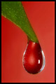
| 01/08/2005 12:06:42 PM |
Mother Nature's Angerby Joey LawrenceComment: greetings from the CC, this shot certainly has a artsy feel, would like to see it in B &W , it also reminds my of munsch's SCREAM. I like the backlighting and use of diagonal composition of the leaf, also has nice textures and details, lots of elements to hold interest. well done, my biggest criticism is I find the color of the leaf distracting from the rest of the image. I think in BW it would be more serious and eerie withstronger impact. |
| Photographer found comment helpful. |
| 01/08/2005 11:57:54 AM |
The Vaseby xtabintunComment: Greetings from the CC, Very good idea and fairly well executed. My biggest criticism would be of the odd format, while I feel the top of the flower could use a little more space, I also think the sides could too. the flower esp on the right seems tooclose to the edge.
I suspect that you had to do it this way because to the faces, perhaps if the flower was more dead center?
Just a thought, overall you get a 10 for creative interpretation : )
well done |
| Photographer found comment helpful. |
| 01/03/2005 12:14:49 AM |
|
| Photographer found comment helpful. |
| 01/03/2005 12:11:08 AM |
|
| Photographer found comment helpful. |
| 12/15/2004 10:28:11 AM |
|
| Photographer found comment helpful. |
| 11/19/2004 11:34:30 PM |
February's Sweetheartsby debitiptonComment: Greetings from the CC, This shot seems to have captured some real emotion, well done, black and white was a good choice, tho would like to have seen a little more subtle lighting, to help avoid the few overexposed areas on his shirt, this shot has a very natural and comfortable feel to it. The compostion and expressions are wonderful. Well done. |
| Photographer found comment helpful. |
| 11/19/2004 11:25:21 PM |
Ballroom Dancing in Decemberby claudia26Comment: Hi greetings from the CC, this shot has potential I think it could of been made much more dramatic by a black background vs. white. It would of made the boa stand out vs. getting lost into the background not to mention would of tied in the bottom of the shot. I would of given a little more room around the shoes, more room for them feet to move : )
hope that helps |
| Photographer found comment helpful. |
| 11/19/2004 11:22:14 PM |
Aussie spring. "November"by NodeComment: Hi greetings from the CC, the horizon seems a bit crooked, I am not sure if I like the perspective here, with the rocks and all, I think I would like to see more of the pier. Something to keep in mind is that the horizon is generally more interesting when it is not dead center. I find the elements of your shot pull at me, the rocks to the bottom the pier to the left and yet I dont really have a focal point. The blues are really nice however, and the grey tones in the rock. Hope that helps a little |
| Photographer found comment helpful. |
| 11/17/2004 09:27:36 AM |
|
| Photographer found comment helpful. |
Home -
Challenges -
Community -
League -
Photos -
Cameras -
Lenses -
Learn -
Help -
Terms of Use -
Privacy -
Top ^
DPChallenge, and website content and design, Copyright © 2001-2025 Challenging Technologies, LLC.
All digital photo copyrights belong to the photographers and may not be used without permission.
Current Server Time: 08/07/2025 12:57:58 AM EDT.