|
|
|
Showing 271 - 280 of ~1202 |
| Image |
Comment |
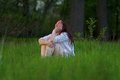
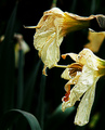
| 05/22/2006 07:25:15 PM | In Her Cathedralby magnusComment: Greetings from the Critique Club,
What I like: The depth of field in the foreground is really nice, as is the background blur I like that you can tell she is in a forest. The green color is very good, one of the better shots with natural green I often find it turns out not quite right, you have handled it very well. I love your model she looks like she belongs in this environment and she is completely credible as an outdoorsy type who would find this to be a holy place. I think her expresion is wonderful (this shot would of also done well I think in enviro port). I also think the light on her face is good.
My only real criiticism is that I would of like to crop about an inch off the right of the photo just to the right of the outside tree, and I would of liked a little more room on the left. And crop a about half an inch off the bottom.( I do not read other comments left, but I am suprised this did not do better--too many thought didn ot meet challenge?)
Very nicely done IMHO.
lynn |  Photographer found comment helpful. Photographer found comment helpful. |
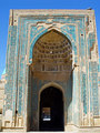
| 05/22/2006 07:18:35 PM | An Old Templeby kiumars_kashaniComment: Greetings from the Critique Club,
What I like: The colors, the textures are really wonderful, The wee little guy looking thru the doorway is certainly a bonus and adds the the mysteriousness of religion and seeking for truth. As does the darkness in the black area and then the light in which the person stands, this photo too me says a lot not only of Holy Places, but of the spiritual journey as well, I find it most enjoyable in that context.
What I do not like: It is a center cropped image but it is not even on the sides, need to crop it more precisely. Could also benefit from correcting the perspective so that the building does not lean in on top. I would also like to see the exposure a hair darker, or the light more golden, perhaps a PS filter? Or reduce highlights? Or could use the burn tool.
Just some thoughts hope they are helpful, sorry this one did not do a little better. | | Photographer found comment helpful. |
| 05/19/2006 06:45:24 PM | Double Peacock Connectionby banmornComment: Greetings from the CC
I like your shot, while it is not particularly WOW, it has interest, good colors, no distracting background and I like that the peacock feathers are almost human like in that they look like 2 eyes. With that in mind I feel like the composition is sort of upside down and I find myself turning my head to look at it. The black background helps the shot to be more dramatic and and the colors to stand out more. The more I lok at it the more I would rotate the whole shot 90 degrees counterclockwise.
Keep up the good efforts and Happy Shooting | | Photographer found comment helpful. |
| 05/19/2006 06:40:42 PM | Divine Princess Codby Ragga2000Comment: Hi Greetings from the Critique Club.
I like the setting of this shot, and I think the 'look' of your model suites the surroundings, she looks sort of mermaid-esque. You do want to be careful not to cut off peoples limbs and digits when you photograph them unless you have a really good reason, that being said would like a tiny bit more on the bottom of the picture.
The thing that I find most that I do not like is the light in this shot. You need to find a way to get rid of the bright white sky! My easiest idea would be to do a vertical crop about 1/2inch past the girls elbow. That would also strengthen your overall compostion a LOT IMO, would also help you to see both fish and model better, without the distracting light. The other way you could work it is put a subtle lighting effect on her and the fish on the left of the phot, brightening her and darkening the sky.
I also really like the color tones. Really cool location for shooting hope we see more shots from there!
Lynn | | Photographer found comment helpful. |
| 05/19/2006 06:33:43 PM | Dead Phone Callby fotomann_foreverComment: Hi Greetings from the Critique Club
Well, I think the pinkish background may have been a little better if it were more reddish. I also think that while this may have some funny advertizing uses it is not the kind of shot most people are going to want a print to hang on wall. My other thought is that whenever you add text to a photo you take away from the photo, i.e. how could you 'show' dead vs. say dead?
The lighting is a little bit on the bright side, especially for a topic as dark as death. May have done better in an irony challenge? Especially with the smiley?
What I think you have done successfully is that your subject is clear and sharp and the viewer is not distracted by any extraneous and unneccessary information.
Hope that helps. Keep shooting. | | Photographer found comment helpful. |
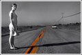
| 05/19/2006 05:01:23 PM | Driving Pass Carmenby kmbr2001Comment: Greetings from the Critique Club.
What I like about your shot is the strong leading line, I also like that this leading line is also the only color and it certainly grabs your attn. It also seems to make me feel like the distance between the person and the car is greater. I might of liked the car even a bit further down the road.
I also really like this girls expression, it is so flat and 'left' looking.
What I think needed a bit of help is the highlights on her back, could maybe use the burn tool or perhaps shadows and highlights to reduce it a little. The other thing is that you need to rotate your horizon a bit to the right. I got a real thing against crooked horizons.
Though I do not need to say it probably....past.
keep up the good work. | | Photographer found comment helpful. |
| 05/19/2006 04:55:25 PM | Demonic Pirate's Conquestby aznymComment: HI Greetings from the Critique Club,
Well, what I really like about your image is the wonderful sense of texture. I also like the abstractness of it, I can see many things in the fabric part. I also like the colors.
What I do not like as much is the compostion, it is a little dull, a bit to central perhaps. I think even if it had been a little diagonal it may have added a little more interest. My choice would of been to place it in the bottom left of the frame and leave quite a bit more on top.
I suspect this image did not do so well, cuz dpc is not so artsy, but I think it is an interesting artistic shot. Well done.
Keep seeing outside the box : ) | | Photographer found comment helpful. |
| 05/18/2006 08:35:13 PM | Doubting Patriotic Convictionsby bvoiComment: Hi Greetings from the Critique Club!
Well, how to critique this without stepping on political toes, as a former american who is not to happy with the USA at the moment I think it is an evocative and interesting photo. From a strictly photographic perspective, I really like the color and the image, it is colorful, the dark ominous figure adds to the drama. I really like the textures in the flag area. I do not know what a scrim is but I think I would love to get one.
I could really see t his image being used as some kind of political comic/satire or used in some kind of advertising campaign. I think it is a creative take and I like it.
My only big critism would be that the guys hat seems a little long, I suspect it is suppose to be a KKK take but it is still a little on the poofy side : )
Well done!
Lynn | | Photographer found comment helpful. |
| 05/18/2006 08:28:14 PM | Dying Plants Cryby obsidianComment: Hi Greetings from the Critique Club,
What I think works about your photo is the background, I like the dark green leaves and the blurred DOF, it helps the viewer to focus on your subject.
What I think needs some improving is that there is quite a big patch that is overexposed, perhaps could be fixed with a dodging, or perhaps adjust in shadows and highlights.
Subject choice: I think the hard thing about photographing something, dead or sad, is that even if you do a good job you will disturb your audience. Most humans are not keen to look death and sadness in the face. So if you chose those kinds of things as subjects, beforewarned you are likely to get a poor response.
Would also be good to have a little more detail in the flowers, tho I suspect that is a limitation of your camera. I actually had that camera for a little while.
Keep up the effort.
Lynn | | Photographer found comment helpful. |
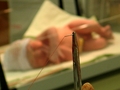
| 05/16/2006 11:28:34 PM | It'll only hurt for a minute!by NowaytotellComment: Greetings from the critique club.
Well, I think this image may make people squeemish a little. Which may not get a good score from people, nor do people generally choose to look at unpleasant things. (Barring medical professionals perhaps) While the baby in the background adds something to the shot, it also makes it more distubing, why are they sewing up a baby? Gives a sense of tragedy. The macro of the needle and thread may have done better on its own, even in the context of the image, it is not such a wow macro in that usually good macros have something intricate or some detail that is usually overlooked.
Anyway just a couple thoughts, you did do a good job of using DOF in your image. Keep shooting! | | Photographer found comment helpful. |
|
Showing 271 - 280 of ~1202 |
Home -
Challenges -
Community -
League -
Photos -
Cameras -
Lenses -
Learn -
Help -
Terms of Use -
Privacy -
Top ^
DPChallenge, and website content and design, Copyright © 2001-2025 Challenging Technologies, LLC.
All digital photo copyrights belong to the photographers and may not be used without permission.
Current Server Time: 12/15/2025 01:17:53 AM EST.
|