| Image |
Comment |
| 03/24/2004 07:23:18 PM |
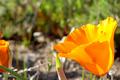
California Poppyby Ram21Comment: These poppies have great colour. The partial flower on the left is distracting though. Cropping it out would give the image far more impact. |
 Photographer found comment helpful. Photographer found comment helpful. |
| 03/24/2004 07:18:00 PM |
Inner Sanctumby TooCoolComment: The lighting inside the dome is incredible. The eye is drawn immediately to the circle at the top of the dome. Even though there are several blown areas they are not distracting due to the strength of the rest of the image. |
| Photographer found comment helpful. |
| 03/24/2004 07:04:56 PM |
Craneby scottwilsonComment: The orange and black are nice contrasts. The white object in the background is a bit distracting.
The orange crane is a little too central. Cropping most of the out of focus part of the newspaper in the foreground or moving the orange crane forward and changing the focus point could help this.
Adding another black bird in place of the white object could add to the impact. |
| Photographer found comment helpful. |
| 03/24/2004 06:18:51 PM |
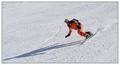
Me And My Shadowby aKiwiComment: Nice capture though the crop is a little tight at the tip of the shadow. A slight adjustment to the brightness/contrast would probably make the snowboarder's suit pop more. It looks a little washed out. |
| Photographer found comment helpful. |
| 03/24/2004 05:52:52 PM |
|
| Photographer found comment helpful. |
| 03/24/2004 04:17:09 PM |
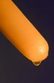
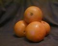
ulgy orangesby maisiebComment: You've lit this perfectly. They're a little too close to the background though therefore not blurring the background enough. They might have had more impact with a white background. |
| Photographer found comment helpful. |
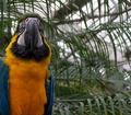
| 03/24/2004 12:25:29 AM |
Orange and blue macawby carycComment: Gorgeous bird. Unfortunately the background is a bit distracting. To blur the background more a larger aperture is required (small number). This would make the depth of field shallower. |
| Photographer found comment helpful. |
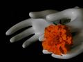
| 03/24/2004 12:16:33 AM |
orange offeringby GinaRothfelsComment: Creative shot. To me it seems a little under exposed and the flower's focus is a little soft. Focus seems to be on the thumb of the nearest hand rather than the flower. |
| Photographer found comment helpful. |
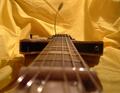
| 03/20/2004 02:54:21 AM |
Parallel Stringsby MattBL34Comment: DOF seems to be in the wrong place and too shallow. Also, to eliminate the sharpness of the background move your subject further away from it. |
| Photographer found comment helpful. |
| 03/20/2004 02:53:04 AM |
Pierby ScottKComment: The angle you chose to take this picture works (other than the list to port). Cropped a little tight on top. |
| Photographer found comment helpful. |
Home -
Challenges -
Community -
League -
Photos -
Cameras -
Lenses -
Learn -
Help -
Terms of Use -
Privacy -
Top ^
DPChallenge, and website content and design, Copyright © 2001-2025 Challenging Technologies, LLC.
All digital photo copyrights belong to the photographers and may not be used without permission.
Current Server Time: 08/05/2025 06:55:06 AM EDT.