| Image |
Comment |
| 05/15/2005 07:26:42 AM |
|
 Photographer found comment helpful. Photographer found comment helpful. |
| 05/15/2005 07:25:48 AM |
|
| Photographer found comment helpful. |
| 05/15/2005 07:22:55 AM |
Rack 'Emby taterbugComment: Might have been an idea to diffuse your light source as the reflection, in my opinion, negitivly effects your image. If it was softened up it could work well. There is also a lot of jpeg artifacts on the table.. if you wanted to get rid of this, try using neat image (www.neatimage.com), works wonders for this problem. |
| Photographer found comment helpful. |
| 05/15/2005 07:18:36 AM |
|
| Photographer found comment helpful. |
| 05/15/2005 07:17:47 AM |
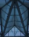
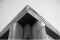
Triangles in the Roundby RistyzComment: I love foreground blur, it adds depth and perspective.. but it is a shame that in this case it encroaches (all be it only slightly) on your subject. 7 |
| Photographer found comment helpful. |
| 05/15/2005 07:13:21 AM |
Three Chairsby colourBlindComment: Awesome shot.. my eyes are going mental trying to fathom it... righto think my brain undersstands now.. not a big building as i first thaught...
Very engaging shot... brillant use of light (and dark)..
I think the shot would be improved
(1) if the triangle was centered...
(2) rotated so the top side of the triangle is parallel with the top...
(3) had a less obvious title.. i think it is more intreguing when it is just abstract shapes!
Great photo though! 9 |
| Photographer found comment helpful. |
| 05/15/2005 07:01:31 AM |
Shady Trianglesby beckettbootsComment: Nice shot.... my brain is making up the rest of the picture.. nice sandy beach... blue water.... hot.....mmmmmmmm |
| Photographer found comment helpful. |
| 05/15/2005 06:59:54 AM |
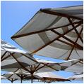
upby nutsahoyComment: Nice abstract.. shame about the crop... and small size. |
| Photographer found comment helpful. |
| 05/15/2005 06:45:57 AM |
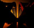
Many Triangles Pyramidby orianaComment: Might have worked better on a plain background (a peice of curved white paper would do) or even a totally contrasting background... like lush grass.... the reflections are kinda offputting... you also could have played with the colours a bit more... boosted them up to really make them jump out at the viewer. |
| Photographer found comment helpful. |
| 05/15/2005 06:42:28 AM |
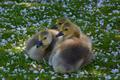
in my sightby parrotheadComment: 10.... gota be the winner! beautiful capture.. i love the grain... and the hi tones. and the cheaky knowing grin... makes the little one look disturbingly (in a good way) grown up. Congrats. |
| Photographer found comment helpful. |
Home -
Challenges -
Community -
League -
Photos -
Cameras -
Lenses -
Learn -
Help -
Terms of Use -
Privacy -
Top ^
DPChallenge, and website content and design, Copyright © 2001-2025 Challenging Technologies, LLC.
All digital photo copyrights belong to the photographers and may not be used without permission.
Current Server Time: 06/15/2025 03:23:50 PM EDT.