| Image |
Comment |
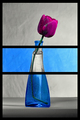
| 04/30/2007 08:48:27 PM |
Destainedby BugzeyeComment: Very cool idea! There's a slightly distracting bluish diagonal line across the rose petals, but otherwise excellent! |
 Photographer found comment helpful. Photographer found comment helpful. |
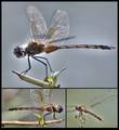
| 04/30/2007 08:23:07 PM |
Dragonfly Studyby zaflaboutComment: Interesting subject, and I particularly like how you got three subtly different plain backgrounds. But the dodging on the body in the large panel is far too obvious. |
| Photographer found comment helpful. |
| 04/30/2007 08:20:55 PM |
Cruisingby p2jvrComment: Excellent concept! I've been on a ship like this and I definitely appreciate the humor in the smallest panel. Hold on, that says "1 mile"? Okay, I guess it's not a ship after all... |
| Photographer found comment helpful. |
| 04/30/2007 08:17:12 PM |
Reflectionsby sfaliceComment: Technically very well done and lovely over-all, but not very compelling. The left panel's subject is excellent but the composition is not great, with the foreground tree taking too much attention. The swan just missed it's light, and the lower right panel is pretty but a bit subtle. |
| Photographer found comment helpful. |
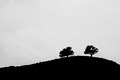
| 04/27/2007 09:08:58 AM |
2 Treesby TomComment: Very elegant and simple, and the grain adds visual interest |
| Photographer found comment helpful. |
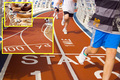
| 04/27/2007 09:06:47 AM |
Spring Trainingby AngadeonComment: If only those two kids hadn't been standing right behind him you'd have a fine picture... |
| Photographer found comment helpful. |
| 04/27/2007 09:01:16 AM |
Morning Flightby louiejf1Comment: Excellent simplicity and lovely color. I would have leveled the horizon (which I believe is allowed in basic editing), but that's a minor complaint. |
| Photographer found comment helpful. |
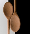
| 04/26/2007 10:26:49 PM |
Yin-Yangby meneleComment: Good concept and nice lighting, but I'd have gone for perfect symmetry, with same size spoons and same amount of space on either side. |
| Photographer found comment helpful. |
| 04/26/2007 10:21:00 PM |
Hells Kitchenby MAKComment: Interesting concept! Normally I don't like this completely over-the-top grunge look, but it sorta fits here. My one big complaint is the eye being obscured by the flying food. |
| Photographer found comment helpful. |
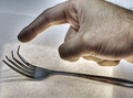
| 04/26/2007 10:17:04 PM |
Touchby zaflaboutComment: Good concept, but overprocessed (the halo around the hand is very distracting) and I'd have either cropped tighter or included the whole hand. |
| Photographer found comment helpful. |
Home -
Challenges -
Community -
League -
Photos -
Cameras -
Lenses -
Learn -
Help -
Terms of Use -
Privacy -
Top ^
DPChallenge, and website content and design, Copyright © 2001-2025 Challenging Technologies, LLC.
All digital photo copyrights belong to the photographers and may not be used without permission.
Current Server Time: 08/04/2025 04:34:03 PM EDT.