| Author | Thread |
|
|
05/29/2007 11:43:17 PM |
|
Awesome shot! Adding to my favorites.. |
|
 Photographer found comment helpful. Photographer found comment helpful. |
|
|
05/07/2007 03:47:28 AM |
I really like this one. It was a great idea.
I hoped to see it on a higher position. |
|
| Photographer found comment helpful. |
Comments Made During the Challenge  |
|
|
05/05/2007 08:46:16 PM |
|
Nice work with the colors. Simple yet well balanced. |
|
| Photographer found comment helpful. |
|
|
05/03/2007 05:17:55 PM |
|
| Photographer found comment helpful. |
|
|
05/03/2007 12:43:36 PM |
|
interesting play with the colors, I like it |
|
| Photographer found comment helpful. |
|
|
05/03/2007 06:53:07 AM |
|
This has a nice stained glass feel to it. The perfect flower would have really topped it off. |
|
| Photographer found comment helpful. |
|
|
05/02/2007 08:35:27 AM |
|
Love the color blocks here. |
|
| Photographer found comment helpful. |
|
|
05/02/2007 06:05:24 AM |
|
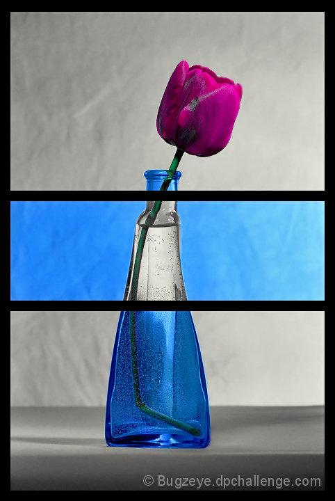
I like this idea... the framing is nice, and I like that it wasn't cut in even thirds. It appears as though there are some desaturated spots on the flower and stem in the top two sections... perhaps from adjusting colors and not sections of the photo? Nicely done though! :) |
|
| Photographer found comment helpful. |
|
|
05/02/2007 02:45:18 AM |
|
Very nice idea - Would make a nice postcard. |
|
| Photographer found comment helpful. |
|
|
05/01/2007 03:20:52 PM |
|
great idea, but the blemished petals aren't helping. |
|
| Photographer found comment helpful. |
|
|
05/01/2007 02:28:58 PM |
I think this will do quite nicely.
I love everything about it.
=P |
|
| Photographer found comment helpful. |
|
|
04/30/2007 08:48:27 PM |
|
Very cool idea! There's a slightly distracting bluish diagonal line across the rose petals, but otherwise excellent! |
|
| Photographer found comment helpful. |
|
|
04/30/2007 08:18:20 PM |
|
Interesting color interplay. |
|
| Photographer found comment helpful. |
|
|
04/30/2007 08:08:33 PM |
|
| Photographer found comment helpful. |
|
|
04/30/2007 01:57:53 PM |
|
| Photographer found comment helpful. |
|
|
04/30/2007 11:49:42 AM |
|
Very interesting! Great take on the challenge! *7* |
|
| Photographer found comment helpful. |
|
|
04/30/2007 11:13:58 AM |
|
Nicely done Triptych with the use of one photo and various levels of PP to get the Triptych look and feel. The color of the tulip jumps out after the blue and greys (which work well together also BTW). Good luck in the challenge. |
|
| Photographer found comment helpful. |
|
|
04/30/2007 07:49:54 AM |
|
Beautiful example of a triptych. Love what you have done with the olours on each frame, excellent entry |
|
| Photographer found comment helpful. |
|
|
04/30/2007 12:55:45 AM |
|
nice idea, well executed...8 |
|
| Photographer found comment helpful. |
|
|
04/30/2007 12:43:54 AM |
|
Great editing. Graphic and arty I like the pop of the fuschia tulip. 7 - and I do NOT know who took this image. |
|
| Photographer found comment helpful. |
Home -
Challenges -
Community -
League -
Photos -
Cameras -
Lenses -
Learn -
Help -
Terms of Use -
Privacy -
Top ^
DPChallenge, and website content and design, Copyright © 2001-2026 Challenging Technologies, LLC.
All digital photo copyrights belong to the photographers and may not be used without permission.
Current Server Time: 06/29/2026 11:42:11 PM EDT.