| Image |
Comment |
| 03/09/2007 05:47:50 PM |
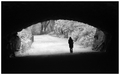
A Silent Exitby meetpdComment: I really like the mood and composition here. Definately a great take on the challenge; great darkness into light feeling. However it feels like it's off-balance; I can see how the shadows might not be horizontal, but she seems to be falling over. I think this would look much nicer rotated upright, and crop the top and bottom about 10% each (also a smidgeon off the right). |
 Photographer found comment helpful. Photographer found comment helpful. |
| 03/09/2007 02:56:29 PM |
Eight Ball -- Corner Pocket by langdonComment: Originally posted by Nightson:
I think it might have been interesting to shift the focus onto the 8-ball, it would have given a different take on the shot |
I would like to see this reshot with the 8 in focus... I like the cue centered under the light though, a great picture overall!
|
| Photographer found comment helpful. |
| 03/09/2007 02:52:29 PM |
Beach Boys - Surfin' USAby byetkoComment: Originally posted by Fibre Optix:
Colors are off...............if it was a black an white. Great Shot. |
Totally disagree. I converted this to black and white just to see... just looks like an overcast day; becomes very forgettable in B&W.
I do have to agree with others on the surfer though, I wish he (she?) wasn't centered under the building. I don't know if positioning him/her left or right would have been better; maybe even all the way to the left of the picture? But of course it's not a model at a photoshoot, so I have to say you did an amazing job of capturing the moment!
|
| Photographer found comment helpful. |
| 03/07/2007 04:40:48 PM |
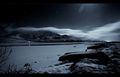
Moonlightby heidaComment: I posted during the challenge, I thought...
to recap, I love this shot! The stars, the glow of the moon, the compostition... I only wish the headlights(?) at left center weren't there. |
| Photographer found comment helpful. |
| 03/07/2007 04:36:07 PM |
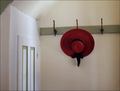
Le Chapeauby BrownEyesComment: This is actually the only photo in this challenge that grabbed my attention enough to vote on it. Love the subject and idea, but the composition is a little lacking... the hat is centered vertically and sort of in-between center and 1/3 right, which isn't very pleasing. I would like to zoom out a little and place the hat one hook right, then align the picture in 1/3's; maybe have the hat hat 1/3 down and 1/3 from right, door&wall cover left 1/3. |
| Photographer found comment helpful. |
| 03/05/2007 07:17:20 PM |
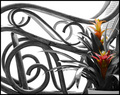
Bentwood and Bromelaidby rjksteschComment: i like the setup here, very neutral with just enough splash of color and lines from the plant. The hightlights on the arms seem a bit bright though... |
| Photographer found comment helpful. |
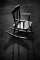
| 03/05/2007 07:14:13 PM |
idleby RKTComment: cute little (dollhouse?) chair. good capture and lighting, well framed... I like the lighting on the chair, but wish the shadows weren't coming straight down though. maybe lit from farther left, behind the chair... 6 |
| Photographer found comment helpful. |
| 03/05/2007 07:02:55 PM |
The Wave Watcherby talikfComment: what movement! great capture! Looks a little too posed though, most kids aren't that philosophical. Also, the design on the shorts is distracting, I'd prefer a total blackout of the silhouette. 6 |
| Photographer found comment helpful. |
| 03/05/2007 07:01:07 PM |
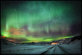
It´s Written In The Starsby LalliSigComment: wow... just wow... let me pause and look some more...
wow again. The only thing I'm annoyed by is what I assume were shooting stars; they look like sctraches. Maybe if there were more they wouldn't seem out of place... hardly your fault though! I'm amazed that the clouds were almost perfectly stationary for what I assume is quite a long exposure, based on the number of stars... I actually like the light at the end of the road, although I think it wouldn't normally have been in such a composition. headlights?
I'd give this an 8; for some reason I don't quite feel it's as perfect as it could be, but can't put my finger on it... have to come back and see if anyone else picks it up. |
| Photographer found comment helpful. |
| 03/05/2007 06:48:36 PM |
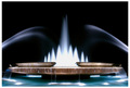
Smooth Flowby breadfan35Comment: beautiful. underwater lights seem a bit blown, probably from the long exposure. Love the water though, I'm sure you'll get "too long" comments from some people (moving water is always a bit controversial) but I love it. I'd give this a 6.
Also, the tips of the upper level fountain at the far left and right are unevenly lit, which is distracting. I'd suggest either cloning the right one and copying it over; actually no I'd take them both out completely. |
| Photographer found comment helpful. |
Home -
Challenges -
Community -
League -
Photos -
Cameras -
Lenses -
Learn -
Help -
Terms of Use -
Privacy -
Top ^
DPChallenge, and website content and design, Copyright © 2001-2025 Challenging Technologies, LLC.
All digital photo copyrights belong to the photographers and may not be used without permission.
Current Server Time: 08/18/2025 10:56:48 AM EDT.