| Image |
Comment |
| 03/23/2007 02:41:56 PM |
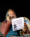
Hey Heiða - did you read about.....by OdedComment: great combination of the challenge and DPC in general; the dog really adds a lot to this! The black background is a little overbearing though; I'd like to see this against a white wall like he's on the sofa at home, maybe with the lower corner of a picture sticking into the upper right corner for some balance and a sense of surroundings. |
 Photographer found comment helpful. Photographer found comment helpful. |
| 03/23/2007 02:38:55 PM |
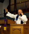
Blessed is he with free anytime minutesby fordmanf1Comment: All the better because I had a professor answer his phone in class recently - twice in the same class. I wonder who's on his speed dial? :) Decent composition, I like the how the details stand out on the pulpit.
...But why is the one organ pipe above his head shiny-er? (sorry I can't spell that right now...) That and the microphone stand over his left shoulder are quite distracting. |
| Photographer found comment helpful. |
| 03/23/2007 02:34:14 PM |
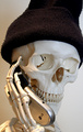
"Your call is important to us. Please hold..."by gzuprukComment: Very funny! I had my boss put me on hold last week and eventually hung up; he called back 45 minutes after first putting me on hold. "He's like the thing that wouldn't shut up!" The man does not know how to get off the phone.
Picturewise, it looks like you have two lights, an overhead to the left and a window or maybe monitor on the right; this is causing the left side to look yellowed and the right is bluish. I like the highlights from the overhead, but a more even and uniform lighting & coloring would improve this a lot.
I like the composition; however in scrolling up and down I think I like it more with the top cropped so the eye sockets are about 1/3 down (cut just where the right side of the hat starts to go straight up); this also makes the overall proportions more aesthetic - or traditional/boring if you did it on purpose, but it seems too tall to me. |
| Photographer found comment helpful. |
| 03/23/2007 02:23:36 PM |
You Can't Have Your Cake And Edith Tooby idnicComment: "pick one" sign not horizontal, which is a little distracting. Clever idea! For some reason this picture seems very flat to me; not a clear sense of distance from dish to easel to backdrop. Good capture on the candles, IMO. |
| Photographer found comment helpful. |
| 03/23/2007 02:20:31 PM |
Just For You by Blue MoonComment: nice lighting and focus; not sure where you were going with the compositino though... not centered, not quite thirds... |
| Photographer found comment helpful. |
| 03/23/2007 02:17:05 PM |
|
| Photographer found comment helpful. |
| 03/23/2007 02:16:35 PM |
Tiny Angelby fordmanf1Comment: good composition and decent lighting; very sweet. Coloring seems somewhat dull though... very nice overall though. 6 |
| Photographer found comment helpful. |
| 03/19/2007 02:44:09 PM |
definition of loveby KrystleComment: Originally posted by OrionThe Hunter:
The Text not being stright across the photo take away from this photograph. |
I actually am glad the text isn't horizontal, would have made this very boring. I would have liked a better view of the bears though, maybe turned them so the camera is looking over red's shoulder...
p.s. Definition 2 is what makes this shot so great to me; sticky bear hugs are definately the personification of love... :D |
| Photographer found comment helpful. |
| 03/13/2007 02:34:56 PM |
Waiting...by oscarmeyerComment: very unique and creative take on this challenge! Good detail on the texture, I wish there was more DOF though. Decent composition, but did you mean to have the top/bottom borders wider than the side ones? |
| Photographer found comment helpful. |
| 03/13/2007 02:31:45 PM |
|
| Photographer found comment helpful. |
Home -
Challenges -
Community -
League -
Photos -
Cameras -
Lenses -
Learn -
Prints! -
Help -
Terms of Use -
Privacy -
Top ^
DPChallenge, and website content and design, Copyright © 2001-2024 Challenging Technologies, LLC.
All digital photo copyrights belong to the photographers and may not be used without permission.
Current Server Time: 04/19/2024 02:06:23 PM EDT.