| Image |
Comment |
| 07/26/2004 12:48:41 PM |
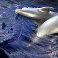
Dusky Platinum Creaturesby MickComment: I really dislike the band name. The photo is interesting. The water capture is very good. I like the positioning of the text and the way it appears to be emerging from under water. The hot spots on the dolphins detract a bit. |
 Photographer found comment helpful. Photographer found comment helpful. |
| 07/26/2004 12:47:06 PM |
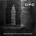
Dreamless Phantom Creatureby nbortonComment: Very good. Original name and the photo really works as an album cover. I don't think the DPC at the top was necessary. I like the font you chose for the bottom text. |
| Photographer found comment helpful. |
| 07/26/2004 12:45:15 PM |
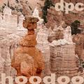
Delicate Pinnacles Celebratedby dr rickComment: Interesting photo. I'm not crazy about the band name. It seems shoehorned to fit the photo. IMO, the band name should have determined the photo content, rather than the other way around. I could be wrong in my assumption--this is just how it seems to me. The text is decent but I think "hoodoo" should not be resting right on the edge of the frame. |
| Photographer found comment helpful. |
| 07/26/2004 12:42:07 PM |
Da Prince Charmingsby MotoCycleBoiComment: This seems a bit shoehorned into the challenge. The lack of text hurts, IMO. It doesn't really feel like an album cover. The photo is good. |
| Photographer found comment helpful. |
| 07/26/2004 12:40:45 PM |
Desert Preservation Companyby BradComment: I really liked this a lot until I scrolled down to the bottom and saw the corny album title and rather cheesy looking text. That ruins it a bit for me. Still, it is a great photo and the band name is good. The text at the top works great. |
| Photographer found comment helpful. |
| 07/26/2004 11:58:49 AM |
Defiantly Pure Cascadesby MaverickComment: This one doesn't work too well for me as a name or album cover. It seems like the band name was shoehorned to fit a photo that was taken during the time frame. You were probably unaware until entering, that text could be added for this one. That probably would have helped convince me this was an album cover. I almost missed that too, but I had a couple of hours left to work on it. I sympathise because this is probably hurting you in the scores.
The photo is quite nice. The composition is great and the blurring water is very effective. It's all over a bit contrasty, especially the rocks on the right side of the frame. The middle values are a bit dark and there is very little detail in the shadow areas. This is a shot that could be heightened dramatically with some highlight dodging. |
| Photographer found comment helpful. |
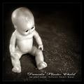
| 07/26/2004 11:50:24 AM |
Daniela Plastic Childby frumoazniculComment: This is excellent! I think I can guess who's this is but I won't say until the voting is over. The two different fonts are great! It shows really good graphic design sensibility. The photo is great and manages to be kind of dark without being creepy. Interesting. The name is interesting and original. The title is excellent! Great job toning down the highlights on the plastic. |
| Photographer found comment helpful. |
| 07/26/2004 11:47:23 AM |
Dusty Psychedelic Cowboysby photomComment: Very good! I'm not crazy about the font you chose but it all fits together pretty well and the name is original. The prism area is a little blown out in the lightest part but for an album cover, it's not really detrimental. |
| Photographer found comment helpful. |
| 07/21/2004 12:49:01 AM |
- Miracle! -by ImagineerComment: Hi Jon! I wondered during the voting if this was yours. I'm getting good at spotting certain members' work.
Congrats on placing so well! GOLDEN!
|
| Photographer found comment helpful. |
| 07/17/2004 05:49:58 PM |
Reading under Purple Light.by biggood53Comment: Greetings from the Critique Club!
While I think the Tiffany lamp has potential as good subject matter I don't care for the way it fights for dominance with the woman's face. The title throws me off a bit. It suggest that I will experience purple light spilling on to the pages of a book. The reality is, the light looks quite warm and golden and we only see a woman's face peering down. She is wearing reading glasses but she could also be sewing, doing a crossword puzzle, or balancing her checkbook as someone else quipped. This suggest to me that the cropping is a bit odd which leads me back to my initial comment regarding the struggle for dominance of subject matter.
My instinct is to suggest a more generous crop so that the viewer can see her activity. Alternatively, you could try a different POV which shows the light spilling onto the pages of her book as she reads. This composition indicates a bit of indecisiveness in choosing a clear focal point. Is it the woman or the lamp? The soft focus on the women helps a bit but her features are still quite visible and add quite a large area of interest that compete with the equally interesting lamp shade. It makes it difficult for the eye to relax. Since this is quite clearly meant to be a relaxing image the dynamics need to be toned down quite a bit.
I do like the placement and cropping of the lamp and the harmony of the jewel tones and the warm, golden light. If the lamp stayed excactly where it is in the composition but the woman was sitting quite a bit further away, perhaps curled up on a sofa, I think it would make for a more balanced composition and a very cozy, pleasing image. Of course, I don't know if this is possible, not knowing what the room is like. This is just how I envision this image working. It could perhaps be done by placing the woman on a cozy piece of furniture under similar lighting but without showing another lamp, and placing the Tiffany lamp several feet away from her on some kind support (a dining room table, a plant stand). Of course you couldn't call it "reading under purple light". The point would be to showcase the lovely lamp shade while keeping it in a warm and human environment. |
| Photographer found comment helpful. |
Home -
Challenges -
Community -
League -
Photos -
Cameras -
Lenses -
Learn -
Help -
Terms of Use -
Privacy -
Top ^
DPChallenge, and website content and design, Copyright © 2001-2025 Challenging Technologies, LLC.
All digital photo copyrights belong to the photographers and may not be used without permission.
Current Server Time: 08/27/2025 05:54:14 PM EDT.