| Author | Thread |
Comments Made During the Challenge  |
|
|
08/01/2004 12:02:53 AM |
|
 Photographer found comment helpful. Photographer found comment helpful. |
|
|
07/29/2004 05:51:14 AM |
|
Nicely done, it works really well. |
|
| Photographer found comment helpful. |
|
|
07/28/2004 09:32:10 AM |
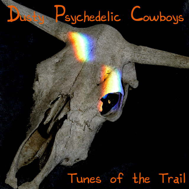
Reminds me of an old Eagles Album.
Good job. Nice overall feel to it.
Good placement of text. |
|
| Photographer found comment helpful. |
|
|
07/27/2004 05:12:46 PM |
|
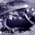
I don't think orange text was a good idea. |
|
| Photographer found comment helpful. |
|
|
07/26/2004 11:47:23 AM |
|
Very good! I'm not crazy about the font you chose but it all fits together pretty well and the name is original. The prism area is a little blown out in the lightest part but for an album cover, it's not really detrimental. |
|
| Photographer found comment helpful. |
|
|
07/26/2004 08:07:08 AM |
|
Nice idea to mix two contrasting images. It worked pretty well imo :) |
|
| Photographer found comment helpful. |
Home -
Challenges -
Community -
League -
Photos -
Cameras -
Lenses -
Learn -
Help -
Terms of Use -
Privacy -
Top ^
DPChallenge, and website content and design, Copyright © 2001-2026 Challenging Technologies, LLC.
All digital photo copyrights belong to the photographers and may not be used without permission.
Current Server Time: 06/30/2026 09:30:43 AM EDT.