| Image |
Comment |
| 07/30/2004 12:03:47 PM |
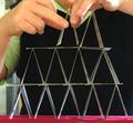
Seconds after it all collapsedby biggood53Comment: Greetings from the Critique Club
A house of cards is a great subject for illustrating balance. You've got a good start here, in spite of your confusing wording. :-D
I don't feel that the building of the house is as interesting as the house itself. From this point of view there isn't really much to interest the eye. Someone suggested a more dramatic angle of view and I would have to agree with that. I would go further and suggest that the house should have been created in front of a simple background to really highlight the intricate structure. The black vest is a good start but the bright green shirt and background elements of the room are distracting. The wrinkled red cloth adds another overly bright visual element that detracts from the potential elegance of the photo.
This is the kind of set-up where you could have used a little trickery, such as creating the house of cards with hot glue so that you had a somewhat stable structure that could be moved around a little bit and experimented with. Try different backgrounds using draped cloth, poster board or simply blur the background sufficiently to avoid distracting elements. The angle I would suggest would be from below and from a position which shows the flat planes of some of the cards and not just the edges and negative space.
This is a fun idea that has a lot of potential for dynamic visual interest. |
 Photographer found comment helpful. Photographer found comment helpful. |
| 07/30/2004 11:50:50 AM |
quietudeby LokiComment: Greetings from the Critique Club
This is a very nice idea for the Balance challenge. Overall, I like the composition. The black and deep blue color scheme is very peaceful. I would have to agree with the some of the comments you received during the voting regarding her watch and the sharpness of the image. Something in me feels that the cropping is a bit stingy. I'd like to see a bit more space above her head and at either side. Also, this pose from what is obviously a standing position doesn't quite portray the meditative quality it would if she were seated. I'm guessing there was no way of achieving this and retaining the simple background of the sky but it appears like more of a set-up this way.
Still, this is a very good effort and shows that some thought was put into the making of it.
|
| Photographer found comment helpful. |
| 07/28/2004 01:45:30 PM |
gadiveby fstopopenComment: It's obviously not about chocolate but I like this photo. It has movement, color, form, and mood. My only problem is it is a bit top heavy. I flipped it horizontally and rotated it and came up with this.

BTW, I didn't vote on it. |
| Photographer found comment helpful. |
| 07/27/2004 01:25:44 AM |
|
| Photographer found comment helpful. |
| 07/27/2004 01:23:05 AM |
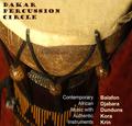
Dakar Percussion Circleby DiamondPeteComment: Very authentic looking. I know because this is excactly the type of CD or record I would pass right by while browsing. Not because it is bad art but because I know what type of musical style the art style typifies. Blah. Not to my taste at all. You've captured that style very well. Good choice of font and nice layout. |
| Photographer found comment helpful. |
| 07/27/2004 01:20:14 AM |
Dead Poets' Childrenby Dr.ConfuserComment: Should be "Dying". The font is kind of cheesy looking for authenticity. The photo works okay as album art but I don't find it to be a great photo. |
| Photographer found comment helpful. |
| 07/27/2004 01:18:26 AM |
Dinner Party Cocktailsby EddyGComment: Cool cover. Don't like the band name--it sounds more like an album title. But the cover is really well done and accurate to the style. Good job! |
| Photographer found comment helpful. |
| 07/27/2004 01:17:34 AM |
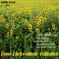
Dense Photosynthetic Colligationby GolferDDSComment: This was so well done! Right down to the choice of font. I love the wide angle for the field of sunflowers. I'm not nuts about the band name (partly because I don't know what colligation is) but it is a masterful 'reproduction' of a vintage album cover. Excellent. |
| Photographer found comment helpful. |
| 07/26/2004 01:25:38 PM |
Dead Peoples Clubby MAKComment: A bit overwhelming. There's a lot going on here with the huge font at the top and the vertically aligned text at the side. The person peeking out from behind the headstone is almost unnoticible at first. The guitar has a squashed, distorted appearance. I think a smaller font and different placement would make this less cluttered looking. |
| Photographer found comment helpful. |
| 07/26/2004 01:22:17 PM |
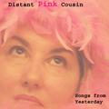
Distant Pink Cousinby GraciousComment: The pose and feathered headdress work really well as 'vintage' album art. The model looks a bit too tired to be really authentic for this idea. The soft focus helps but I can still see the bags under her eyes and the lines in her lips. More dramtic eye make-up would brighten things up. Overall, well done. |
| Photographer found comment helpful. |
Home -
Challenges -
Community -
League -
Photos -
Cameras -
Lenses -
Learn -
Help -
Terms of Use -
Privacy -
Top ^
DPChallenge, and website content and design, Copyright © 2001-2025 Challenging Technologies, LLC.
All digital photo copyrights belong to the photographers and may not be used without permission.
Current Server Time: 08/28/2025 04:14:49 AM EDT.