| Author | Thread |
|
|
08/04/2004 10:50:05 PM |
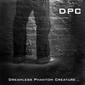
Hello Peter from the Critique Club
This is a very good image and Idea for a C D album cover and very nicely done
Colours, detail, lighting, focus and title all really well done
I agree with one voter that the wording should not be white but maybe a colour (maybe gold ) taken from the image to tone in nicely
I think D P C voters obviously liked your image because you have a very decent score. It competed well with the others but there were a lot of very impressive entries in this challenge.
So Peter there's not much I can add other than to say enjoy your photography and Good luck in future Challenges
If you have any questions please feel free to pm me
Regards
Sally |
|
Comments Made During the Challenge  |
|
|
08/01/2004 12:00:42 AM |
|
Good job! Looks like a real one! |
|
 Photographer found comment helpful. Photographer found comment helpful. |
|
|
07/29/2004 03:06:55 PM |
|
| Photographer found comment helpful. |
|
|
07/29/2004 05:54:18 AM |
|
Excellent, truly looks like an album cover. Love the angle on the drum. |
|
| Photographer found comment helpful. |
|
|
07/28/2004 02:18:44 PM |
|
I love the colours, composition, really moody shot! :-) Though, I am not familiar with the tipography in the left bottom corner. It's so different from the one above (I like that), and the whites are adding too much Contrast IMHO. I would use a smaller font type for the text in the bottom and align it absolutely to the right, I would also use the beige shades instead of the white. Just an idea. (7) |
|
| Photographer found comment helpful. |
|
|
07/28/2004 12:37:40 AM |
|
A very pleasing composition taken in excellent lighting. |
|
| Photographer found comment helpful. |
|
|
07/27/2004 07:21:43 AM |
Excellent use of tones, textures and colour here. Love this shot.
Use of text is well done.
Excellent job........should do well. |
|
| Photographer found comment helpful. |
|
|
07/27/2004 01:23:05 AM |
|
Very authentic looking. I know because this is excactly the type of CD or record I would pass right by while browsing. Not because it is bad art but because I know what type of musical style the art style typifies. Blah. Not to my taste at all. You've captured that style very well. Good choice of font and nice layout. |
|
| Photographer found comment helpful. |
|
|
07/26/2004 05:24:38 PM |
|
Lovely subtle use of shallow DOF. Wonderful viewpoint choice and composition is just excellent. Font choice and text placement also work very well. All in all a very strong image which I think any contemporary African music act would be very proud of. 10 |
|
| Photographer found comment helpful. |
|
|
07/26/2004 10:01:07 AM |
|
nice shot - i think it could do -w/o the lower text |
|
| Photographer found comment helpful. |
|
|
07/26/2004 05:53:58 AM |
|
| Photographer found comment helpful. |
Home -
Challenges -
Community -
League -
Photos -
Cameras -
Lenses -
Learn -
Help -
Terms of Use -
Privacy -
Top ^
DPChallenge, and website content and design, Copyright © 2001-2026 Challenging Technologies, LLC.
All digital photo copyrights belong to the photographers and may not be used without permission.
Current Server Time: 06/28/2026 05:29:46 PM EDT.