| Image |
Comment |
| 08/20/2004 04:33:04 PM |
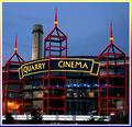
Picture Show Magicby SandyPComment: This is a good subject and a good start. However, I feel like you should have waited for it to be completely dark and used a tripod to really capture a stunning shot of this building. Another suggestion is to crop out the bottom portion of the building and the trees since they add nothing of viewing interest, in my opinion. My final suggestion would be to take the shot from slightly left or right of the building to really capture the angularity of the three sections jutting out from the building. From this nearly straight on point of view, they get somewhat 'flattened' out. This might have the added benefit of eliminating the "Alamo" tower which attracts the eye away from the main subject with little reward. |
 Photographer found comment helpful. Photographer found comment helpful. |
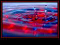
| 08/20/2004 04:31:37 PM |
Ouchby arnigunnarComment: Neon? The yellow on that bandaid doesn't look like neon or day-glo to me. It's a rather muted and pale lemon color.
Returned to edit critique....
I like the lighting on the foot and the dark background. I find the narrow, horizontal cropping a bit awkward for the subject matter which suggests a vertical format with perhaps two-thirds of the negative space leading away from the point of the foot for a more dynamic composition. I'm not sure there is enough going on here in terms of form and space to make this a really compelling photo for me. |
| Photographer found comment helpful. |
| 08/18/2004 11:53:06 PM |
|
| Photographer found comment helpful. |
| 08/18/2004 11:51:21 PM |
|
| Photographer found comment helpful. |
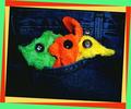
| 08/18/2004 11:48:03 PM |
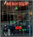
Ghetto Goldby chik0325Comment: The colors are a bit drab and faded looking. The reflections in the window are distracting. Next time if you don't have a polarizing filter, try shooting through glass at an angle. That cuts down on the glare and reflections considerably. |
| Photographer found comment helpful. |
| 08/18/2004 11:46:14 PM |
|
| Photographer found comment helpful. |
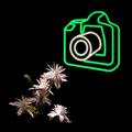
| 08/18/2004 11:43:36 PM |
Photographyby GabrielComment: Great idea. I like the stark contrast and the playful combination of the white flowers and the neon sign. |
| Photographer found comment helpful. |
| 08/18/2004 11:41:30 PM |
|
| Photographer found comment helpful. |
| 08/18/2004 11:40:25 PM |
Finding neon where I can...by ursulasComment: It looks like the busy border is doing half the work of the photo which makes this entry veer into digital art, IMO. As digital art, it is cute and compelling. |
| Photographer found comment helpful. |
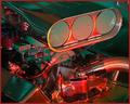
| 08/18/2004 11:31:53 PM |
Engine-uityby JarradComment: Tennuous connection to the challenge for me. There is a hint of neon in the color cast of the light but it's not really singing out to me as 'neon'. |
| Photographer found comment helpful. |
Home -
Challenges -
Community -
League -
Photos -
Cameras -
Lenses -
Learn -
Help -
Terms of Use -
Privacy -
Top ^
DPChallenge, and website content and design, Copyright © 2001-2025 Challenging Technologies, LLC.
All digital photo copyrights belong to the photographers and may not be used without permission.
Current Server Time: 08/27/2025 08:59:32 AM EDT.