| Image |
Comment |
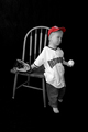
| 01/14/2006 04:26:25 PM |
Little Natby ShelleyComment: I would like this better if Nat were looking at the viewer instead of looking out of the frame. I hate selective desaturation and in this case it appears to be used simply to fit this photo to the challenge. IMO the burst of color should be the focal point. In this case,the red cap shouldn't be the focal point of a studio portrait. |
 Photographer found comment helpful. Photographer found comment helpful. |
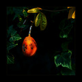
| 01/14/2006 04:21:05 PM |
Imperfectby aznymComment: Better cropping to eliminate the highlighted leaves in the corner would improve this. The yellow of those leaves competes for focus with the persimmon (?). |
| Photographer found comment helpful. |
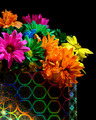
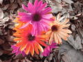
| 01/14/2006 04:19:58 PM |
Bag of Daisiesby banmornComment: Very vibrant and crisp. I like the black background and the repetition of the gaudy, unnatural colors of the flowers in the holographic bag. |
| Photographer found comment helpful. |
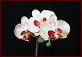
| 01/14/2006 04:18:53 PM |
|
| Photographer found comment helpful. |
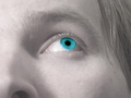
| 01/14/2006 04:18:00 PM |
Window to the soulby nlghttrainComment: Relies to much on post-editing IMO (selective desat, unnatural blue of the eye). For me,this shot has become rather ubiquitous for DPC. I think it would have been more effective to keep the tight cropping and eliminate the selective desat. The natural color of the eyes was likely striking enough against the more neutral tones of skin and hair. On a final note, the nose is a bit of a focal grabber for me. It seems to loom hugely in the lower portion of the frame. |
| Photographer found comment helpful. |
| 01/14/2006 04:11:40 PM |
Bloomby jsasComment: I think the texture of the leaves is competing with the flowers for focus. Maybe shallow depth of field would have worked better? |
| Photographer found comment helpful. |
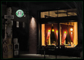
| 01/14/2006 04:10:58 PM |
Boulevard of Java Dreams (ala Gottfriend Helnwein)by DrAchooComment: Very Edward Hopper-esque...I like the moodiness of this. This wasn't the type of shot I envisioned for "A Burst of Color" but I can't argue that there are colorful (if subdued color) elements in an otherwise neutral background. I just noticed the title. I will have to look up Gottfriend Helnwein. |
| Photographer found comment helpful. |
| 01/14/2006 04:07:36 PM |
Crazy Daziesby hideoutComment: There is a stark and offbeat quality to this shot that appeals to me. At first I was inclined to critique the unbalanced placement of the flowers at the top of the frame and dismiss the line of grout as a distracting element. However, the more I look at this the more I like it. I can actually imagine enjoying viewing this in a gallery frame. It is likely a happy accident but thanks for sharing it. |
| Photographer found comment helpful. |
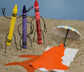
| 01/14/2006 04:02:30 PM |
Beach Meltdownby TransitComment: Only Yellow appears to be upset by this tragic mishap. Blue seems peeved but not overly concerned over the fate of poor Orange and Red is standing off in the background rubbernecking. I like that there is stil a bit of head left on Orange--it's rather unsettling and gory in a whimsical sort of way. |
| Photographer found comment helpful. |
| 01/14/2006 03:56:59 PM |
Sarah - Land downunder coloursby trobergeComment: I like this in a weird 80's graphics kind of way. The cropping is cutting it close near her head, however. Also, there is a harsh line of shadow along her right arm, and an area of darkness between her left arm and her jeans that give this a weird cut-out appearance. I think the cloning could have been a bit smoother. |
| Photographer found comment helpful. |
Home -
Challenges -
Community -
League -
Photos -
Cameras -
Lenses -
Learn -
Help -
Terms of Use -
Privacy -
Top ^
DPChallenge, and website content and design, Copyright © 2001-2025 Challenging Technologies, LLC.
All digital photo copyrights belong to the photographers and may not be used without permission.
Current Server Time: 08/26/2025 02:17:37 AM EDT.