| Image |
Comment |
| 03/15/2006 10:24:57 AM |
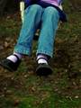
Swinging Shoesby buddybuddy1226Comment: A bit out of focus. I think with a composition like this, you could have included the whole figure and still made the shoes a major focal point. This just looks chopped off. |
 Photographer found comment helpful. Photographer found comment helpful. |
| 03/15/2006 10:23:27 AM |
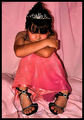
why won't they fit me?by xXxscarletxXxComment: The direct flash gives this a harsh appearance. The subject, a young girl, wearing pink, against a pink background, calls for much softer lighting. |
| Photographer found comment helpful. |
| 03/15/2006 10:16:52 AM |
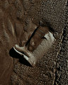
Leftby aznymComment: I like the overall quality of this shot. I'm not sure if centering the subject was the best choice, although I like the angle of the boot. I'm wondering if it wouldn't be more dynamic if the boot were placed in one of the lower corners of the frame? |
| Photographer found comment helpful. |
| 03/15/2006 10:09:37 AM |
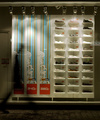
Which to shoes?by timluComment: I don't quite understand the title. I like this because of the blurred figure, the warm quality of the light and the area of bright color in contrast to the overall neutral tones. This isn't the kind of thing that tends to do well in the voting, however. It appeals to me, though. |
| Photographer found comment helpful. |
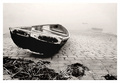
| 03/12/2006 04:05:20 PM |
High and Dryby geewhyComment: Here's another great shot I missed during the voting. Great POV and I love the way the the background disappears into the fog. |
| Photographer found comment helpful. |
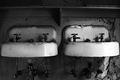
| 03/12/2006 04:00:34 PM |
His and Hersby moviemanComment: Wow! I wish I saw this during the voting. This is beautiful. I love this type of shot. I just entered something with a similar type of viewpoint in the Comfort challenge so it was cool to come across this so soon after. I like the grain and the slightly blown-out areas on the sink give this a natural appearance. |
| Photographer found comment helpful. |
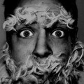
| 03/12/2006 03:54:26 PM |
Things that go BUMP in the night...by tryals15Comment: I'm only seeing one of the items here. I'm guessing you used peanut butter as glue for the feathers but it just isn't clear by this image, therefore, the peanut butter (or maybe jello?) isn't an integral part of the composition--It would seem to be playing a 'behind-the-scenes' technical role. Maybe if you had used color? |
| Photographer found comment helpful. |
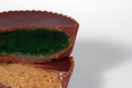
| 03/12/2006 03:28:50 PM |
Hey! You Got Your Lime In My Peanut Butterby CoozComment: Bleah...another pb & lime jello combo. My poor stomach. This is a nice simple composition but the objects just aren't presented in an appealing way. The colors are just unpleasant and there is nothing to relieve the viewer's eye. I think a different color background, maybe a rich red would have added much needed visual dynamic range and made the browns and swampy green warm neutral accents. |
| Photographer found comment helpful. |
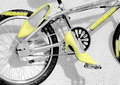
| 03/12/2006 03:22:23 PM |
Mongooseby IndigoButterflyComment: I'm not sure about the placement of the shoe near the tire but I like the high key look and even though I generally don't like selective desat, I think it works here. A good effort. |
| Photographer found comment helpful. |
| 03/12/2006 03:19:56 PM |
Peanut Butter and jell O ?!?by mfairbanksComment: Fun idea for combining pb and jello and nowhere near as nausea inducing as some I've seen so far. I think the blob of jello on the jar was one detail too many. It doesn't make sense and it doesn't add to the composition. This leaves something to be desired in terms of exposure and image quality---the jar looks nice and sharp and the color is good, if a bit contrasty but the desert dish is out of focus at the bottom and the whipped cream blends into the background and it is too contrasty. Also, the color of the peanut butter is off. What I'm seeing in my viewer looks more like nutella than peanut butter. It is way too brown. It looks brown on the label of the jar also. Overall, a nice effort. |
| Photographer found comment helpful. |
Home -
Challenges -
Community -
League -
Photos -
Cameras -
Lenses -
Learn -
Help -
Terms of Use -
Privacy -
Top ^
DPChallenge, and website content and design, Copyright © 2001-2025 Challenging Technologies, LLC.
All digital photo copyrights belong to the photographers and may not be used without permission.
Current Server Time: 08/24/2025 08:34:24 PM EDT.