| Author | Thread |
|
|
03/12/2006 04:00:34 PM |
|
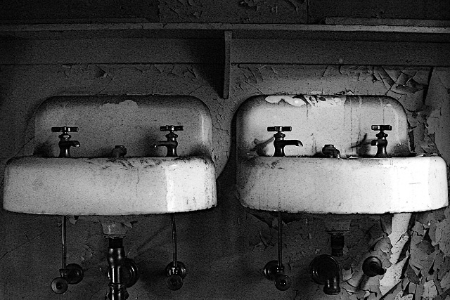
Wow! I wish I saw this during the voting. This is beautiful. I love this type of shot. I just entered something with a similar type of viewpoint in the Comfort challenge so it was cool to come across this so soon after. I like the grain and the slightly blown-out areas on the sink give this a natural appearance. |
|
 Photographer found comment helpful. Photographer found comment helpful. |
Comments Made During the Challenge  |
|
|
02/07/2006 11:25:59 PM |
|
I enjoy this type of minimilistic photography a lot. ( as my portfolio shows with lack of comments and low-scores). Sinks are a little too centered and the shot feels a bit cramped for space, but I like the b&w conversion you did, the light and the subject choice. I see a lot of potentially interesting other pics in this shot. Good luck. |
|
| Photographer found comment helpful. |
|
|
02/07/2006 04:39:29 PM |
|
I think the image grain is a bit too much, and the sinks could have a bit more space (left & right). |
|
| Photographer found comment helpful. |
|
|
02/03/2006 10:03:54 AM |
|
i like the composition but it needs some more contrast maybe? |
|
| Photographer found comment helpful. |
|
|
02/01/2006 09:25:40 AM |
|
I like this shot however I think it could use a bit more space on the left and right - as is it seems a bit too tight |
|
| Photographer found comment helpful. |
|
|
02/01/2006 04:32:35 AM |
|
Nice catch, nice treatment, nice title. That is to say, yuck ;-) |
|
| Photographer found comment helpful. |
Home -
Challenges -
Community -
League -
Photos -
Cameras -
Lenses -
Learn -
Help -
Terms of Use -
Privacy -
Top ^
DPChallenge, and website content and design, Copyright © 2001-2026 Challenging Technologies, LLC.
All digital photo copyrights belong to the photographers and may not be used without permission.
Current Server Time: 06/28/2026 08:04:20 PM EDT.