| Image |
Comment |
| 04/28/2004 05:22:26 PM |
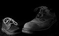
First and last stepsby BiduleComment: The title is uneccessary and leaves the impression that the owner of the adult sized boots is dead.
It's a reasonably pleasing still life but it doesn't move me. I usually like contrast but there is a bit too much here and too much loss of detail. |
 Photographer found comment helpful. Photographer found comment helpful. |
| 04/28/2004 05:18:32 PM |
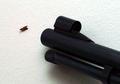
Pest Controlby soccerdadComment: A funny idea. Not an overly successfull image. The bug isn't in focus enough to make an impact. Most of the gun barrel is also out of focus. |
| Photographer found comment helpful. |
| 04/28/2004 05:16:57 PM |
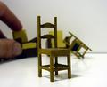
Does Size Matter?by kevrobertsonComment: I'm not sure why you chose to include the other tiny furniture in the background. It only takes one to illustrate the point and the others just distract, particularly chair that looks like it is in the act of tipping over. The hand reaching for the chair should be in much sharper focus. Difficult with a close-up, I know. |
| Photographer found comment helpful. |
| 04/28/2004 05:14:49 PM |
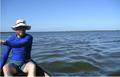
Empty in the Evergladesby bigjvoltageComment: I kind of like this as a candid portrait but I don't see how it meets the challenge. I like the extreme of placing the subject to the very edge of the frame with the expanse of water and sky filling the rest. I guess in a way the composition demonstrates proportion. I think your title has thrown me off. Fill-flash would reveal more detail in the subject's face, although you might have lost that intriguing blur of his hand at the edge. Overall, I think it's an effective image. |
| Photographer found comment helpful. |
| 04/28/2004 05:07:44 PM |
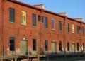
Concrete Proportionsby DonatienComment: This is kind of a ho-hum cityscape. Those concrete tanks and the brick building in front of them don't hold enough visual interest to be a focal point. The trees in the foreground are just distracting and out of focus. I see potential for an interesting shot in the buildings and the river in the upper right quadrant. |
| Photographer found comment helpful. |
| 04/28/2004 05:03:22 PM |
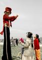
Circus Clownby JoviComment: This is a nice image. I would have waited for the background to be free of people before shooting. Also, it took me a moment to notice there was a third, smaller child. I would have waited until the girl lowered the toy she is holding so little boy's face could be seen. It's also a bit overexposed looking. It meets the challenge. |
| Photographer found comment helpful. |
| 04/28/2004 04:59:03 PM |
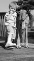
Look, I've got big feet like you!by Prof_FateComment: This is a nice boy and his dog shot. I'm not sure that duotone is working very hard here. Placing your models in front of a less distracting background would have gone a long way toward making this fabulous instead of just cute. It is a bit high key for my taste. It looks like exposure came from the sky instead of something more neutral--the boy's face or the dog's fur for instance. See how the detail in the white sneakers are completely washed out? You can't see where the sneakers end and the socks begin. The subject does meet the challenge. |
| Photographer found comment helpful. |
| 04/28/2004 04:51:33 PM |
House of Worshipby jazzmanmgtComment: There is too much going on here. Perhaps if you had concentrated on only one or two elements of this landscape? Lines leading into the image can be a good design element but here they are stopped short by the fountain which is to small to be the main focus and which interrupts the progression to the building. The building is impressive enough that you could have stood in front of the fountain to get the shot. As it is, it is too far back in the frame and there is not enough contrast between the building and the sky. I also think this is an ugly building and the landscaping is bad and it is probably influencing how I see this picture. |
| Photographer found comment helpful. |
| 04/28/2004 04:40:38 PM |
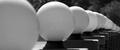
Light Formsby breckinshireComment: I like this. I would like it more if you could have cropped it to exclude that foremost bulb. |
| Photographer found comment helpful. |
| 04/28/2004 04:34:56 PM |
Untitledby davidbedardComment: It illustrates proportion but this image doesn't hold my interest. There's too much going on with the colorful windows, the shadows at the bottom, and whatever those girder things are on the roof. I do kind of like the way they look against the blue sky but that leaves 2/3 of the frame filled with nothing much. |
| Photographer found comment helpful. |
Home -
Challenges -
Community -
League -
Photos -
Cameras -
Lenses -
Learn -
Help -
Terms of Use -
Privacy -
Top ^
DPChallenge, and website content and design, Copyright © 2001-2025 Challenging Technologies, LLC.
All digital photo copyrights belong to the photographers and may not be used without permission.
Current Server Time: 08/23/2025 06:07:55 PM EDT.