| Image |
Comment |
| 05/31/2004 11:52:51 PM |
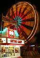
A Carnie's Life For Meby DefyTimeComment: Great color in the blurred ferris wheel. Nice focus on the foreground subject and the colors echo the wheel. A really fun and effective use of blurring. One of my top picks. Good luck! |
 Photographer found comment helpful. Photographer found comment helpful. |
| 05/31/2004 11:51:11 PM |
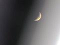
Moon and street lightby BrooklynsbridgeComment: Beautiful and moody. I love the grainy soft-focus. You will likely suffer in the voting for this but good for you for making the choice. The subtle gradiation in tone from light to dark is so effective. One of my top picks. Good luck! |
| Photographer found comment helpful. |
| 05/31/2004 11:48:46 PM |
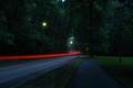
Wet New England Roadby RatedRComment: Great composition. Great focus on the the landscape. The motion blur of light is super deliniated. The small amount of bright red works nicely in contrast to the overall dark greenish cast. This was one of my top picks. Good luck! |
| Photographer found comment helpful. |
| 05/31/2004 11:09:52 PM |
Living Room Moonriseby C-town driverComment: This is such a nicely focused shot. I like the white against the dark background. The dew and the texture of the petals is captured quite nicely (except for a slight overexposed area on the petal directly beneath the purple and white petal). Unfortunatey there is no separation between the flower and the 'moon'. The light becomes a distraction. In my opinion, this shot suffered so much from that light. |
| Photographer found comment helpful. |
| 05/31/2004 11:07:19 PM |
Sun, Moon, Starby hannafateComment: A little too much going on here in terms of color and design. It becomes a jumble of color. Perhaps a black velvet background might have worked better? I'm assuming you used more than one light source to light this and are not just relying on a pun to meet the challenge. |
| Photographer found comment helpful. |
| 05/31/2004 11:05:42 PM |
Illuminationby redmoonComment: Nice sharp foucs on the lighting filement (is that the right word?). The color is nice. I don't find this to be a good composition, however. The looking-down P.O.V. makes the bulb appear top heavy, like it is about to fall down and out of the frame. |
| Photographer found comment helpful. |
| 05/31/2004 10:42:16 PM |
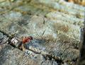
big big world, originalby mijakComment: You know, the colors of this log are so grey that there isn't a big difference b/w this and the desaturated image. The most noticable difference is in the mossy green area at the top of the frame. I think the desaturation in the challenge shot is so subtle that you don't notice it at first. It just appears to be a very grey log. I think either shot works pretty well; the ant is in excellent focus and is just colorful enough to stand out against the drab wood. The mossy area is a bit more blurred and the color difference draws more attention to this. So, while it kills me to admit, I think the selective desaturation improves this shot. |
| Photographer found comment helpful. |
| 05/31/2004 01:25:53 PM |
Lane 3by ZoomdakComment: Great composition. Lively, interesting subject matter. Excellent. |
| Photographer found comment helpful. |
| 05/31/2004 01:25:03 PM |
|
| Photographer found comment helpful. |
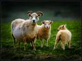
| 05/31/2004 01:24:16 PM |
Family of threeby arnitComment: Nice warm lighting, great capture of the curiousity of the mom the bigger lamb. I like the smaller lamb's shy expression. She is turned away from the camera but is keeping an eye on mom. Nice simple background. I have a guess who made this shot and I'm looking forward to seeing if I'm correct. ;-D |
| Photographer found comment helpful. |
Home -
Challenges -
Community -
League -
Photos -
Cameras -
Lenses -
Learn -
Help -
Terms of Use -
Privacy -
Top ^
DPChallenge, and website content and design, Copyright © 2001-2025 Challenging Technologies, LLC.
All digital photo copyrights belong to the photographers and may not be used without permission.
Current Server Time: 08/26/2025 02:15:27 AM EDT.